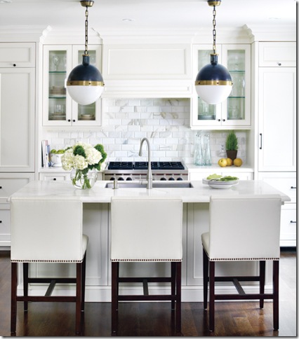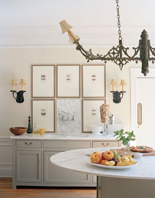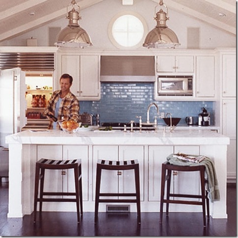
It has been ages since I’ve done a kitchen post. I think the last official post was last April when I blogged about black and grey kitchens. As I researched and went through my files for this morning’s post for Circa’s blog on beautiful kitchens with equally gorgeous lighting, I came across a lot of kitchens I had saved in the course of the last year and fell in love with them all over again. I’ve divided them into three categories and truth be told, I’d be hard pressed to find a favorite. I think it would totally depend on my mood!
{I love the casual elegance of this kitchen featured in House Beautiful. Even though, the space is a little tight, the designer has made great use of what is available and maximizes the space by drawing the eye up with great lighting from Circa and a mirror.}
{This just seems like the most charming country house!}
{This sweet, charming kitchen was featured in Country Home Magazine. The crystal chandelier, beamed ceiling, and white-washed chairs lend an air of casual elegance to the room.}
{I love the cabinetry and classic subway tile in this teeny, tiny kitchen. Notice how small the range and sink are. Image via Daisy Pink Cupcake}


{This kitchen was recently featured in House Beautiful and caused quite a stir! It is housed in what used to be the historic home’s dining room. It is the type of room that causes a definite visceral reaction. You either love it or hate it right away.}

{I happen to think this kitchen is very beautiful, but can’t imagine that it would be super practical for someone who cooks a lot. You would be wiping of those frames and the mirror over the range every five minutes!}
{I love the turquoise accents in the kitchen of Juicy Couture co-founder, Pamela Skaist-Levy which was featured in Haper’s Bazaar back in 2005.}

{The Eugene Pendants look fantastic in this kitchen! I love how well they lend themselves to coastal, country, eclectic, or industrial-influenced styles.}
{I could totally see myself in this beautiful kitchen by Brown Design. I love how it is flooded with light. The hood and subway tile in the range area look fabulous!}
{I could totally picture myself in this kitchen as well. The cabinetry is great. I love the sharp contrast of the white cabinets and black countertops as well as the nook with the banquette and black wall, but the star of the show is definitely that gorgeous green subway tile. Image Credit: Chic Coles via Sotheby’s}
{Another classic kitchen with colored tile. This time, it’s a pretty aqua hue. Image via Shelter}
{This kitchen from Southern Accents looks very architectural to me. I love the use of clean lines and a soft palette. They really help make the beautiful windows a focal point.}
{This gorgeous, grey kitchen from Country Style has the most phenomenal island! Isn’t it great? I probably would have chosen different lighting though to add some warmth from all that grey.}
{This lovely kitchen was submitted by a reader to Decorno. Isn’t it wonderful? I love the custom cabinetry, carrera marble island, and those great teak stools.}
{This kitchen from the May 2009 issue of ELLE DECOR features all of my favorite elements along with a a marble-top Saarinen Tulip table.}
{I wouldn’t usually opt for brass hardware, but I think it looks great in this elegant kitchen from House Beautiful.}
{In the past, I’ve admitted to watching Tori Spelling’s show, Tori and Dean. I think her kitchen is great and love the gorgeous parquet floors.}


{The lighting and thick slabs of marble use in this kitchen photographed by Jean Randazzo definitely make it veer towards a more modern aesthetic.}
{I love the overall style of this kitchen by Breathing Room Designs. While the kitchen itself is quite classic, the lighting and furniture give it a more eclectic vibe.}


{I absolutely love everything that Angie Hranowsky does and her kitchen is no exception! Lucite bar stools, black cabinetry, open shelving, marble counters, and iridescent subway tile? Yes, please!
{I love the commercial quality this kitchen has. I think I’d feel like a pro cooking here. I love the subway tile nook for the range and the lighting is fantastic! I’m so glad to see the large, wooden table. It adds a sense of warmth. Image via: Sarah’s Fab Day}
{I can’t get enough of the bold colors and wonderful patterns used in the fabulous Cottage Living Idea House 2008 kitchen designed by Jackie Terrell.}

Which style do you most identify with? If you could have your pick, which kitchen would you choose? If you’re as indecisive about this sort of thing as I am, you can pick one from each category!
Please be sure to stop by Circa Lighting’s blog for my post on beautiful lighting options for your kitchen.


23 comments:
Love the small kitchen with the b & w photographs, and I love the olive green pantry. Guess I'm modern all the way.
I love the kitchen would the big mirror! I wouldn't have ever thought that would look good... But it does!!
The first image you have here is my favorite kitchen. Actually I love the whole house too- the kitchen is just part of the beautiful space :)
wonderful kitchen round up, thanks for the inspiration...
I actually think I liked almost all of them. Great images!! Loved looking at them,Kathysue
I think 90% of the kitchens here have Carrara marble in them somewhere!!
Ahhhh, I loved every single one of those kitchens!!! Something about all the light white, marble, the grays, the islands, great lighting...makes me want a new house! Our kitchen is just ok and I'd love a fresh start!
Love the huge mirror over the stove. Stunning and so unexpected.
Wow -- breathtaking! I especially love the coastal style kitchen. Thanks for the pics. I have some ideas for putting the finishing touches on our kitchen remodel now.
wow..suuuuper awesome post dollface. kitchen is my favorite room of the house. i love all of them...
anything with an island ill take.
I can't pick my favorite one. I love them all. I have the white look in my kichen, I love the fresh look of it. Yes, classic look!
Beautiful kitchens! Love that green subway tile with the white cabinets!
I don't think there's a one I'd turn down, but the modern/eclectic group really steal my heart!
Mmm....what lovely kitchens!
: )
Julie M.
Kitchens are one of my favorite things, I think because I love design and love to cook! It's funny that you brought up the framed pictures in the kitchen because I've thought the same thing myself. I've even thought about posting kitchens and having a little poll: Cook or Not Cook. The kitchens that I think appear to be cook's kitchens seem a little more functional with less accessorizing. Thoughts?
Very pretty, I'm always re-doing my kitchen in my mind and so many of these are perfect inspiration!
xo
wow
all look
great
clean
and
tons of style
Hmmm...tricky to pick one but probably the kitchen with the aqua subway tiles. I'm a sucker for a large island where you can actually sit (i.e. overhang for stools.) Checked out the Circa blog - congrats!
I can not get enough of the "all white" kitchen! So many great elements in each of these that its hard to choose a favorite...
These are some absolutely glorious designs. I'm a cabinetmaker who is always surfing the Internet looking for something new and exciting, because when I do our bathrooms and kitchen, I do NOT want to do the same thing everyone else does. As yet I still have not figured out what I'm going to do, but one fine day I hope to have something wonderful to share with people on the Internet. And if I do, concepts like these will help me get there. Thank you for sharing this with us.
Holy moly! I LOVE the large ornate mirror behind the stove. How glamorous and chic! Thanks for such great photos!
Yummy!
KItchens are my favorite! I again am struck by the large mirror behind the stove in the House Beautiful image. Love the unexpected . . . like that one. cheers
Post a Comment