photo home-76.png photo about-71.png photo contact-65.png photo press-19.png photo LDV.png photo services-7.png

Wednesday, March 31, 2010

My Top 20 Interior Design Idols: Part Two

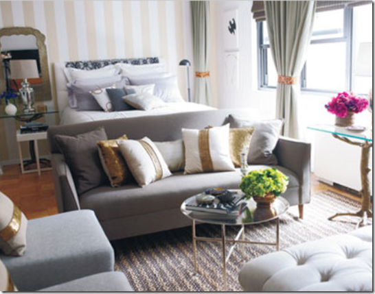
thom filicia hb3

{This gorgeous bedroom was designed by Thom Filicia for the House Beautiful Designer Visions Showhouse.}

So, let’s pick up where we left off yesterday, shall we? Today, we’ll continue with the next five designers on my Top 20 list. These five gentlemen bring an air of sophistication to everything they do. While they share a modern, tailored approach, each designer’s work is distinctly his own.
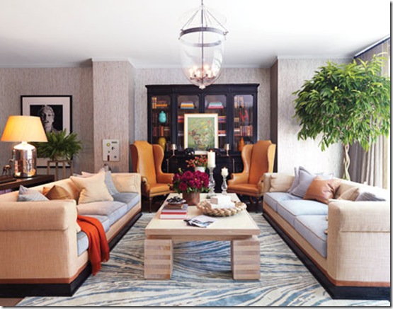
filicia-showhouse-living-room-1109-deThom Filicia: Thom brings a relaxed sensibility to his work that I adore. Take the living room pictured above for instance. It is completely chic and elegant, yet it feels totally casual and inviting. You can just as easily picture yourself having cocktails with friends in this room as you can imagine lounging on the sofa with a pile of magazines. I love the way he accessorizes each room, creating a layered feel.

todd romano

todd romano aptTodd Romano: I love Todd Romano’s fearless approach to design. He often mixes textures, patterns, and bold colors with amazing results. I admire the fact that he always incorporates artwork into his rooms. This fellow Texas native is a mix-master of sorts. He blends furniture from various periods, new pieces and antiques, traditional and modern with complete bravado.

Thomas O’Brien: What can I say about Thomas O’Brien that hasn’t already been said? He has accomplished what so many designers hope for. He is highly revered by design aficionados and has received critical acclaim, plus he has achieved enormous commercial success through his collections for Visual Comfort & Co., Hickory Chair, Reed & Barton, Safavieh, Groundworks-Lee Jofa, Waterworks, and Target. Spaces designed by Thomas always feel so personal, mostly through his brilliant way of layering accessories. There is also an architectural element to his work that I truly admire.

david jimenez kc

David Jimenez: I simply adore David’s classic sensibility and attention to detail. His designs are elegant, tailored, and timeless. His Kansas City home was one of the first homes that I truly fell in love with when I first started blogging. It is done in a formal, elegant style, but maintains a relaxed and inviting quality. He has always been so gracious and kind to me and that gentlemanly demeanor is reflected in the classic spaces he creates.

steven gambrel2steven gambrel elle decor Steven Gambrel: Some of my favorite country houses are designed by Gambrel. He has designed some of the most amazing coastal-inspired houses in recent memory. Despite the fact that a home may be designated as a country home or beach home, he brings an urbane sophistication to each project. Unafraid to use bold colors, Gambrel often opts for beautiful blue hues reminiscent of the sea. Blue isn’t typically my favorite color, but he has made me a believer! This consummate designer is a trained architect and also designs furniture.


Let’s hear it for the boys! Yesterday’s group was a cross-section of several aesthetics, while the designers in today’s post share a tailored, classic aesthetic infused with a knack for color. Of today’s group of designers, who would you choose to design your own home? Whose aesthetic is closest to your own style?

Product Review: Jo Malone Kohdo Wood Collection

The wonderful people at Jo Malone were kind enough to ask me to review the scents in their new Kohdo Wood Collection for the home which is set to debut in April. I was thrilled to have the opportunity because I have loved every Jo Malone scent I have ever smelled. So often, home fragrances smell artificial, overly sweet, and overpowering. On the other hand, Jo Malone scents are elegant and luxurious.

Kohdo_Scatter Candle Collection_300dpi[1] Both of the scents in the Kohdo Wood Collection arrived on my doorstep, beautifully packaged in Jo Malone’s signature cream boxes with black trim. The first, Lotus Blossom & Water Lily is meant to be a daytime fragrance. Its blend of “mandarin, sacred lotus blossom, bamboo and aloeswood encourages energy, inspires confidence and focuses the mind”. The second, Dark Amber & Ginger Lily is an intoxicating, rich fragrance meant to encourage tranquility in the evening. The scent is comprised of a combination of “cardamom, orchid and kyara wood designed to cleanse the senses and encourage calmness, relaxation, and positive thought.” The fragrances complement each other perfectly. Each is completely luxurious. I love the woodsy undertones of each fragrance which lend a sense of warmth.

v&a_06_039_v5[1] I think it’s brilliant that one fragrance is meant for day and the other is meant for night because it is nearly impossible to choose a favorite between the two. Each scent is sensuous, luxurious, and utterly chic. The collection will be available in April at Jo Malone boutiques, on the Jo Malone website, and at stores including Bergdorf Goodman, and select Saks Fifth Avenue and Neiman Marcus stores.

Tuesday, March 30, 2010

My Top 20 Interior Design Idols: Part One

domino klj2

{Katie Lee’s Living Room designed by Nate Berkus}

For someone who loves reading and taking surveys, I am sometimes caught off guard when someone asks me what my favorites are. I love so many things, that I sometimes have a difficult time narrowing it all down on the fly. Just the other day, I was asked who my favorite interior designers are. I named a few of my top favorites off the top of my head, but I knew that I had inevitably left some names of my list.

A few days later, I really started to ponder who my favorite designers were. I could have gone on forever! There are so many designers whose work I admire so, so much, but I knew I would have to narrow it down. I whittled down the list until it was still about a mile long, but that still seemed a little excessive for a “favorite” category. I then challenged myself to name my top 20. It was no easy task. In all honesty, I really do admire so many things about the work of many, many designers out there and I love discovering new ones along the way. I am sure my list will continue to grow and change over time, but in the meantime, I will be doing a four-part mini-series on my Top 20 Interior Design Idols, each of whom has greatly influenced my own personal design aesthetic. They will appear in no particular order, beginning with the first five today. Be sure to come back tomorrow for the second installment of my list!

nate berkus glamour2Nate Berkus: I adore Nate’s polished style and the fact that he emphasizes the importance of making a space feel personal. Every room in a home should say something about the people who live there. I usually love the color palettes that Nate employs and love that every space he designs features a touch of glamour. And by the way, could he be any cuter?

Nate has something that most other designers do not, even the ones that every design-minded person knows. He is a household name that even people who do not have a vested in design are familiar with. I love that he has brought an awareness of design to the masses. Did you know that most of the items in the room pictured above are from his line for HSN and are pretty affordable? It doesn’t hurt to be Oprah’s go-to-guy does it? It also doesn’t hurt that he is incredibly, undeniably talented.

jkfsuite2

jk capriMichele Bonan: This Italian designer is a true master in my opinion. Most of the spaces he has designed rank amongst my all time favorites. These images, from the JK Florence and JK Capri Hotels respectively are so telling of his effortless, elegant style. Every last detail is incredibly chic. He always manages to bring out the stunning architecture of each room and often uses subdued palettes. He uses accessories and art so masterfully and makes each room look completely elegant and timeless, which is a true coup in an industry that is ever-changing.

atl showhouse

Suzanne Kasler: I love Suzanne’s genteel aesthetic. Everything she designs is elegant and classic. She has such a knack for infusing a bit of a modern touch to her otherwise traditional rooms. Her designs are undoubtedly feminine and classic, but always feel so fresh and new.

Lázaro Rosa Violán: Lázaro is a Barcelona-based designer whose work I have been crazy about lately! I have featured him on my blog a few times since January, when I stumbled upon his work while looking for a hotel for our trip to Barcelona. His main emphasis is on hotel and restaurant design. The spaces he creates are not only gorgeous, but completely original and full of character. Take the Big Fish restaurant pictured in the first image above, for example. It’s definitely not what comes to mind when one thinks of a sushi restaurant. I love the minimal color palette, the amazing lighting, the use of various textures, and the fact that he mixes new pieces with vintage ones to create the most amazing, layered looks.

Angie Hranowsky: I adore the way that Angie uses color and mixes high and low-priced items. Not only are the spaces she designs beautiful and inspiring, they feel attainable. Many times, we’ll find ourselves admiring gorgeous interiors only to realized that we may never be able to spend tens of thousands of dollars decorating a single room. Angie’s designs inspire me to be more creative and to check out different sources like thrift shops and estate sales where surely, some of the items in the rooms pictured above were found.


I wonder what my affinity for these designers says about my own style? I suppose I could describe it as classic with a twist? Eclectic with a hint of glamour? Let’s get the conversation rolling! Have I mentioned any of your favorite designers in this post? Whose style do you identify with? Who are some of your own design idols?

10 Things I Can’t Live Without: The City Sage

city sage Today’s installment of “10 Things” features the lovely Anne Sage of The City Sage, a super-inspiring blog about fashion and interior design. Anne always features a treasure trove of gorgeous images and does a fabulous job of creating stories that match interiors to fashion perfectly.

vintage fashion prints[1]
1. Vintage fashion prints: I love fashion, but I'm also a huge history nerd. So what better way to combine two of my top interests? Plus vintage prints can be a super affordable way to fill your house with one-of-a-kind artwork.

ballet flats[1]
2. Ballet flats: While I adore the look of heels, the reality of living in a city and walking everywhere means that I usually stick with flats. Thank goodness there are so many gorgeous options out there! Lanvin slays me every time.

M0851 bags[1]
3. M0851 leather bags: For buttery soft leather that only looks better with age, look no further than M0851. I have their bags in every size--from wallet up to luggage--and I always receive complements on them. Their jackets are fab as well.

taza chocolate[1]
4. Taza Organic Chocolate: Not only is this chocolate organic, it's also stone ground and minimally processed using ancient Oaxacan techniques, so the flavor is super intense. Honestly, you haven't tasted chocolate until you've tasted Taza.

kainstory[1]
5. Super soft tee shirts: With baggy jeans and sneakers or with slim trousers and my hottest jewelry, I always feel effortlessly stylish in a cozy, almost sheer tee shirt. Kain Label makes my favorites in a palette of soft hues and neutrals.

workout DVDs[1]
6. Workout DVD's: I'm a huge believer in the power of exercise to cure what ails you. I'm also a huge believer in lazing around at home. DVD's with my favorite trainers provide the shortest distance from the couch to a major sweat session.

la natura lavender[1]
7. Anything lavender: My mom is obsessed with all things lavender, so when I'm missing her I take a whiff and it's as though she's next to me instead of 3000 miles away. La Natura has a terrific line of lavender products featuring sustainably farmed ingredients.
thymes home fragrance[1]

8. Thymes home fragrance mists: Sophisticated rather than gag-inducing like other home scents, these are my reward for doing housework. After I've tidied up, I run down the hall spritzing each room. The apartment isn't officially clean until it smells nice too!

historical romance novels[1]
9. Historical romance novels: I read about two romance novels a week. Handsome gentlemen, saucy heroines, and a guaranteed happy ending. What more could you want? My fave author is Mary Balogh; I'd read the back of a cereal box if it was written by her.


10. Pampering home facials: I love to give my skin a good scrub, do a little face massage, then smear on a rejuvenating mask. Astara makes especially lovely ones--and they go really well with an afternoon spent eating chocolate and reading romance novels ;)

Monday, March 29, 2010

A Dream Home in the City by the Bay

Isn’t it crazy when you come across a home that feels like it was designed specifically for you? This happens to me every now and then as I leaf through my favorite magazines. On Friday afternoon, I was flipping through the latest issue of Traditional Home and I came across this gorgeous San Francisco home, designed by Melissa Warner of the wonderful Massucco Warner Miller design firm. San Francisco is one of my favorite cities. It is gorgeous and to imagine living in a such a beautiful city in an equally stunning home sparked my imagination. I could move right in!

{The living room features pink velvet chairs and a fabulous little table.}

{The Home’s Dramatic Entry}

{The dining room plays host to bold orange chairs and gorgeous hand-painted de Gournay wallpaper, which you might recognize from the cover of the Domino book.}

{The powder room features several glamorous accents from the beautifully-shaped, vintage gilded mirror to the Ginger Single-Arm Sconces from Circa Lighting. The Scalamandre Zebras Wallpaper adds a touch of whimsy and eclecticism.}

{The kitchen, designed by architect Robert Stiles lends a sense of lightness to the house. The rest of the rooms are dressed in vibrant, saturated tones. The kitchen is an oasis of bright light. It is absolutely beautiful and has just about every feature I could ever hope for in a kitchen.}

{This lovely home belongs to the Morfit family which includes a two year-old daughter and four year-old son. Keeping the children’s ages in mind, Warner used faux-ostrich vinyl on the banquette and a laminated linen seat on the rattan chair in the breakfast nook.}


{The island, breakfast nook, and this seating area provide plenty of room to entertain in the kitchen.}

{In order to create a feeling of warmth in the master bedroom, Warner employed a palette of gold, white, and coral.}

{The beautiful linens are Matouk and the fabulous bedside lamp is from the owner’s personal collection. The wallpaper is “Asuka” by Osborne & Little.}

{A Charming Nook in the Master Bedroom}

{Isn’t the dressing room amazing? Notice the fretwork on the pocket doors and the wallpapered ceiling. I love the chain link design of the Soumak carpet.}

{Perfection! I love every last glamorous detail.}

{The two year-old daughter just may have my favorite room in the house. Isn’t it darling? The built-in bed and shelves are both efficient and stylish. I am head over heels for this color palette!}

{The headboard is upholstered in Quadrille’s “Paradise Background”. The pillows were custom-designed for this little client. I seriously want this to be my room! Although, I may be a little too tall for the bed and I’m not sure how Fabian would feel about it.}

{This four year-old boy’s room is more chic than most adult’s rooms! I love the bold, striped walls and the combination of orange and blue. It’s timeless.}

{The attic office would be a perfect place to write La Dolce Vita, don’t you think? I love the use of white as well as the lighting and of course, the Imperial Trellis roman shades.}

{A Stylish Place to Store One’s Wares}


Image Credit: David Fenton

P.S. The wonderful ladies over at Material Girls are featuring my home on their blog today. Please stop by and take a peek when you have a moment.