photo home-76.png photo about-71.png photo contact-65.png photo press-19.png photo LDV.png photo services-7.png

Tuesday, January 31, 2012

Dream Home: Moth Design

Today’s beautiful “Dream Home” comes from the fabulous Erica of Moth Design! She picked some stunning kitchen and bath options for her post. Once you’re finished here, be sure to check out Erica’s stunning “real” home on her blog!

moth design

Hello, it's Erica from Moth Design here today with my dream home. When Paloma asked me to be a part of this series I found myself pondering what indeed makes a home a dream home. Finishes? Interior? With a little contemplation I realized it's just as much about location, functionality and aspects other than just aesthetics.


For me a dream home would be in a moderate climate (no -22F weeks). My list would include an enclosed outdoor area, the property would have great soaring views and waterfront access. My dream home would also have slightly more modern bones, architecturally speaking and slightly more traditional soft furnishings. While all of these elements might make for a pretty outstanding place I know it could still feel less than perfect without the details, character and special accents that give a home soul.

 
When welcoming you in to my home you may see something a little like this...
Setting the pace for what's to come in the rest of the home.
For my family, the kitchen is by far the most important room as we seem to do most of our living there. I know from my home now that a gallery wall is perfect in the kitchen.
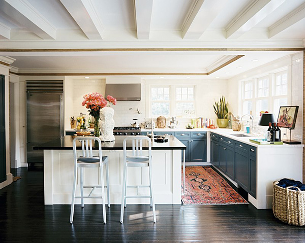
I've done many white kitchens for myself and clients alike, however I'm thinking the next space would be layered with black and mixed metals. I seem to gravitate to this look.
Pinned Image

via


This banquette is so inviting. I can imagine spending many happy hours in a space like this.
                 Pinned Image
via
I'd keep the formal living room a little on the smaller side.
Pinned Image
via
When it comes to hanging out as a family I'd want a room to hold the largest most comfy sofa around. There would be a lot of great movies viewed, board games played and generally good family times spent in a room like this.
 
I love a repetition of black and white in my home. I also love built in niches and marble. This is my idea of bathroom perfection.
 
I also have a soft spot for intriguing little architectural details. I really feel they are what give a space it's personality. This circular window in charming and I love the principal suite to match. Not too big and soothing in it's tone on tone palette.
Let us not forget the walk in closet!
via
This oversized covered dining room is amazing... with the addition of an all weather seating area and outdoor fireplace it would be nothing less than idyllic.
via
Pinned Image

Is there anything better than being able to close the doors on this when you're done with food prep? I think I'll add this to the photo above as well!
via
Now, this may seem silly, but I've loved the idea of a paved yard for some time. I think this idea came from hot Calgary summers. The grass gets so dried out and my brown thumb doesn't help.
So there you have it. Thanks so much for having me here on La Dolce Vita for this fun guest post Paloma! Also, while we're at it, I'm on to thinking up my dream cottage, ski chalet, and destination city pied a terre. Ha! xo

Monday, January 30, 2012

Visual Comfort & Co. Job Opening: Marketing Coordinator

VC_CHA8970ALB-NP

We have an exciting job opening in the Marketing department at Visual Comfort & Co. I know how talented and savvy La Dolce Vita readers are, so if you live in the Greater Houston Area, please contact human.resources@visualcomfort.com if you feel that you are the ideal candidate for the Marketing Coordinator position described below.

Do you have a Bachelor’s degree in Marketing, Graphic Design, Fine Arts, or a related field?

Do you have excellent skills in PhotoShop, InDesign, Illustrator, and Microsoft Excel?

Are you highly organized and detail-oriented with an ability to handle multiple projects and deadlines simultaneously?

Do you have excellent communication and problem solving skills?

Are you a team player with a positive attitude who thrives in a fast-paced environment?

Do you have at least two years experience in graphic design work?

Do you currently live in the Greater Houston Area?

We’d love to hear from you if you can answer all of the questions above with a firm YES. Please email your résumé and portfolio to human.resources@visualcomfort.com if you feel that you are a good candidate for this position and we will send you more information.

This Week’s Quote

Alankeightly

{Image Source}

Friday, January 27, 2012

Fabulous Room Friday 01.27.12

Pinned Image

This week, I’m loving this simple and inviting living room. Through the use of eclectic accessories, neutral fabrics with rich textures, and a few statement-making pieces such as the abstract painting above the mantel, the gold tulip table, and fabulous lantern, the space makes a big impact in spite of its relatively small size and low-key vibe. The use of color is just enough to add interest, but is not overwhelming. The Fiddleleaf Fig trees and pink peonies are the perfect finishing touch!

Have a wonderful weekend!

{Image via Pinterest}

Thursday, January 26, 2012

The Luxe Report: Pastels

When Karl Lagerfeld leads the way on a fashion trend, you know it has to be right. It's Rebecca from Young Sophisticates here with another oh-so fun and fabulous Luxe Report to share with you! I hope you'll be as excited as I am about one of Spring/Summer 2012's biggest trends: PASTELS.
Don't be afraid to wear pretty pastels - think pink, purple, yellow, green in soft sorbet shades... I say wear any pastel hue you prefer & feel the most confident in this spring!!
Chanel's Spring 2012 RTW fashion show was set "under the sea" in Paris, with Karl Lagerfeld walking out on stage with Florence Welch. There were so many pastel hues in Karl's portrayal of an under the sea fashion world - a sea of pastels!
{Photo Credits: via theCut; via myFDblog.com; via shopandbemerry}
Chanel wasn't the only designer label showing the pastel trend on the runway: Louis Vuitton (by brilliant designer Marc Jacobs), Valentino, Carolina Herrera and Phillip Lim (rainbow sherbet colored separates, pictured above) all incorporated this trend on the runway. This trend is still going strong - Elie Saab incorporated the trend into the very romantic and glamorous Spring Haute Couture 2012 collection, shown in Paris earlier this week.

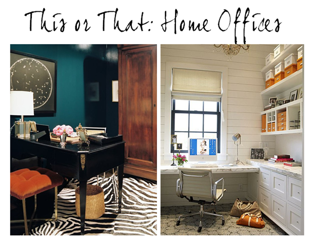
This or That: Home Offices

thisthatoffices

thisthatoffice2

Seeing as how I’ve been working like a mad woman lately, I can’t help but gravitate towards chic office spaces. These two examples could not be more different from one another, yet they are both so beautiful and stylish.

Pinned Image

The office above, with its glamorous furnishings and rich color palette was featured in Lonny last year and belongs to Nate Berkus Associates’ talented, Lauren Gold. Every piece in the room is special and has a story. The use of color and the chic accessories are so spot on. This space would really get one’s creative juices flowing!

Pinned Image

thisthatoffice

This office is from a real estate listing in suburban Houston that I came across earlier this week. The built-ins, woodwork, and marble desktop are stunning! I love how light, bright, and relaxed the space is. It’s elegant and would inspire me to be very organized.


Both spaces are gorgeous in their own ways. Which would you rather have?

Wednesday, January 25, 2012

Design Under the Influence: Kilim Rugs

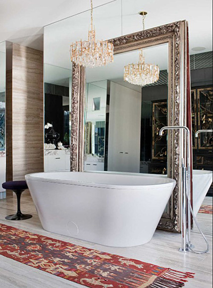
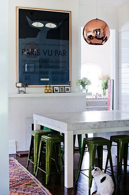
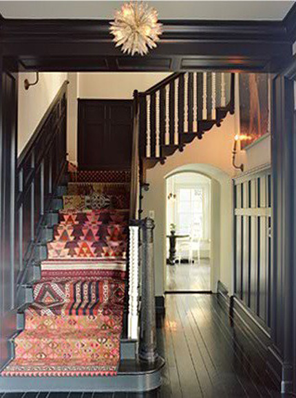
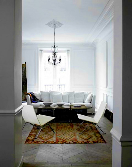
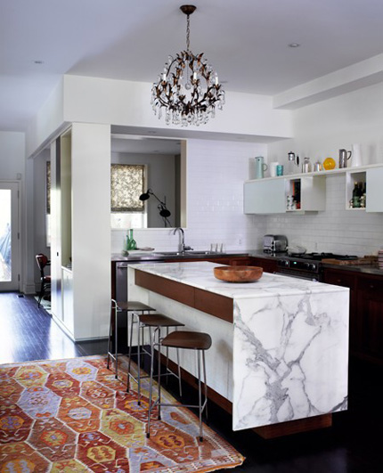
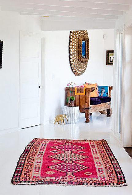
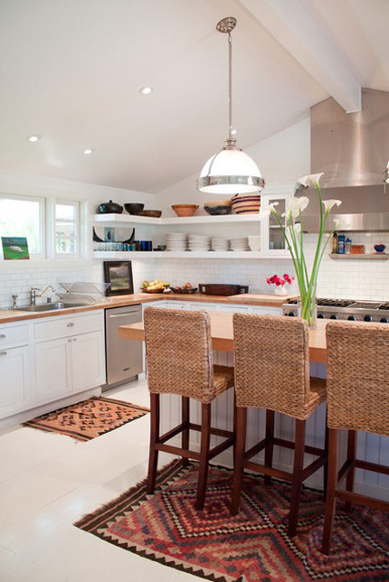
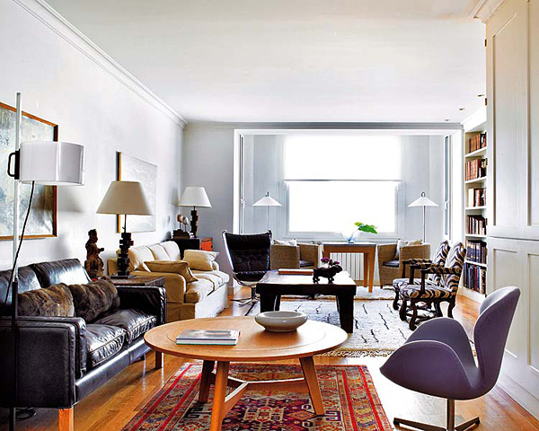
Hello again, it's Erika from small shop, bringing you an eighth installment of Design Under the Influence. Today is going to be a quick lesson, with emphasis on the eye candy! We're talking about kilim rugs, which I've been seeing everywhere lately, have you? What I've really been loving are the fresh ways these rugs have been incorporated into interiors lately — seems to me like they add a dash of boho, making any space suddenly hip.

"Kilim" rug weaving is said to be a tradition that migrated with the Turkmen tribes to parts of present-day Iran, Turkey and Afghanistan in the eleventh century A.D. But archaeological evidence of kilim woven textiles from 7,000 B.C. have been recovered, making kilim one of the oldest and longest held design traditions in the world.

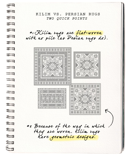
Not exactly sure what makes a kilim a kilim? Two easy differences between a traditional Persian rug and a kilim rug are:

And now for the fun part:

[ Commune Design ]

[ via The Lonely Wife Project ]

[ via Apartment Therapy ]

[ via Apartment Therapy ]

[ via Apartment Therapy ]

[ Fran Ugarte via Nuevo Estilo ]

[ David Cafiero via Lonny ]

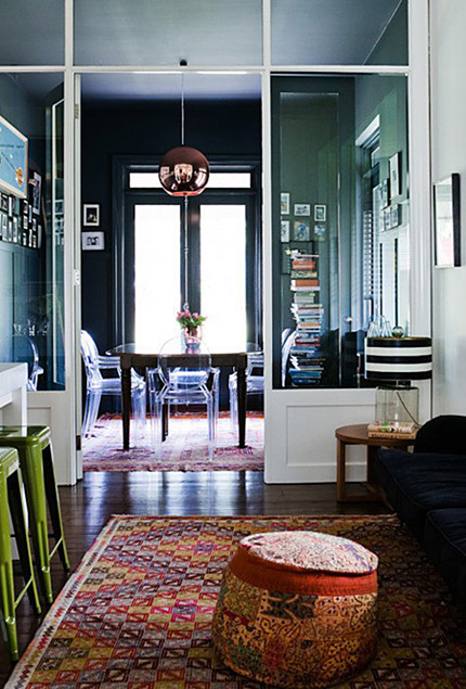
Tough to tell if these are all flat-woven rugs like a kilim. But nonetheless, mixing them into white contemporary interiors softens up an entire room, don't you think? Makes it feel more well-traveled and vintage-y. Do you have any kilim rugs in your home?

Images on my LDV Pinterest board, although I had a lot of trouble finding the original sources for many of these. If you happen to know that, please let us know!

Tuesday, January 24, 2012

Dream Home: Nonsense and Sensibility

Today’s “Dream Home” comes from stylish Dallasite, Haley Schultheis of Nonsense and Sensibility. Haley’s signature sense of style is reflected in each of the beautiful rooms she selected for her dream home. Enjoy!

Obviously, being a Gemini (through and through), it is often difficult for me to make decisions. And, when Paloma invited me to contribute to her "Dream Home" series, I said yes before I even thought twice (who wouldn't)! So, when actually faced with the project, I created a neat little folder called "HOME" on my desktop. I was sure as I perused my favorite homes again I'd come up with the absolute perfect combination of all of my favorites. Uh-hem. Well, let's just say when you find yourself fancying a farmhouse in the English countryside, a historical home in Charleston, a brownstone in NYC's West Village, a ranch in Aspen, and a lake house in Austin - things can get a little bit tricky. Lucky for me, I was able to somewhat refine my tastes and stick to something more sensible - even if it's just a bit over the top and wholly impractical for a single writer and her dog.
I chose the home above because of it's clean lines and stateliness. It's classical without being over the top and I love the window arches and double fireplaces. One can never have too many fireplaces! And, aren't the shutters a nice touch?

The Entryway Chair & Wallpaper : Gwyneth Paltrow's Hamptons Home - House & Garden
The Entryway Table (+ pups): John Traina's home from C magazine
I've always loved the spread on Gwyneth Paltrow's Hamptons home ever since I purchased that issue of House & Garden when I saw her on the cover. I still have it and still flip through it from time to time. I absolutely love her kitchen. I really could re-post that entire spread as my dream home, but I'm forcing myself to be a bit more creative (*don't worry- I also promise not to show Jenna Lyon's bathroom or dressing room- as difficult as that is)! I love the mix of modern pieces with traditional patterns in both of these images. I love the traditional wallpaper in a light gray paired with the modern light fixtures in the entry hall. And, as for the lucite dresser above and its magnificent hardware? No words. What an incredible piece! I would love to have this in my room and neatly arrange my brightest sweaters inside of the drawers - how fun!

I love this wallpaper and there's just something so perfect about the sink, console, and even the touch of the lilac steps. j'adore!
The Formal Living Room: Alexis and Trevor Traina's Home - Elle Decor
A perfect room for formal occasions!
The Formal Dining Room Mood: Elle Decor
Dark, moody, and elegant!
I've always loved Alexis and Trevor Traina's home that was featured in Elle Decor. I think what I love most about the room above, is the success of combining the printed wallpaper with the printed sofa in such closely matched red hues. It somewhat reminds me of a MUCH toned down modern day interpretation of the late Diana Vreeland's red sitting room in some ways. Maybe that's why it amuses me so? And, I love the picture of The Queen above the sofa - the polka dot chair is great too.

The Kitchen - Cabinets & Hardware: Laura Casey Interiors
The Tile & Faucet: Remodelista
The Layout and Barstools: from House Beautiful
My Farmhouse Sink (reimagined- vintage with gold hardware): Country Living
The Breakfast Room- because I can: Elle Decor
Ok, so as of late- I've had a serious obsession for silver and gold OR anything sterling and brass. There is something about the mix of the two kinds of metals that just kills me. It's fresh and clean- but old and elegant at the same time. I can't wait to have my gray cabinets with brass hardware, my farmhouse sink, and chic brass lighting in my kitchen someday! And, it's also great mixed with the subway tiles and Carrera marble. So, gray cabinets with gold hardware asap? Yes, please! As for the breakfast room, I can't imagine a better place to read the morning paper and drink my coffee. It's bright, inviting, and so cheery with those peacocks. How could you not start your day off right?

The Living Room: Elle Decor
The Library/Study: Vogue
I love the idea of a casual working library and study - a giant table surrounded by books. Perfect for afternoon sketching or a lazy read!

The Entertainment Room: Elle Decor
I love all three of these rooms for different reasons, but all seem to offer a refined old-world elegance with a modern twist. In my dream dining room, I love the old wood paneling mixed with the gilded mirror and modern chairs. It would be like waking up to Sofia Coppola's Marie Antoinette each morning. The living room, Fruzsina Keehn's, has always been one of my favorites. The classical body form sketches on the wall paired with the light gray paint and fabric and zebra rug is impeccable. Again, that mixture of silver and gold has caught me! As for the entertainment room, it's posh and comfy. This is a place where you (hopefully) wouldn't care too much if the little ones were coloring on the couch (or at least on the floor right beside it). This is the movie room, cozy and inviting!
The Master Bedroom: Roman & Williams
* Gywneth Paltrow's - but TRIBECA this time!
My Dressing Room: Mary McDonald in House Beautiful
The Master Bathroom: Mission Stone Tile
For the master bedroom, I love the focus on the gorgeous comfortable bed and plush carpet in the room. This space is very 60s luxe and oh-so-chic. It's definitely cozy and elegant at the same time. As for the dressing room, I adore the zig zag wallpaper paired with the mirrored dresser! It's the perfect place for a vanity. Mary McDonald always get things right. As for the master bath, I am drawn to the light and open airiness of the space. Ialso like that there is a freestanding tub. My dream home absolutely must have one of those and of course, the marble is absolutely gorgeous.
Guest Bedroom: Elle Decor
I've loved this room for an eternity- I had to include it.
The Nursery: Vogue
I mean seriously- how can you beat the fact that there's a GIANT hot pink Elizabeth Taylor on the nursery wall? So great.
Kid's Bath: Lifestyle Bohemia
I absolutely love the nursery above paired with this bathroom. Seriously, the flamingos and the painted vintage tub are fantastic. And, again, the giant Elizabeth Taylor painting on the wall? How much better can life get!
The Courtyard/Terrace: Vogue
The Garden- like The Grove the home and garden of the late David Hicks - David Hicks gardens
This beautiful NYC terrace would probably be more of a courtyard for me, but I love the space nonetheless. The only thing I think I would add, is a gorgeous intricately carved outdoor stone fireplace for chilly nights and maybe a big tufted sectional covered in a weather friendly fabric.

The Hidden Door: Anunsom Blog
As for the hidden door? Not quite sure where this leads to yet- just that I've always wanted one. I suppose that's the nonsense in me!
Thanks for reading - hope you enjoyed it!

Cheers!
Haley <3