{The living room features a vintage sunburst mirror purchased in San Francisco, a sofa and rug from West Elm, along with several pieces from eBay. How many shelter magazines do you know that publish homes filled with inexpensive, attainable items?}
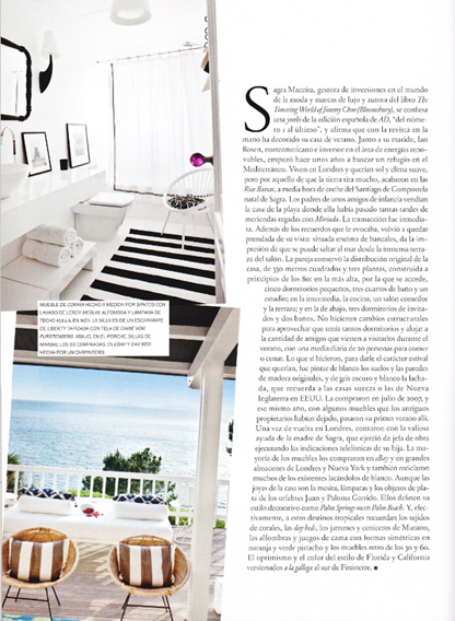
While in Barcelona, I made sure to pick up a few Spanish design magazines. My favorite is AD España, which in my honest opinion is much more fresh and inspiring than the American version of Architectural Digest. One of my favorite features in the July/August issue was this cheery summer house belonging to a couple from London. The wife is Spanish and the husband is American. They decided to buy a summer home near her hometown of Santiago de Compostela, Spain and wanted it to be the antithesis of their home in London. They painted the walls and floors bright white and filled the home with bold colors and patterns. The result is what they describe as “happy chic”, a la Jonathan Adler.

{The living room features several patterns. The tray on the side table is by Svenskt Tenn, while the leopard print pillows are from Pierre Frey, and the Octopus pillow is from Thomas Paul.}
{The Master Bedroom features crisp, classic linens, another Thomas Paul Pillow, a rug from IKEA, chair from Habitat, nightstand by Lloyd Pearson, a silver and glass lamp by Paloma and Juan Garrido, and a classic Slim Aarons photograph.}

The canopy bed was custom-made, trellis sheets and bird pillow from Zara Home, end table and chair from eBay.}
{This guest bedroom features the same style bed as the previous one. They both have pendant lights by Tom Dixon as well. This room features sheets from Pottery Barn and some really interesting little tables purchased on eBay.}
{The black and white palette in the bathroom feels very clean and soothing. The lighting is all from IKEA, the countertop was custom-made, the chair is from Liberty and features a cushion upholstered in fabric by Diane von Furstenberg. This couple definitely has a favorite style of chair, don’t they?}
All Images Scanned by me from the July/August 2010 issue of AD España










16 comments:
I love that orange rug..it's perfect in every way!
<3 Cara
Love all the patterns and color...very "happy chic"!
I would love to subscribe to that magazine~!
Oh, I'm really really really in love with this home! Thanks so much for sharing!
Rooms like these are what finally sold me on white walls...it almost makes the room MORE colorful! SO fresh and happy.
Great pops of color...Who can resist the orange used in this space? I agree..if this is any example of what is featured in this magazine, then yes, it seems to outdo Architectural Digest.
ahhh, I LOVE this space!! I would move right in. I need that mirror for a project.
I love it ALL.
So gorgeous and fun!x
Love this home! The white is such a great backdrop to fun pattern and colorful accessories. Love even more how attainable this look is.
I love the bright colors over the black and white interior. So much fun!
oh my,, this space is so wonderful and bright,,, oh how i love white :)
Beautiful,, thank you for sharing :)
xoxo
Edyta
http://edytaandco.blogspot.com/
Love it! My favorite Spanish magazine is definitely Nuevo Estilo, but I haven't gotten my hands on the AD yet.
xx
dagny
Gorgeous! Love all the different patterns and love the use of high and low cost materials - I never tire of mixing up the elements
I have to say that Spanish Designers and Brands are the ones to watch right now. Check out Spanish modern lighting brand Metalarte at Foundry Light & Design.
Thank you for posting these! I included one of your pics in a post:
http://www.dwellandtell.com/2011/03/sunburst-mirror-behind-sofa.html
Erin
www.dwellandtell.com
Post a Comment