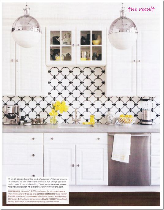
This week’s fabulous room is an oldie, but a goodie. Originally featured in the May 2008 issue of Domino, this modern kitchen by Christina Murphy has long been a favorite of mine. By now, you all know that I love a white kitchen, but what makes this special is its graphic quality. I am crazy about the Beau Monde “Cary” tile from Ann Sacks. I really think it makes the kitchen along with the gorgeous, oversized Thomas O’Brien-designed Hicks pendants from Circa Lighting. They are even more beautiful in person and make such a statement. Today, I would probably replace the yellow accents with turquoise ones, but that’s just because turquoise is one of my favorite colors. Keep in mind yellow, black, and grey was a pretty hot color combination in 2008.
Image scanned by me from Domino Magazine


8 comments:
I love this. 2008 or 2010 - either way it's a beautiful kitchen, and you can never go wrong with ann sacks and beautiful pendants!
That back splash oh my! Gorgeous!
This is one of my all-time favorite kitchens!
Those hanging pendants get me every time I see them!
Fantastic! I love those bright pops of yellow. So fun.x
I'm LOVING the tiles!!
BTW - I'm having a litography giveaway I think you're totally going to love by Cecilia Carlstedt (she's an illustrator and has previously worked for vogue, elle, H&M, neiman marcus)
That back splash really makes the kitchen pop... along with the yellow accents. LOVE IT!
Love the graphic quality of that backsplash! It's very appealing to the eye!!
Nancy
Post a Comment