At this point, I feel like I should probably just accept the fact that I have grown to be a fan of the color blue. It has never been my favorite color, but over the past year or so, I have come to really love deep cobalt, navy, and peacock blue hues. Some blues are flat, but others, like the color used on this stunning cottage have such rich depth that it’s nearly impossible not to love the color. Featured in the August issue of Style at Home, this lakeside cottage in Ontario was designed by Dee Dee Taylor Eustace of Taylor-Hannah Architects. The home’s lakeside setting sets the tone for the palette used both on the exterior as well as the interior.
{The kitchen is bright and open. I love the framed print of the Chrysler building. It looks like they used the same chairs that are around the dining table and used them as stools by adding some sort of extensions to the legs. I’ve never seen anything like that before and I can’t say I am crazy about them. I like the room quite a bit but the “stools” and the pendant lights don’t make sense to me. The lights look cool, but the light would not be dispersed properly if they ever turn them on since they aren’t facing down our up.}
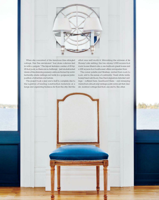
{The dining chairs are lovely and the Global Double Arm Sconce by Michael S Smith for Visual Comfort & Co. is the perfect accent in this stunning vignette.}
{How fabulous are the windows surrounding the living room?}
{Eustace opted for an exterior-style wall treatment for the screened in porch. I love the continuity it creates as it literally brings the outdoors in.}
{The cream furniture works beautifully against the deep blue background. This home truly illustrates the power of color.}










10 comments:
I too am a lover of blue.. though I have never used darker blues and navy in my home.. yet.. i definitely plan on it. This blue on the walls above is gorgeous.
I'm with you on the navy blue! Always thought of it as a old lady color but in the July issue of Style at Home designer Kelly Deck used it to paint the lower half of the kitchen cabinets and it was stunning! It was B.Moores Hale Navy, which I have used on exterior jobs but never inside! HMMMM next project please!
http://www.dawnajonesdesign.com/
De quoi vivre la vie en bleu!
Gros bisous.
i really love houses with white interiors and blue accents.
Absolutely stunning. I never tire of navy mixed with a hefty dose of bright white.
I love blue! While I say pink (hot pink of course) is my favorite color, which is true, blue has always been my close second. It's my instant pick for just about anything. I love the dramatic look of this color! What a gorgeous space!
Amazing photos! The screened in porch with shingled walls has to be my favorite. Love your blog!
www.FashionablyTactless.com
This was crazy cool to read about because as a child we vacationed at the same place only a different island cabin in Stoney Lake!
Wow. These pictures are beautiful. I just love your blog. :D
I work for a custom home builder in Oakville ON and have a client who would love to know the colour used on the cottage on Stoney Lake in Peterborough. Any chance for you to forward along?
Thanks,
Shelley Cochran sochran@whitehallhomes.ca
Post a Comment