{A Contemporary, Eclectic New York Apartment Designed by David Scott Interiors}
I recently came across the work of New York-based interior designer, David Scott for the first time. It is always so refreshing to find a designer whose work is both new and inspiring to you, especially here in blog land where it seems that we often focus on the same designers over and over again. David’s work is tailored and sophisticated, a reflection of his personal aesthetic as well as his surroundings. For nearly twenty years, David Scott Interiors has produced chic spaces perfectly suited to both town and country. His work has appeared in publications such as Architectural Digest, The New York Times, and Gotham magazine.
{An Elegant Bathroom Filled with Unique Touches, Such as the Unique Vanity and Tilework}
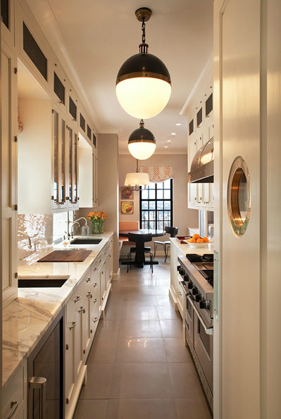
{The New York Galley Kitchen Goes Chic}
{I love the choice of fabrics in this child’s room.}
{A Tailored, yet Casual Living Room}
{A Stylish Kitchen with all of the Classic Elements}
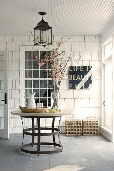
{The white clapboards and the styling in this space are just lovely.}
{A Tailored Living Room Filled with Textures and Patterns}
{This is such a handsome bedroom. I love the bed and the combination of linens. This color palette looks very luxurious.}
{The Drapes, Gorgeous Mirror, and Art-Deco Inspired Chandelier are Just a Few of the Lovely Touches in this Corridor}
{Images via David Scott Interiors}


13 comments:
What fabulous rooms! Truly inspiring!
I especially adore the first image. Love the use of several sculptures.
beautiful find! his work is stunning....that gallery kitchen is absolutely to die for! ox
All of these interiors are really suited well for a man/woman combination. I know my husband would feel right at home in any of these rooms, and so would I!
The first room is pure awesomeness! Could live there in a heartbeat.
every room makes my mouth water. Gorgeous! Love the mixture of earthy textures and classic elements. The tailored classic living room...yum!
I love it all! I'm currently struggling with decorating my husbands office and mixing masculine and modern with some feminine touches....these are wonderful examples!
Except the last one, the mirrors look like youknowwhats. (I'm so sorry)
Lauren@Baylor, I thought the mirrors looked very phallic too! Hee hee hee. They are very beautiful mirrors.
I loveee everything about this!!!!
jen
http://blankwhiteframes.blogspot.com
loved the bathroom.. great wallpaper, mirrored walls, chandelier.. beautiful
Love seeing masculine rooms! David Scott's work is fab!
Thanks for sharing, I love the all the rooms they were so stylish but not stuffy
I really like the bookshelf. I love to read and i'm not quite ready to switch to kindles or tablet devices yet. The problem with that is I ran out of space about a year ago and since then most of my books have been in self storage. I really like the idea of displaying a book collection like this, I know I won't miss the space and it would give me a change to show them off! Really great design!
Post a Comment