photo home-76.png photo about-71.png photo contact-65.png photo press-19.png photo LDV.png photo services-7.png

Friday, December 30, 2011

Fabulous Room Friday 12.30.11

bodice table lampbbl martensen jones

{A Gorgeous Bedroom by Martensen Jones Interiors—Notice the beautifully framed windows!}

I found this week’s “Fabulous Room” while writing a blog post for the Visual Comfort blog on a beautiful bathroom designed by Martensen Jone Interiors. While perusing their portfolio, I fell in love with this stunning, Indian-inspired bedroom. The hand-blocked wallpaper, linens, and furnishings are all neutral while the space is accented with a few pops of pink, resulting in a feminine and eclectic respite. The look is romantic and feminine without being sugary sweet.

bodice table lamp3

{I love the juxtaposition of the clean lines of the headboard and the crisp white linens against the eclectic, Eastern accents throughout the space. The hot pink velvet upholstery on the Chippendale chairs is out of this world amazing! Love it!}

bodice table lamp

{A Detailed Close-up of the Bedroom featuring a pair of Bodice Table Lamps by Barbara Barry for Visual Comfort & Co. along with a Lovely Mirrored Pillow}

image

{A Romantic Shot of the Desk in the Bedroom and a Detailed Image of a Beautiful, Inlaid Chair}

bodice

{A Peek into the Bathroom Shows an Indian-Inspired Triptych-Style Mirror over an Interesting Sink}


Can you believe 2011 is coming to a close this weekend? I am pretty ready to put this year to bed as it’s been filled with ups and downs. I hope you all have a wonderful and safe New Year’s Eve!


{Image Source: Martensen Jones Interiors}

Thursday, December 29, 2011

The Luxe Report: Stripes Now and Later

Hello, La Dolce Vita readers. It's Rebecca from Young Sophisticates wishing you a happy and healthy New Year! I hope 2012 is your best year yet! Last spring, nautical stripes were everywhere... from the runway at Prada, to the red carpet, and at almost every store! Horizontal stripes are still in style, and will give your off duty look a dose of classic cool, now and into spring 2012! How to wear it now? Wear a nautical striped navy and white long-sleeved tee under a black cashmere wrap, like Marc Jacobs' muse Sofia Coppola (pictured above) with dark gray trousers or blue jeans.
What's the best way to wear the look this spring? You'll start shopping for spring soon enough, so why not start to think about it now. Here's some inspiration for your closet when the temperatures begin to warm up...
Ashley Olsen's coral suit from The Row mixed with a nautical stripe t-shirt...
Take the horizontal striped tee in a less nautical direction, with a black and white thick horizontal stripe - like J. Crew's Jenna Lyons (pictured above). This tee is just as versatile as a blue and white nautical tee.
GET THE LOOK:

Do Tell: Which movies do you never tire of?

Pinned Image

I may have had the shortest Christmas break of my life this past weekend, but that did not stop me from squeezing in a few hours to watch some of my favorite holiday movies—Home Alone and Elf, anyone? This got me thinking about the movies that I’ve watched at least a dozen times, but never tire of. You know, the ones that are played on cable every other week, yet still manage to pull you in. Which movies can you watch over and over? A few of my favorites are Auntie Mame, The Devil Wears Prada, Clueless, Mermaids, and Hitch. No matter how many times I’ve watched them, I am always happy to watch them again!


{Image via The Decorista}

Wednesday, December 28, 2011

Design Under the Influence: Vincent Van Gogh

[ Vincent Van Gogh, The Starry Night, 1889 ]
"I make a plain background of the richest, intensest blue that I can contrive, and by this simple combination of the bright head against the rich blue background, I get a mysterious effect, like a star in the depths of an azure sky."
Erika from small shop here, bringing you a sixth edition of "Design Under the Influence"! I wanted to take a post to talk about one of the most recognizable paintings in modern history, post-impressionist Vincent Van Gogh's The Starry Night (1889), for a few reasons: his place in art history, his technique, his signature hue, and his influence on modern music.
HIS PLACE IN ART HISTORY:
While Impressionists like Claude Monet advanced modern painting with refusing to paint exactly what they saw, they still used the colors that they saw, i.e. true colors of the natural world. Van Gogh strove to use imaginative color and exaggerated movement in order to express emotion rather than reality -- a very modern thought at the time! And if you think about the fact that The Starry Night was painted purely from memory, you can't help but be affected by the brilliance of this clearly creative mind.
HIS TECHNIQUE:
If you've ever been lucky enough to see a Van Gogh painting in person, then you know that it jumps out at you: the depth and dimensionality make you feel as if you could walk right into it! This is because of two reasons: first, Van Gogh was a master at using complementary colors against each other to intensify the luminosity of each. And secondly, he carefully built up his brushstrokes in layer upon layer to create a 3-dimensional depth that is very intentional: although the movement of the brushstrokes often look hurried and sporadic, it is said that he would sometimes paint only one stroke a day!
HIS SIGNATURE HUE:
One aspect of his paintings that I particularly love is his use of a vibrant indigo blue that is so intense you can't take your eyes off it. It reminds me a bit of rich blue lacquer walls we've been seeing a lot in interiors lately. Especially when paired with its complementary yellow/orange, I can't help but think they must have been influenced by Van Gogh's paintings. Nonetheless, it's a finish with a big impact:
[ Flickr ]
HIS INFLUENCE ON MODERN MUSIC:
And how about art influencing music? I for one think it's kind of neat that The Starry Night inspired one of the most beautifully written songs in the 1970's: Don McLean's Vincent (1970). McLean recalls he was reading a book about the artist and the painting, and felt compelled to pick up his guitar.
"Looking at the picture, I realized that the essence of the artist’s life is his art. And so, I let the painting write the song for me.”
Isn't that beautiful? And have you heard Roberta Flack's equally beautiful song Killing Me Softly With His Song (1973)? The backstory is that the original singer was so moved by a Don McLean performance that she wrote a poem and passed it on to a writing team that penned the song.
Some fun facts for you...hope you enjoyed it and will pass it on!

Tuesday, December 27, 2011

Dream Home: BAD- Blog About Design

Today’s stunning “Dream Home” comes from the mind of Brendan from BAD: Blog About Design. It is evident that each space was selected with great care. I so admire Brendan’s ability to create, or in this case, imagine, such cohesive spaces. Each room in Brendan’s “Dream Home” is at once grand, but intimate. Enjoy!


http://www.sothebyshomes.com/greenwich/sales/0065618#
http://www.sothebyshomes.com/greenwich/sales/0065147#
Hello La Dolce Vita Readers! Brendan here of BAD Blog About Design. I live in a brilliant 1920s estate in Greenwich, Connecticut, set on over six acres of land. I have a passion for English Manors, and this home falls nothing short! With a magnificent iron gate, lush landscaping and driveway I have much privacy. In addition, the grand motor courtyard allows my cars and guests to park easily. My home is a short drive to town where I can enjoy shopping and dining! 
http://www.whatmiami.com/guide/what-miami-nightlife-guide
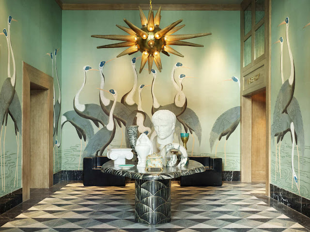
The Foyer of my home is full of surprises! With a brilliant patterned stone floor and an exotic chandelier my entry vestibule pushes the envelope. I placed two arm chairs in the foyer to allow extra seating. The statues atop the stone table add contrast as well as visual interest.
http://design-bad.blogspot.com/2011/12/room-spotlight-classic-glamour-with.html
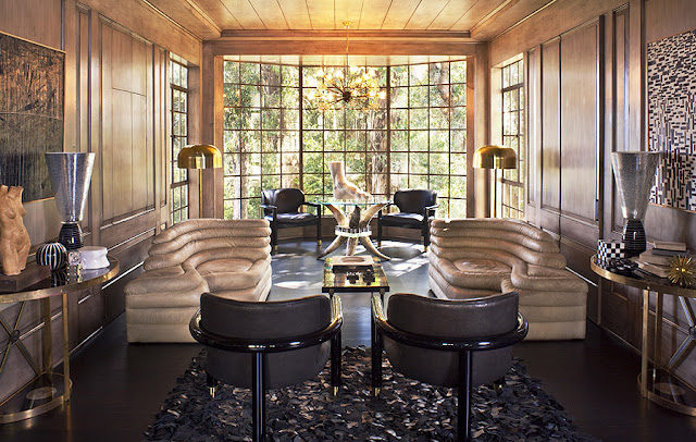
The Family Room is my favorite place to unwind at the end of the day. The two Terrazza DS 1025 sofas are by far my favorite. These 1970s sofas are functional as they can be joined. The two funnel shaped lamps work beautifully with the checkered painting, accessories, and rug. The floor lamps next to each sofa are great for reading as they provide direct light. The incredible windows in the Family Room allows much light throughout the day. I decided to use wood paneling in this space to bring the outdoors in.
http://design-bad.blogspot.com/2011/11/why-i-love-living-rooms.html
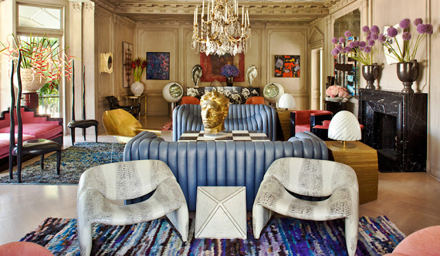
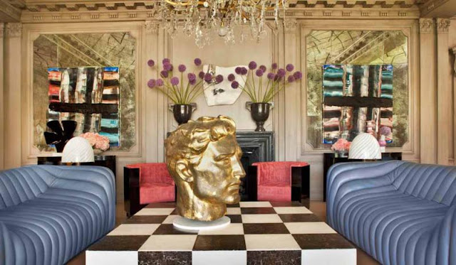
The Living Room is a work of art. The two sofas on either side add a burst of color to the space. Not only do I love their form, but they are also very comfortable to sit in. The center statue on my checkered coffee table is a great conversation piece. I brought three area rugs into this space to bring in texture. I mainly use this space for entertaining, as there is much seating. Despite there being many objects and pieces of furniture in this space, each piece speaks for itself.
http://www.grantkgibson.com/
I love hosting parties in my formal Dining Room. It's traditional with a twist! I purchased this amazing chandelier from Rollins & Hill. I added visual interest to this space by painting the floors an unusual pattern. I have been collecting French vases for several years now, I decided to finally display them on the dining table as well as buffet table.
http://www.houzz.com/ideabooks/1013770/list/WHITE-KITCHENS
I decided to remodel the Kitchen with a delicate color palette. With all the wild patterns throughout the home, the Kitchen serves as a calm oasis. I love my wood center island. It makes preparing dinners easier.
http://www.kellywearstler.com/
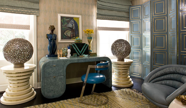
My Office is my creative escape. The whole room is vintage and I absolutely love it. The two tables on opposite sides of the desk were once the base of my dining table. I decided to reuse them and place circular lamps atop them. All the pieces in this space have clean lines.
http://design-bad.blogspot.com/2011/12/how-to-design-your-home-library.html
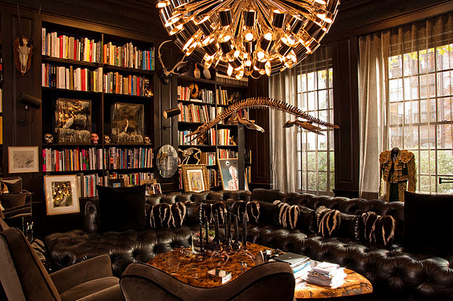
When designing my own library I chose to use dark colors for the space. Dark colors in a library, allow the binding of the books to stand out. The chandelier in this space is impeccable, as it looks like black cups with a light bulb inside it. Large chandelier's in a library are ideal as they light the space well. Be sure to add much seating to your library, it is important to be able to spread out and relax when reading.
http://www.kwid.com
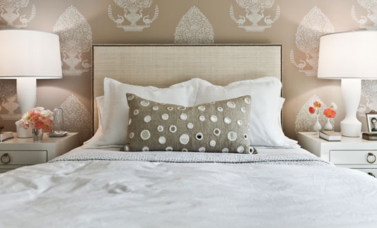
My Bedroom is both full of energy and relaxing. I love my yellow and white stripped cashmere blanket. The pink armchairs are very comfortable to relax in and read a good book. The rug made me think of tree branches when I bought it, so I decided to continue the theme with a small plant on the bottom corner on each of the four bed posts. The chandelier reminds me of an upside down lamp--love it!
http://www.lagnese.net/
http://www.architecturaldigest.com/
The backyard is all about privacy. I love all the nature as well as the pool! Coming out here is so unwinding and was definitely a reason why I bought this amazing English Manor. I love coming out here and running with my dog! You can add as little or as much to your space as you want. Don't follow rules, just do.

This Week’s Quote

Pinned Image

Pinned Image

{Images via Pinterest}

Friday, December 23, 2011

Warm Holiday Wishes

christmas card 2011

As I sign off for the weekend, I am sending you each warm holiday wishes, no matter what you celebrate. Thank you for your readership, support, and friendship. It means more than you’ll ever know. May the holiday season fill your home with joy, your heart with love, and your life with laughter.

Thursday, December 22, 2011

Glamour Obsession: Chanel 2.55 Jumbo Bag

(Totally inspired by this look for 2012!)
Happy Holidays LDV Readers!  Vanessa Stern here from Vanessa & Valentine.  With Christmas around the corner, I'm happy to say I've finished all my shopping for others, but can't help but daydream about what I really want to buy for myself!  I've been completely obsessed with this Chanel 2.55 Jumbo Bag since I tried one on at Bloomingdales a few months back and I literally melted at how utterly stunning the thing was!!!  Besides being totally out of my price range (yes it's gasp $4800 in lambskin) and totally impractical for a new working mom like me, I can't help but imagine owning one of these bad boys! (Yes, it's a total classic, I will own it for years, and it will never go out of style, like my justification??)
I'm not one for New Year's Resolutions, but I'm secretly determined to continue working my ass off at work closing deals, so I can treat myself to my very own Chanel Bag in 2012!  Hey, we all need goals to keep us motivated and inspired, even if they are a little frivolous.       
Of course swooning over the gold hardware details.
I especially love how it looks worn everyday with a basic black and white striped tee and jeans a la Nicole Richie! 

Italian fashion blogger Chiara Ferragni rocks it so perfectly with a neon dress and stilettos. 
And I love how the chain can extend to wear it long or short.
Again Chiara wears hers with a much more conservative look and transitions perfectly!
Now gray with silver hardware is really quite lovely, but if I was going to drop that much I definitely would go with the classic black and gold. 
Lauren Conrad got hers!  Adorable with the red dress!
What do you think?  Totally worth it or total waste?  I would love to hear your thoughts!!!

Here's to health and happiness this holiday season and I wish you all the best!
 
xo,
 
Vanessa
 
images via Pinterest

Wednesday, December 21, 2011

Beautifully Organized: 2012 Planners

Hi everyone! Arianna here of Arianna Belle Organized Interiors. It's almost a brand new year (can you believe it?) and for many that means a new planner with fresh pages for jotting down plans, goals, to-do's etc. I'll be getting a 2012 refill for my pink leather Kate Spade organizer (pricey but one of those purchases I don't at all regret because I use it everyday and even after a few years it still looks great). If I didn't have a planner already, I'd be considering one of these stylish picks: 1- laurel denise planner, 2- tudor city large debra, 3- jonathan adler 17 month agenda, 4-bijou soho diary, 5- cavallini leather daily planner, 6- dozie bowtie pocket planner, 7- sarah pinto stripe weekly planner, 8- moleskine assorted month daily planner, 9-russell and hazel mini binder, 10- faux snakeskin vintage daily planner

Do you get a new planner each year, refill one you already own with new pages, or prefer to organize your life digitally?

'Til next time!

-Arianna