photo home-76.png photo about-71.png photo contact-65.png photo press-19.png photo LDV.png photo services-7.png

Wednesday, August 31, 2011

Currently Loving: Artesian Bar by David Collins

david collins artesian

London-based David Collins is one of my favorite designers in the world.I usually don’t think twice about a person calling his or herself a decorator or a designer, but for anyone who might be wondering, Mr. Collins is a designer in the true sense of the word. He doesn’t just plan and decorate spaces, he also designs furniture, lighting and offers branding and architectural design as part of his services, creating something beautiful from nothing. The man is a creative genius. Time and time again, I am blown away by the sophisticated, glamorous spaces her creates. I constantly look forward to seeing new projects from him and it always feels like Christmas when I come across a new project of his. The Artesian Bar at the Langham Hotel in London is no exception. Every last detail in this bar is stunning from the lighting to the lavender color palette and the Asian influences that are evident throughout the space.

david collins artesian2

Take a look at the gorgeous details in this shot. The mirror inlay on the walls is beyond! Everything is so rich and sumptuous. Other cities should take note as London has some of the best design hotels, restaurants, and bars in the world and the Artesian certainly falls into that category. Perhaps Mr. Collins should take his talents to cities like Madrid which offer a very small selection of design destinations as I recently discovered while planning our upcoming trip.

david collins artesian3

Things take a slightly more classic turn in the Artesian’s bathrooms where Mr. Collins has opted for clean lines and timeless finishes. Is anyone else feeling inspired to hop on a plane to London to experience this gorgeous space in person? I’ll be at the bar!


{Image Source: David Collins Studio}

Tuesday, August 30, 2011

Dream Home: Arianna Belle

I have loved seeing the ways in which everyone who has participated in the "Dream Home" series since last December has taken rooms that are either new to us and even some we've seen and loved for some time and have made them look completely fresh and exciting within the context of their dream homes. I am in love with the post that Arianna of Arianna Belle Organized Interiors has put together for us today. Many of these images are new to me, while others are old favorites and they all look absolutely perfect together. I love the classic, romantic sensibility of this home. Fabulous job, Arianna! 
arianna blog
 
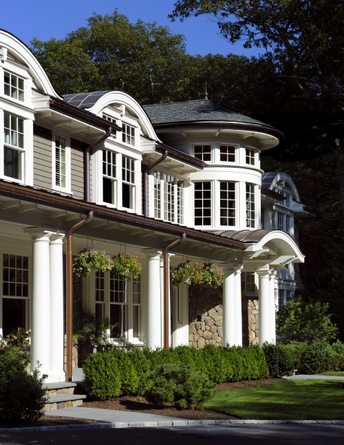
Thank you Paloma for inviting me to participate in this series. Putting together this post was such a fun exercise! My dream home would have beautiful curb appeal. I love the exterior of this home (below) though I'd probably add a bit more to the landscaping (maybe roses or hydrangeas) to make it a bit more lush...
1- exterior.jpg
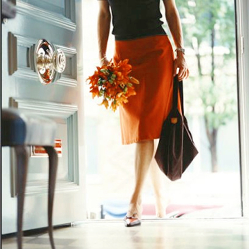
The entry door would be painted a fun color (maybe blue like the one below) and would have beautiful little details like a unique knob...
2- entry.jpg
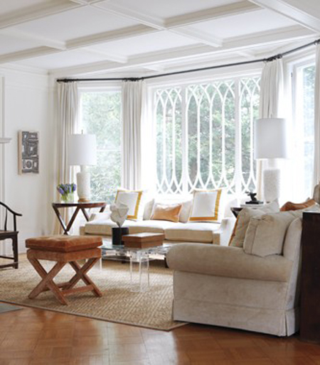
The "formal" living room would be bright and inviting...
3- formal_livingroom
The kitchen would have white cabinetry (with glass front upper cabinets), marble counter-tops, pendant lighting, and a big island in the middle with some seating, since the kitchen always tends to be a hang out spot...
4 -kitchen
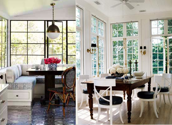
There'd also be a little breakfast nook in the corner surrounded by windows to allow for lots of natural light as well as views of the backyard greenery...
breakfastnook.jpg
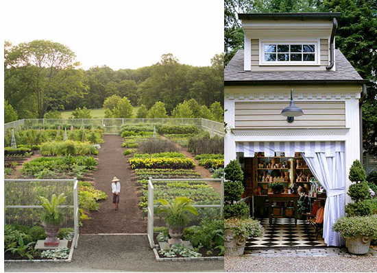
Speaking of backyard, just outside the kitchen would be a garden where my husband and I could grow our own organic veggies and herbs. There would also be an accompanying garden shed...
10 -garden.jpg
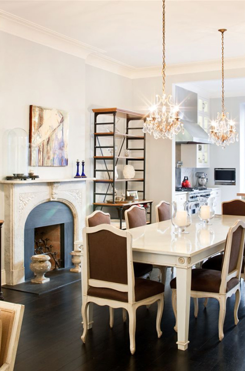
Back inside, the dining room would be perfect for entertaining. It would have a long table enough to seat at least six, white framed chairs, a chandelier (or two!) and a fireplace...
diningroom.jpg
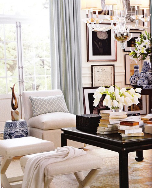
The living room would also have a fireplace, as well as framed artwork, elegant lighting, cozy throws, and comfy seating...
livingroom.jpg
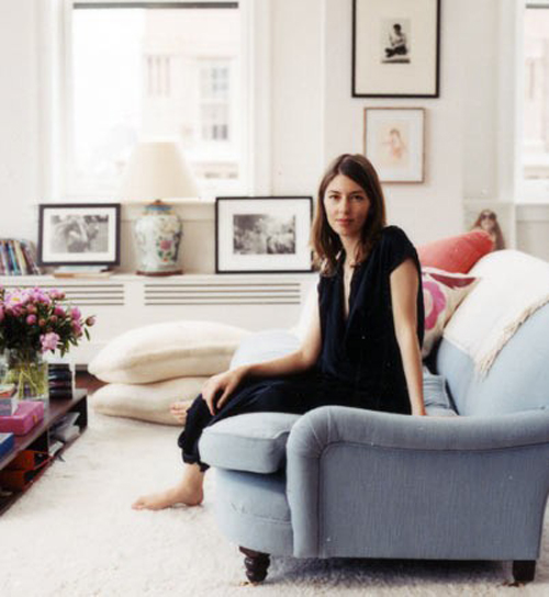
A blue George Smith sofa just like Sofia Coppola's would be perfect!
sofiacoppola-livingroom.jpg
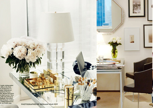
My home office would be a bit glam with a mirrored desk, a lucite table lamp, gold accessories, and fresh flowers...
8- home_office.jpg
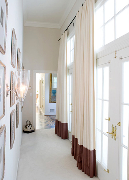
Framed artwork on the walls and gorgeous drapery framing large windows would make for a beautiful hallway...
hallway.jpg
The guest room would be serene and fresh...
guest-bed.jpg
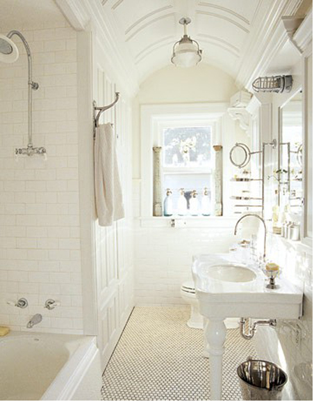
A bright clean guest bath would be adjacent...
guest-bath.jpg
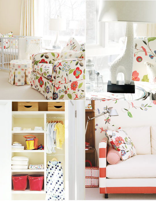
The nursery {for my hypothetical kid(s)} would be soothing yet bright and cheerful...
14- kidsroom.jpg
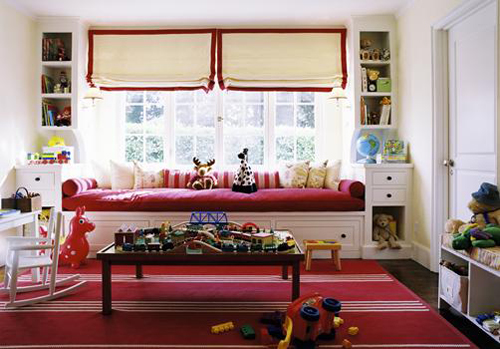
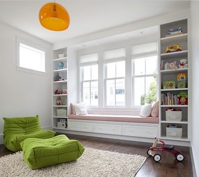
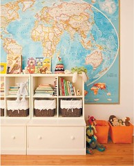
There would also be a colorful playroom with toy cubbies, bookshelves, a window seat, and lots of floor space...
playroom
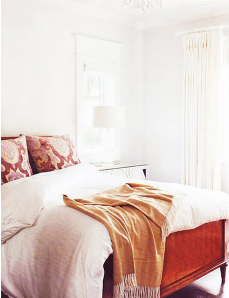
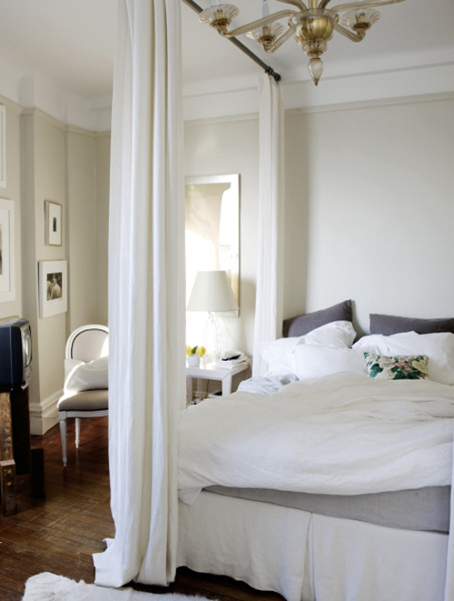
The master bedroom would be tranquil and have a king sized plush bed with luxurious sheets...
16- masterbedroom.jpg
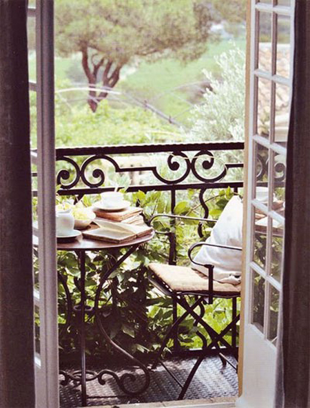
A balcony would be accessible through the bedroom and would be the perfect spot for enjoying a cup of coffee in the mornings or simply a few moments of fresh air...
17- bedroom balcony.jpg
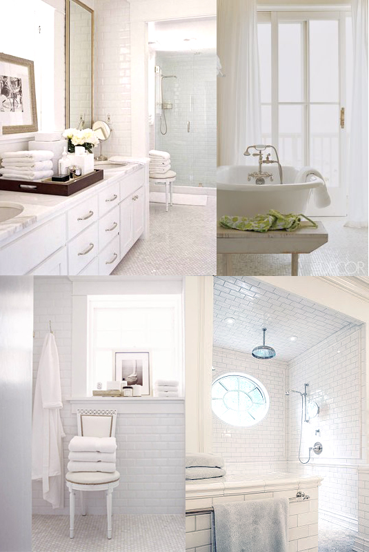
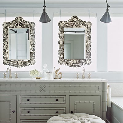
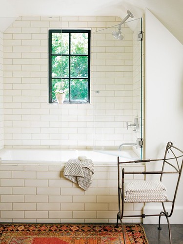
The master bath would have double sinks, floor to ceiling white subway tiles, a rainshower, and most importantly a luxurious tub...
11- masterbath
There would be two walk-in closets. One for me...
14- closethers2
one for him...
19- closethis.jpg
Both beautifully organized of course ;-)
12- library2.jpg
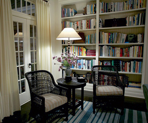
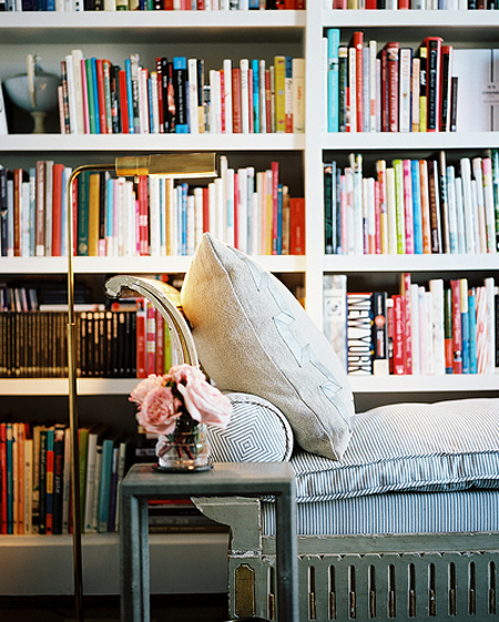
The library would be a quiet refuge with cozy spots for reading and unwinding...
12- library.jpg
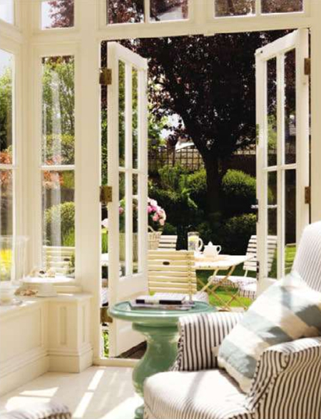
The sunroom would be another great spot for relaxing...
6 -sunroom.jpg
as well as the hammock out on the backyard...
9- hammock.jpg
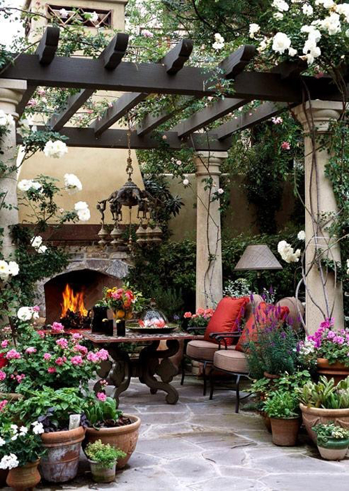
Last but not least, my dream home would have a beautiful outdoor living area. Something like this...
7- outdoorsittingarea.jpg
...with a pergola, flowers everywhere, a fireplace and comfortable seating, would be the perfect spot for enjoying evenings with good company.
image credits: exterior - gleysteen design; entrance - domino; formal living room - photography by stacey brandford via house and home; kitchen 1- via milk and honey home, 2- design by jennifer dyer via mar/apr '11 issue of lonny, 3- unknown; breakfast nook 1- pin, 2- pin; garden - martha stewart; garden shed - better homes and gardens; dining room -via prudential douglas elliman real estate; living room 1-william sonoma, 2- house + garden magazine; office 1- photography by norman jean roy, 2- shot from the devil wears prada; hallway -blumenfeld interiors; guest room - via style at home; guest bath - country living; nursery (all) - sarah richardson; playroom via design revolution; master bedroom - photography by melanie acevedo; bedroom balcony - via oliveaux blog; master bath 1- photography by jose picayo via house beautiful, 2- elle decor, 3-photography by jose picayo via house beautiful, 4- via oliveaux blog; her closet - jan/feb '11 issue of lonny; his closet - martha stewart; library 1-shot from something's gotta give via architectural digest 2-unknown; sunroom - unknown; hammock - french country home by jocelyn sibuet via dress design decor; outdoor living area - better homes and gardens

Monday, August 29, 2011

Style Profile: David Scott Interiors

david scott7

{A Contemporary, Eclectic New York Apartment Designed by David Scott Interiors}
I recently came across the work of New York-based interior designer, David Scott for the first time. It is always so refreshing to find a designer whose work is both new and inspiring to you, especially here in blog land where it seems that we often focus on the same designers over and over again. David’s work is tailored and sophisticated, a reflection of his personal aesthetic as well as his surroundings. For nearly twenty years, David Scott Interiors has produced chic spaces perfectly suited to both town and country. His work has appeared in publications such as Architectural Digest, The New York Times, and Gotham magazine.

david scott8

{An Elegant Bathroom Filled with Unique Touches, Such as the Unique Vanity and Tilework}

david scott9

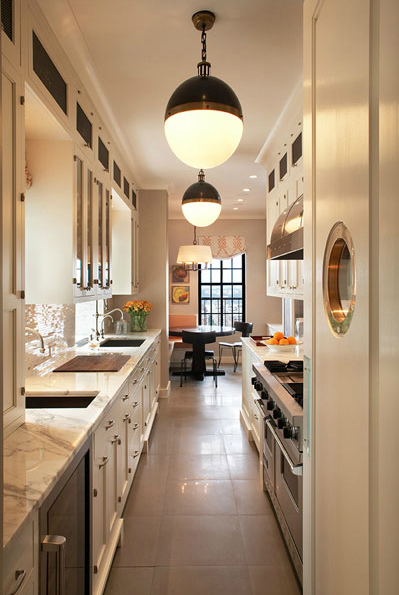
{The New York Galley Kitchen Goes Chic}

david scott10

{I love the choice of fabrics in this child’s room.}

david scott4

{A Tailored, yet Casual Living Room}

david scott6

{A Stylish Kitchen with all of the Classic Elements}

david scott5

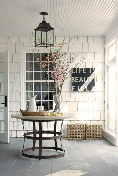
{The white clapboards and the styling in this space are just lovely.}

david scott3

{A Tailored Living Room Filled with Textures and Patterns}

david scott2

{This is such a handsome bedroom. I love the bed and the combination of linens. This color palette looks very luxurious.}

david scott

{The Drapes, Gorgeous Mirror, and Art-Deco Inspired Chandelier are Just a Few of the Lovely Touches in this Corridor}


{Images via David Scott Interiors}

This Week’s Quote


{Images via Pinterest}

Friday, August 26, 2011

Fabulous Room Friday 08.26.11

I recently came across this fabulous kitchen by Minneapolis designer, Alecia Stevens and immediately fell in love with every chic detail. I love the classic checkerboard floor and the beautiful, pale grey cabinets. I am a huge fan of pairing light grey with gold accents and this kitchen absolutely nails the look with the use of brass hardware, plumbing fixtures, LaCornue range, and of course, lighting. The Visual Comfort lighting in this kitchen makes the room even more fabulous! If you missed my announcement on Wednesday, I am now the Director of Marketing for Visual Comfort. Shown here are two of the popular Goodman Hanging Lamp over the island and a Clark Ceiling Light over the sink. Both fixtures are shown in Hand-Rubbed Antique Bronze.

The graphic tile backsplash is stunning paired with the La Cornue range and brass accents. I absolutely LOVE this kitchen, but I can’t help but wonder if the backsplash will eventually look dated in five or ten years. Would you do something like this in your own home or do you prefer to admire it from afar? Do you choose to embrace trends now and update the look later on?

Have a wonderful weekend!

{Image Source: Alecia Stevens}

And the Winner is...


Congratulations to Lauren Christine of Golden White Decor who is the lucky winner of the lovely robe from Plum Pretty Sugar Loungerie! Thanks to everyone who entered the giveaway and to Plum Pretty Sugar for sponsoring this contest.

Thursday, August 25, 2011

Love it or Leave it: A Lush Entrance

I recently came across this home while perusing designer,  Madeline Stuart’s website and was immediately smitten. Located in Los Angeles’ gorgeous Brentwood neighborhood, this home exudes chic style and charm through the entrance alone. I don’t know what it is, but lately, I have been coming across so many beautiful homes located in Brentwood. Anyhow, I love the lush landscaping and the lovely ironwork surrounding this entrance, but I am sure this look isn’t for everyone. Something tells me this is one of those “love it or leave it” cases. Does this appeal to you or would you pass on this home?

Wednesday, August 24, 2011

Back to work!

{Illustration by Inslee Haynes}

For the past three years, I have worked from home blogging, taking on freelance projects, and in the past year, starting and running High Gloss. As most of you know, a couple of weeks ago, we announced that High Gloss has come to an end. Your words of encouragement have truly helped us through what was a very difficult decision. But remember, I told you that we each have some exciting things going on. While I’ll let  Lauren and Dabney share their news when they feel the time is right, I am so excited to share my big change with you!

{Illustration by Inslee Haynes}

I used to believe that the old adage of “everything happens for a reason” was kind of a cliché, but I truly have come to believe in these words over the past couple of years. I have often said that since I started this blog over four years ago, I have felt as if I’ve been on the journey that was meant for me, but I wasn’t quite sure what the final destination would be. While most of us will never really know what the final stop on our journey will be, we certainly do know when we arrive at a destination that feels perfectly right for us; the type of place we’d like to linger for a long time. I was lucky enough to arrive at that place just a few weeks ago. In the midst of analyzing the big decision of whether or not to continue with High Gloss, I was called in for a meeting to discuss social media strategy which led to an offer to be Director of Marketing for Visual Comfort & Company. I was both surprised and elated because it was all so unexpected, it was an incredible opportunity, and the timing could not have been better.

Visual Comfort

Whether you know the Visual Comfort name or not, chances are, you are probably very familiar with their products. The fabulous lighting selection at my beloved Circa Lighting is manufactured by Visual Comfort. Visual Comfort sells to the trade while Circa Lighting sells to the public through its retail stores and website. For nearly twenty-five years, Visual Comfort has executed the vision of America’s most important designers including Ralph Lauren, Sandy Chapman, Thomas O’Brien, Barbara Barry, Alexa Hampton, and Suzanne Kasler. Every month, Visual Comfort’s designs appear in the pages of the top shelter magazines and are a topic of conversation on many of your blogs as they have been on mine. I am elated to be overseeing all aspects of marketing, brand identity, and brand awareness for Visual Comfort’s designer lighting collections as well as managing our social media efforts, directing the creation of marketing materials and advertising, and handling press and media relations. To say that this job is right up my alley might be an understatement!

VC_AH3024PN-NP

We’ve all adjusted to my working outside of our home full-time rather well, though it has been a big lifestyle change. Fabian’s mom is generous enough with her time to visit Tate every afternoon so that he doesn’t get too lonely and I am loving being in a traditional work environment again. I’ve been busy at work with several projects, including the implementation of Visual Comfort’s social media accounts. It would mean so much to me if you could show us some support and follow us on Twitter, Facebook and the Visual Comfort Blog. Thank you!

Tuesday, August 23, 2011

Dream Home: designstILes

Today, the stylish Irene from designstILes is sharing her "Dream Home" with us. I love the way she blends bohemian style with classic elegance. The result is beautiful and inviting. Enjoy!

designstILes

Hello, it's Irene from designstILes. So flattered Paloma asked me to be a part of this fun series. I had to refresh my page a few times just to make sure her email was in fact meant to be sent to me.

My dream home consists of a colonial facade, filled with punches of color and patterned interiors.

pinterest

Welcome to my dream crib.

That's Mr. Dream Car too.

housebeautiful

Foyer.

Natural light is a must. It's all throughout the house.

My owl is from Home Goods. Even though I'm rich and have a big house, I still like to keep it real.

lonny

Formal living room where no one really hangs out. I usually only come in to water my orchid. Don't ask me how it stays alive.

In your face patterned ottomans are my favorite pieces in the room.

lonny

Across the living room is the dining room. We rarely eat dinner in here. I'm uneasy about stains ruining my ikat chairs.

housebeautiful

Adjacent to the dining room is the kitchen. I just made cookies, in case you're wondering why the milk is out. You came to visit on the right day.

designstiles

This is the nook off the kitchen where we eat most of our meals. Oh look, more food.

lonny

Family Room. We hang out in here a lot. My husband loves the pink ottoman.

housebeautiful

Powder Room. Love the natural wood mixed with wallpaper and faux bamboo pieces.

rue

My home office. She's a beauty.

http://farm7.static.flickr.com/6209/6067835369_7d91d932a2.jpghttp://farm7.static.flickr.com/6183/6068380296_f089821617_m.jpg

nurserynotions

A playroom for my daughter and one day other sibling. It's not always this clean.

Follow me upstairs.

inspirationfordecoration

Sometimes my laptop and I hang out on that window seat. My dogs love looking out the window.

brynalexandra

Glad I decided to put the laundry room upstairs. It's a lot easier not having to carry several loads up the stairs.

better homes and gardens

Guest Room is what I call California Cool. Easy Breezy.

http://farm7.static.flickr.com/6186/6068399428_0ec5473aa4.jpg http://farm7.static.flickr.com/6062/6067853889_3489c2068a.jpg

younghouselove/house beautiful

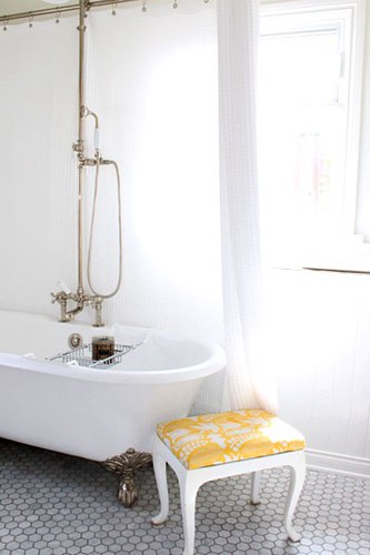
Guest Bath. We get lots of compliments on the clawfoot tub. Good choice.

pinterest

Nursery. Dresser was a Craigslist find. I had it professionally painted.

decorpad

Master Bedroom. Even though I have an office, I added a desk to our room. I'm confused too.

http://farm7.static.flickr.com/6066/6068417856_a5bf4b47e8.jpg http://farm7.static.flickr.com/6190/6067872707_ba28ac9cf6.jpg

coastal living/pinterest

Master Bath. The vanity was custom. Kept things classic with the white subway tile.

decorpad

My dressing room. I have lots of fancy dresses but don't really go to fancy parties. I like to be prepared.

tumblr

Big backyard where we host lots of bbqs and outdoor movie night come summer.

Sometimes I do cartwheels on the grass. No, not really.

Thanks for visiting my dream home. You should come by more often.

And thank you Paloma for having me!