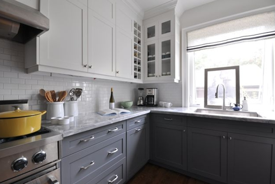
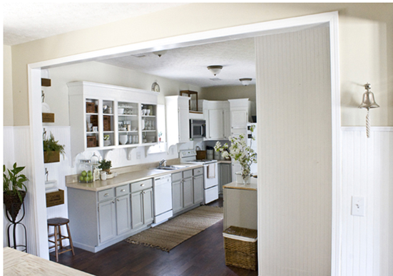
How do you feel about lower cabinets being a different color than the upper cabinets? I am particularly interested in hearing your thoughts on having dark countertops with white upper cabinets and grey/greige lower cabinets, like in the kitchen pictured above. I like the contrast and the fact that this combination is a departure from an all-white kitchen, but something keeps me from embracing it 100%. Should I go for all white in my kitchen or should I try a white/grey combo?

{Images via Decorpad}


31 comments:
So funny, I am in the middle of a kitchen redeux....my cabinets are upper whiteish cream and lower RL Nariobe.......trying to decide on the countertops......My uppers are distressed in an old world finish with french pewter pulls...below will be distressed too.
LMF.
Leslie
that 5th image is soímply lovely...
I never really thought about it as a possibility but I quite like it, different!
Paloma, as long as you have the colors tied in together (like the sink in the 4th pic) I think it will work beautifully. Why not? And, it will look new & sleek too.
i like the contrast b/t the white & gray. i read somewhere recently that darker lower cabinets are also great for hiding spills/dust that gets on cabinets. since i have lots of animals, this makes me consider it even more!
I love this look. It makes for an interesting room, especially when there are lots of cabinets. Don't think it would work as well in a smaller kitchen (like mine).
love it and a client is doing it now. Such gorgeous contrast. That being said, I think it is super-trendy. I don't know if that matters to you. I think it will be dated in about 8 years (I'm trendy in so many things, though--can't help to be!)
I commented about not loving subway tile earlier, but I LOVE LOVE LOVE white upper and dark lower cabinets. I dipped my toe into this pool—uppers are a clean white and lowers are a very subtle blue/lavender/gray (depends on the lighting and pairing) called Heaven from Ben Moore. It's a tiny kitchen and has been a few years, and I'm not at all tired of the combo!
While I like the idea of different colour upper and lowers, I feel as though the look will be dated in a few years. I much prefer the same colour cabinets and then a standout colour on an island.
The light gray is a fabulous colour for cabinets though!
Amy
I personally love the contrast! I am going for all white cabinets but painting the island dark gray-a variation on this theme!
I dislike having two different colors. I think bringing in other colors in the kitchen can be done with tiles, countertops, walls, etc. I like the cabinets to match... although I am somewhat OCD.
I have never done it in my business, but I'm seeing it everywhere and think I might try to talk a client into it. Please post of you do it!
Just did it in my kitchen and adore the results . . . Have to admit that I'm a mother of two little ones, and I love how the lower cabinets hide tiny finger-prints! You can see the reno at http://burkettfamily.blogspot.com/2011/04/i-heart-calacatta-gold.html. I chose honed black for the main counters and honed calacatta for the island. Wishing you the best (and great take-out) as you venture into your kitchen reno!
I think the white/grey combination would work best with white countertops rather than black! the black with grey makes the bottom look too heavy and dark.
I think you'll tire of the 2-tone cabinets. I'd go all white with grey walls. I think lighter countertops too.
Love the different paint colors on the lower and upper cabinets! I think is breaks up the mass of the wood and makes it feel more antiqued and customized! great idea!!!!!
xo allison
Spicer + Bank www.spicerandbank.blogspot.com
I like the look a lot but think it's super trendy - I went with white cabinets and dark marble counters and never looked back! Timeless, I like to think. :)
I like the look... but don't know if I could commit to it in my own home. I am thinking about doing my island a darker color... but not all of the bottom cabinets.
I love the classic look of white kitchens, but if I say take a shot with the gray lowers. You can always change them back :)
I would do the combo. It gets you out of your comfort zone in a good way and if you hate them after a while, repaint them. Paint is cheap! Let us know.
Huge fan of the 5th picture- not a huge fan of the white and gray combo something drab about it- the 5th picture is beautiful without being of the top and also keeping a clean feeling, which I think is very important in a kitchen. Personally just not a huge fan of the white and gray thing, I have yet to see it and been sold on it.
There are some combos that look lovely, but I prefer the traditional look of all one cabinet color.
Every once in a while I see a pic that it really works in, but usually I find myself wondering why they didn't "go for it" and paint the uppers as well. I never actually dislike it though, except where white appliances break up the continuity of the greige lowers...
i don't really like the look of different colored cabinets. i find it distracting to the eye and agree with others that it's growing trendy.
I love the idea of greige paint on the lower cabinets and open white cabinets on the top. One of my favorites for the bottom is Mouse's Back from Farrow & Ball. I have always preferred the counter tops light as opposed to dark...I like my kitchen to be bright and crisp. I find having white upper cabinets, a black counter and grey or beige below looks so chopped up.
Please post when you are finished!
The grey/greige warms it up. Who doesn't need that in the kitchen? Love it!
I think it only works in certain situations. I think in a small kitchen it is too much. I prefer the cabinets to match in color and maybe bring in a different color in an island.
I have to disagree with most of the posters; I think it breaks up the room too much. If you want two different colors, I like a contrasting island, but I don't like the look of different upper and lower cabinets.
I really dont care for it too much unless its an open shelving situation. I think it looks great in that aspect. Also a no-no with woods only painted I think. I cringe thinking of cherry uppers with walnut lowers yuck.
the great thing about dark lowers & white counters is contrast. in this case having that contrast allows for the white uppers & white subways. white uppers & lowers w/ dark counters also provide contrast. but w/ lots less style than w/ dark lowers (sez me).
I am planning to do this same thing to my kitchen. I've been debating it for some time, now I'm going for it. After all....it's just paint. It can always be re-done if you aren't happy!
Post a Comment