Sally Wheat’s home has been a ubiquitous source of inspiration in the blogosphere since it was first featured by Joni of Cote de Texas back in 2008. Since then, Sally’s home has been completely transformed and the new, strikingly different look has its official “coming out” in the pages of the new Modern Luxury Interiors Texas magazine, which hits newsstands today. If you don’t live in Texas, you can view the digital edition here. I am inspired by Sally’s continuous quest to make her home even more beautiful. Perhaps it is a “job hazard” associated with being a designer, but in addition to designing homes for her clients, Sally is always redecorating something in her home, perpetually on a quest to try something new, spurred on by a good creative challenge. Each time I visit Sally’s home, there is always something new and fabulous at which to marvel.
Just last year, Sally completely redesigned her home. Prior to the revamp, the look of Sally’s house was a mix of eclectic, unique finds, neutral colors, and Belgian inspiration. Now, Sally has taken things in a completely different direction, embodying what could be described as “modern traditional”—blending traditional elements with vibrant colors and patterns along with rich textures like velvet, python, and mohair. Special touches like Dorothy Draper chests, Serge Mouille Lamps, and abstract art can be found throughout her home. Each room has an interesting focal point, as well as a distinct point of view. Sally’s feature in Interiors Texas features a glimpse into her stunning, newly redecorated home and lucky for us, I have the inside scoop—Sally sent me plenty of images of her home that did not make it into the feature.

{I am obsessed with the pink David Hicks La Fiorentina chairs in Sally’s Living Room. The Pop Art portrait of Queen Elizabeth no doubt inspired the title of her Interiors Texas article.}
{The stunning dining room features covetable vintage Milo Baughman chairs upholstered in a rich blue velvet. How fun is the bench?}
{The dining room also features Cole & Son paisley wallpaper and a beautifully-styled Lucite bar cart.}
{The foyer hosts a Dorothy Draper España chest, Jonathan Adler Meurice Lamp, striking black and white abstract painting, and a hot pink cowhide rug. The last time I was at Sally’s the cowhide had been replaced by a Moroccan Beni Ourain rug. Her home is constantly evolving and just keeps getting better and better!}
{Another Glance into the Living Room—Notice the fabulous Italian floor lamp and vintage, mirrored coffee table.}
{If you remember what Sally’s home looked like before this transformation, you’ll probably find the family room to look familiar. The reclaimed doors are still there and the layout is the same. Her classic sofas have been reupholstered in grey velvet and of course, the accessories and color palette have changed.}
{A Glance at the Living Room from the Opposite Direction—Notice the Amanda Talley painting above the fireplace and the fun, zig zag stool in front of it.}
{The Harry Allen Golden Piggy Bank and Praia Piquina photograph by Christian Chaize are standouts in this vignette.}
{The Breakfast Room features an Eclectic Mix of Furniture and Accessories}
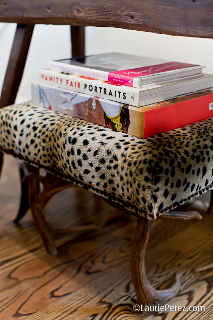
{I am in love with this leopard stool! Sally’s home is filled with unique details.}
{Sally’s kitchen, beloved by so many bloggers and readers alike hasn’t changed much and why would anyone want to change it? It’s classic and beautiful. The cabinetry is painted in Benjamin Moore’s “Fieldstone”.}
{Kitchen Detail}
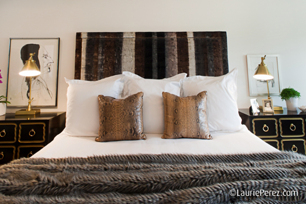
{Moving upstairs, you’ll notice the swanky, glamorous vibe in Sally’s bedroom. The brass lighting, Dorothy Draper Chest, and variety of textures create a sumptuous look and feel.}
{An ombre velvet upholstered headboard and Presmer Python pillows make for ultra-luxe bedding.}
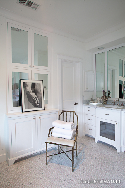
{The Master Bath is Classic in Every Sense}
{The Guestroom provides an updated take on the classic “Houston Look” that Sally still does for clients. Irreverent touches like the vintage chandelier and mohair pillow give the look a touch of edge in this space.}
{Sally’s son’s room is super cool—would you expect anything less than rock and roll for a boy whose mom has such killer design sense? Notice the fabulous striped ceiling and industrial pendant—the Eugene Pendant Light from Circa Lighting.}
{Sally’s patio is as well-designed as the inside of her home. I love the circular vines lining the fence.}
{Photos by Laurie Perez, Courtesy of Sally Wheat}


18 comments:
Looks great!
I know lots of readers have been waiting for this reveal for oh, at least a year or two now.
Can't wait to see what Sally does next.
Cheers, Alcira
nerochronicles.com
Fabulous! Everything so trendy! Loved Harry Allen's Pig Bank. XoXo
I thought the kitchen cabinet color was BM fieldstone?
Yes, Anna, you are correct. Sorry about that!
Love every single thing !
xxLily
goldandgray.com
Wow, what an inspiring space! I too love the David Hicks-covered chairs. I also love the portrait of the man's hand in the bathroom. What a lovely space!
XO,
Sam
www.ThePeakofTresChic.com
I CANNOT get over the change! I love where she went with it all, and (no offense to your prior look, Sally) it IS a much younger, more hipsta look ;)
Lady can do no wrong so far as I'm concerned.
Like a who's who of all the big name designers! Hicks, Draper, Adler, Chaize...how can you go wrong!? Gorgeously styled!
I’m hosting 5 days of GIVEAWAYS in honor of my blog’s 2yr anniversary…would love for you to stop by and enter to win!
xo-Julie
Peace. Love. LOL!
Haute Khuuture.com
Love this so much! Thanks for the photos, Paloma!
Love that black and white abstract painting... and there is that gold pig again :) He keeps popping up everywhere!!
Very interesting look, but I miss the previous design of her interiors. I thought the previous was more classic and beautiful. The new look comes off as a bit too trendy.
Lisa
Love the revamped look. Those doors are amazing in the living room! And I love that black and gold chest.
www.donnaviningblog.com
I love the neutrals that are used with the pops of colors here and there. And that kitchen...WOW! I want it!
peacelovedecor.com
Love this designer and her home thank you for sharing the changes with us.
Hi Paloma! Do you happen to know Sally's white paint color in the living spaces? I loved the re-design!! So fun!
Emily @ Material Girls
Love this space! So happy you've posted about it, with so many awesome pics. Beautiful.
Does anyone know who makes the gold lamp on the Dorothy Draper dresser? (I don't think it's a meurice by Adler b/c the legs on the Adler are totally straight, but these are more graceful)
HI! What kind of blanket is on the bunk bed (bottom bunk)? I love the texture and color.
Post a Comment