Monday, August 31, 2009
Friday, August 28, 2009
Fabulous Room Friday: 08.28.09
 This week's fabulous room is Rachel Zoe's amazing new studio. Sure, it's just a modern room with sleek lines and minimal furniture, but who cares! Do you see all of the couture and gorgeous shoes that I see? All together now, kids: I DIE!! Be sure to read the Q&A with Rachel in The Huffington Post.
Images via The Huffington Post
Thursday, August 27, 2009
Personal Style, Defined: i suwanee
 It's back! I am extending the "Personal Style, Defined" series because of the wonderful feedback I received from my fabulous readers. I've got quite the line-up for round two and we are kicking things off with the super talented and hilarious, Jamie Meares, founder of the blog, i suwanee and Furbish Design.
  ah, you lovely room of bookcases and symmetry and pink and carefully thought out furniture placement. let me COUNT the ways i LOVE you.
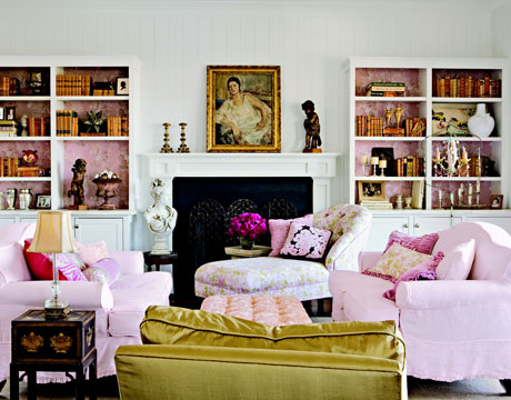
lately, i look at rooms for inspiration differently than i did a few months ago.
now i look a layer deeper - at exactly where the furniture is... what pieces have they used? why did they select what they did for the room? i look at the textures, the combinations, the finishes, the colors, the fabrics, the styling. and then i think, how can i do this? how can i make this look affordable for my client on a budget?
for me, decorating is sort of formulaic, and i'm trying to develop the perfect formula that i can use to turn my clients' rooms into beautifully thought out spaces. this room is a perfect example - i keep this up on my inspiration board to remind me to constantly glean EVERYTHING i can from a well done room.
doing what you love for other people is much different than just loving something. now it's important to think about what the BACK of the couch will look like and if someone will knock that lamp off the end table, or if the cording on that chair will make it too expensive, or if the husband will agree to the tufted pink ottoman. it's a whole new ballgame. i'm trying to curate my inspiration images to not only inspire, but to TEACH me how to succeed with decorating my client's homes.
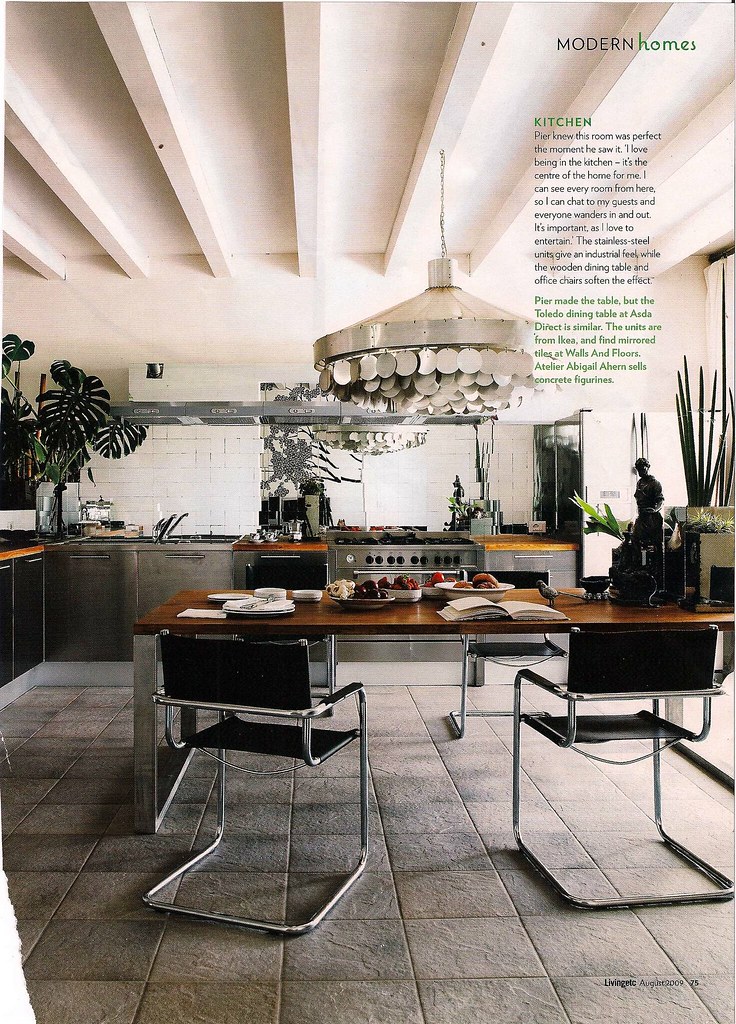
when i first saw this room in this month's living etc, i starred at the page for at least 5 minutes soaking in exactly what was going on here. then i yelped, AH HA and brian meares said INSIDE VOICE PLEASE because he was asleep. i love rooms that are tricky like this. that mirrored backsplash is FABULOUS and is accomplishing more in this room than 57 yards of the most beautiful fabric every could. it's reflecting the light, the plants, the chandelier. it's immediately engaged you in the room. you want to look deeper, and see more. and it's ready to accommodate! perfect.
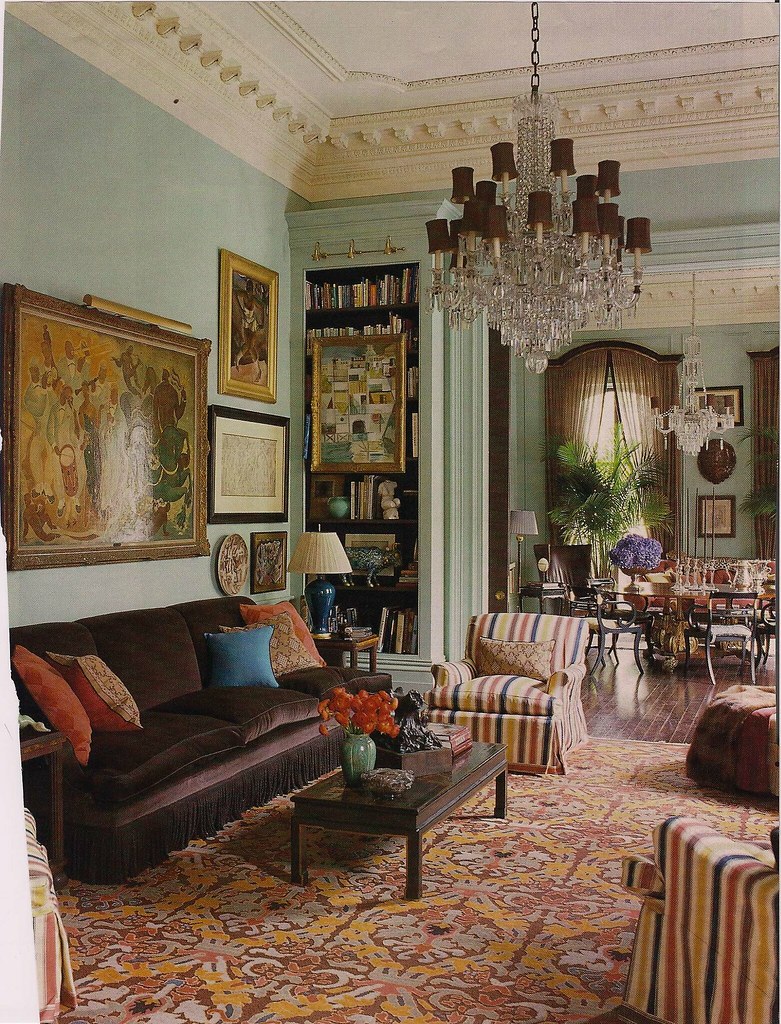
there's an interesting quality to this room that says 'a small country's economy can't hold a candle to all the money/labor/choices/planning/contractors tied up in here'.
i don't know if i love how it looks, but i love what it says: we hired a decorator who spent shit tons of our money but lordamercy look what we got for it. this is opulence at it's calculated best. from the trim on the chairs to the tassel on the sofa. oh, and there's a bookcase. i like that.
this room says we've got money to spend, we're a little nutty and we'll serve you a cocktail at 4:00 and give you a sweahrtuh if you're chilly.
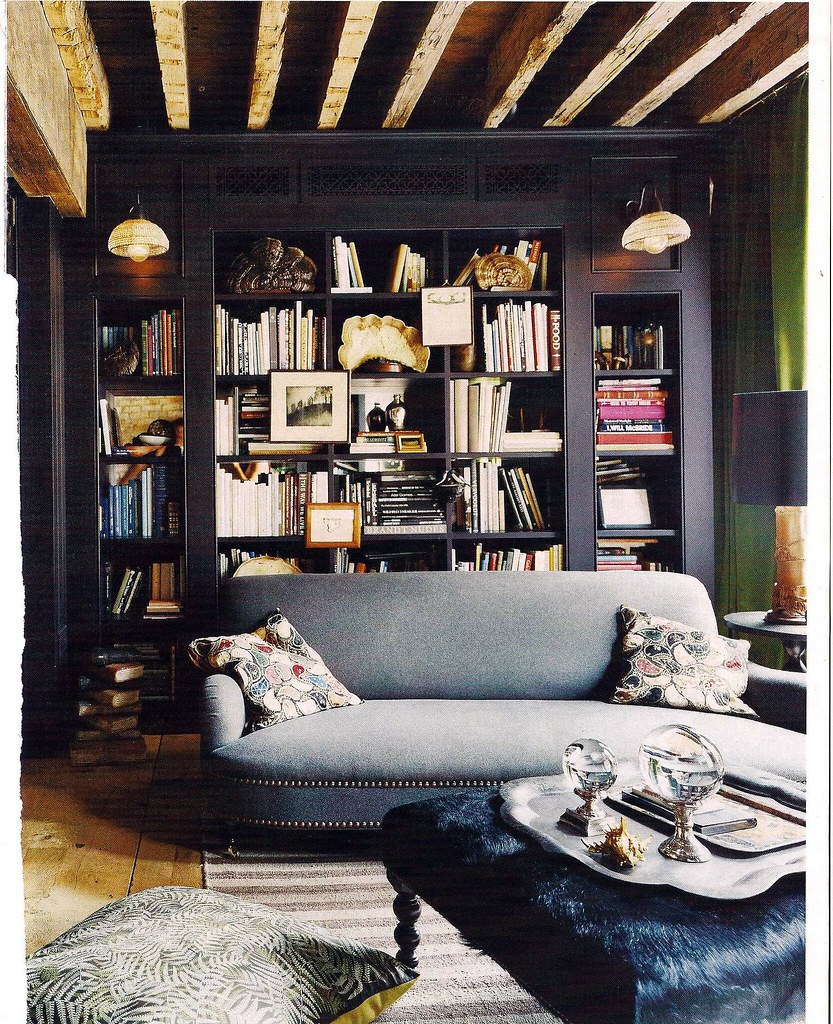
you dark and lovely room. look at you - all masculine and luxurious. i'll never in a million years be able to put glass orbs on a silver platter atop a furry ottoman, but man - if i could.
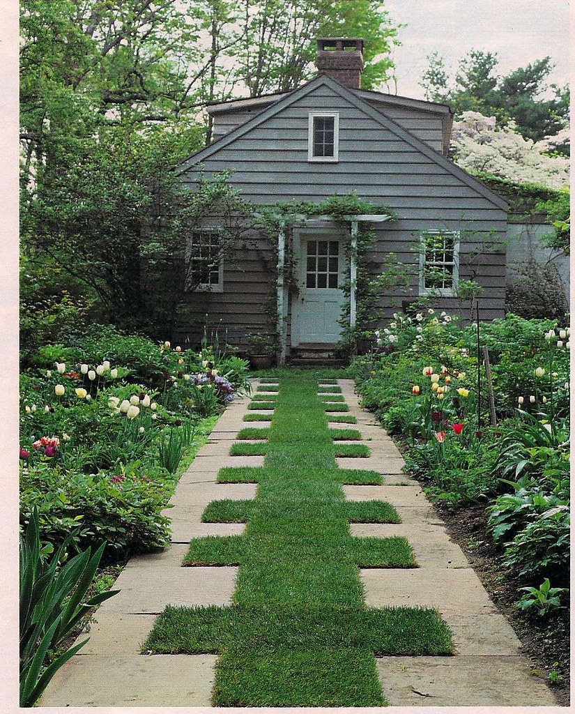
minimal grass mowing - yes
overall approval rating = high.

in general a mural is never a good thing. but this!
where the wild things are = this kitchen. this is wonderful.
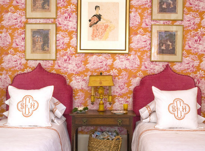
matching twin beds are all the rage lately, and here's my fave of the pack. i can't imagine where this would exist -- who has rooms, (that aren't kids rooms) with two twin beds, and then, they decorate them like this - to BOOT!?
it's perfectly crazy and over the top.
symmetry makes me happy. it says yes, all is right and balanced in this room - so just soak in my orange and pink toile and delight in my expensive monogramming and rest easy, because the left side is just a perfect as the right.
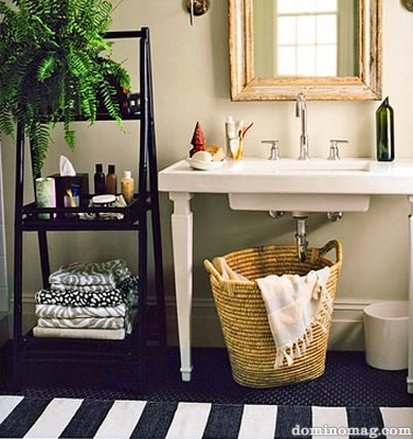
i'm very interested in how people solve bathroom crisises that revolved around not having sink storage. i'm also interested in where exactly people put their deodorant, because you see all these carefully styled products on trays and in pretty tins and glasses but where's the deodorant?
love the mix of towels, the texture with the basket, the stripe on the rug and the FERN! the glorious fern. every bathroom should have a plant. it will soak up your shower steam and give you green.
Wednesday, August 26, 2009
Sponsor Spotlight: Rock Paper Scissors
If there is one thing in life that I cannot resist, it is beautiful stationery. My willpower may prevail in regard to clothes, shoes, or makeup if I am trying to curb my spending, but I always find it impossible to say no to stationery. I am very excited to have Rock Paper Scissors on board as a new sponsor because they specialize in my bread and butter, gorgeous, unique stationery.
 {The stylish Lauren Rauter}
When I clicked on their "Our Story" page, I knew that it was kismet. Rock Paper Scissors owner, Lauren Rauter and I must be kindred spirits. Just take a look at their manifesto.
The Barefoot Contessa can do no wrong
There's no excuse not to send a thank-you note
The Discovery Channel rocks
Every guest room should have a notepad on the night stand
A cute apron can make you cook better
The wrapping paper is better then the gift
A loaf of French bread and pat of butter can make you feel better
Gift bags are lazy
Nantucket is the best place on earth
And... As far as gifts go... anything paper is perfect!
Rock Paper Scissors carries a fabulous assortment of boxed and personalized stationery, along with invitations, chic gifts and accessories for the home, and gorgeous gift wrap that is sure to rival the gift itself in appreciation from the lucky recipient.
Lauren has carefully selected the items she carries in her shop and her attention to detail really shows. She has perfectly curated her beautiful selection of stationery which includes brands like Dabney Lee (a personal favorite), Sugar Paper, and the gorgeous in-house lines, RPS Signature and RPS Luxe.
 Jack and LuLu's amazing five-volume Stationery Library which features 100 personalized notecards.
Dabney Lee's London Calling notecards
 RPS Signature Line Ciao Bella Notecards
 The RPS Gracias Swash notecard also comes in a Bonjour or Hello design in various colors.
 I love the vintage feel of the RPS Air Mail Flat Notecards.
 I am still loving everything from the 1960s, so these Jackie and John notecards from the RPS Luxe line are right up my alley! I love that you can choose from several color options for your ink and envelope liners.
 How gorgeous is this RPS Luxe Garden Chandelier Invitation?
 The Camelot Calling Cards are completely customizable as well as completely chic!
 These Sweet as Honey Calling Cards are exactly that. Aren't they cute? I love bumble bee designs and I must say that pairing your calling card with a matching envelope is a very chic touch.
Be sure to visit Rock Paper Scissors to see the rest of their beautiful stationery!
Tuesday, August 25, 2009
Wishful Packing
We're leaving for London in ten days and I have to admit that I am feeling a little overwhelmed about it. I feel like I have known more about most of the destinations I have traveled to in the past than I do about London. Plus, everyone says it is so huge! At the end of the day though, I attribute these stressors to my OCD nature and the fact that it is in my nature to try to plan everything down to the last minute. However, I am going to do my best to just relax and play it by ear when it comes to our itinerary.
 {Schoolboy blazers seem rather appropriate for London.}
Having said that, there is one area that I cannot stop stressing about: fashion! I am feeling a little anxious about packing for a climate that seems completely foreign to me right now considering the fact that it has been scorching hot in Houston for the past five months! The high temperatures should be around sixty with lows in the mid to high forties while we are in London. I want to be comfortable since we will be out sightseeing all day everyday, but I'd like to at least look a little stylish since I've heard London is filled to the brim with fashion mavens. I wish that I could hit up J.Crew and Anthropologie and scoop up all of these looks for our trip since they fit the comfy but stylish bill.However, that won't be happening. A girl can dream, right? Any tips on what to pack for a week in London?
 Again, I love this schoolboy look. The coat is so fun!
 This outfit is a hot mess in my opinion. It's not really my style, but I do love the blazer.
 I love the rust color and ruffle detail on this jacket.
 I am craving a nice whiskey colored leather jacket like this one from Anthropologie for Fall.
 Can you tell I love a good ruffle? This Anthro jacket is so gorgeous!
I love the Victorian feel and think it would be very appropriate for London.
 I love the pretty yellow color of this cozy sweater from Anthropologie. Does anyone else have an aversion to wool? I can't stand to wear it and I feel like 9 out of 10 cute sweaters always have wool in them.
Another Nice Dress Option from J.Crew
Monday, August 24, 2009
I heart Circa.
 {Circa's Mokko Form Gourd Lamp in the Gorgeous Stairway of Cottage Living's 2008 Idea House}
It's no secret that I have been a long-time fan of Circa Lighting. I think their pieces are so gorgeous and timeless. They carry such a broad assortment of lighting designed by some of the most important designers working today such as Thomas O'Brien, Alexa Hampton, Barbara Barry, Clodagh, Eric Kohler, and Suzanne Kasler to name a few. They truly offer something for everyone and their lights send this lamp tramp's heart aflutter.
I was very excited to learn recently that Circa has joined the Facebook phenomenon and has created a Circa Lighting Fan Page. Oh Circa, how do I love thee? I won't take up so much of your time as to truly "count the ways", but I would like to bring back a glorious example. In my opinion, the 2008 Cottage Living Idea House served as an extraordinary showcase of Circa Lighting's beautiful designs. To be honest, I adore the entire house, particularly the Mexican flair in the main living areas. I think the overall design by Jackie Terrell is just brilliant. The gorgeous lighting is just the icing on the cake!
 RA Single Arm Sconces and Moravian Stars grace this lovely hallway.
 The AMAZING kitchen features the classic Short and Long School House Flush Mount Fixtures.
 I love the various colored subway tiles used in this home, especially the turquoise ones in this bathroom. Thomas O'Brien's classic Vendome Sconce is the perfect complement.
 A punchy orange bathroom is home to Boston Functional Library Wall Light.
 This beautiful bathroom features two of my favorites: the Double Twist Sconce and Terri Crystal Accent Lamp.
 This corner of the kitchen features another Boston Functional Library Sconce along with a Boston Functional Single Pendant over the sink.
 The dining room features a pair of Large Classic Balustrade Lamps in Oak along with a very cool industrial piece that serves as a buffet.
 I love the black cabinetry in this nook as well as the beautiful Selecta Desk Lamp which adds the perfect contrast.
 Another of my favorites: The Longacre Floor Lamp, which is such a stunning, architectural design. Its lines remind me of the Chrysler Building.
 I love the masculine look of this room. The rustic materials play so well against the dark walls. The Hudson Column Lamp is substantial enough to hold its own in this visually heavy room.
 The Ziyi Pivoting Floor Lamp's streamlined shape works perfectly in this vignette.
 You can't see them very well here, but the serene master bedroom features a pair of Hudson Floor Lamps.
Images 1-9 via Circa Lighting


