 It's back! I am extending the "Personal Style, Defined" series because of the wonderful feedback I received from my fabulous readers. I've got quite the line-up for round two and we are kicking things off with the super talented and hilarious, Jamie Meares, founder of the blog, i suwanee and Furbish Design.
  ah, you lovely room of bookcases and symmetry and pink and carefully thought out furniture placement. let me COUNT the ways i LOVE you.
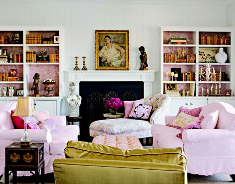
lately, i look at rooms for inspiration differently than i did a few months ago.
now i look a layer deeper - at exactly where the furniture is... what pieces have they used? why did they select what they did for the room? i look at the textures, the combinations, the finishes, the colors, the fabrics, the styling. and then i think, how can i do this? how can i make this look affordable for my client on a budget?
for me, decorating is sort of formulaic, and i'm trying to develop the perfect formula that i can use to turn my clients' rooms into beautifully thought out spaces. this room is a perfect example - i keep this up on my inspiration board to remind me to constantly glean EVERYTHING i can from a well done room.
doing what you love for other people is much different than just loving something. now it's important to think about what the BACK of the couch will look like and if someone will knock that lamp off the end table, or if the cording on that chair will make it too expensive, or if the husband will agree to the tufted pink ottoman. it's a whole new ballgame. i'm trying to curate my inspiration images to not only inspire, but to TEACH me how to succeed with decorating my client's homes.
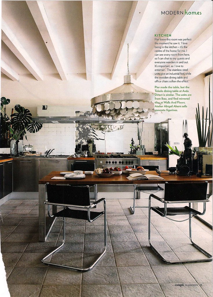
when i first saw this room in this month's living etc, i starred at the page for at least 5 minutes soaking in exactly what was going on here. then i yelped, AH HA and brian meares said INSIDE VOICE PLEASE because he was asleep. i love rooms that are tricky like this. that mirrored backsplash is FABULOUS and is accomplishing more in this room than 57 yards of the most beautiful fabric every could. it's reflecting the light, the plants, the chandelier. it's immediately engaged you in the room. you want to look deeper, and see more. and it's ready to accommodate! perfect.
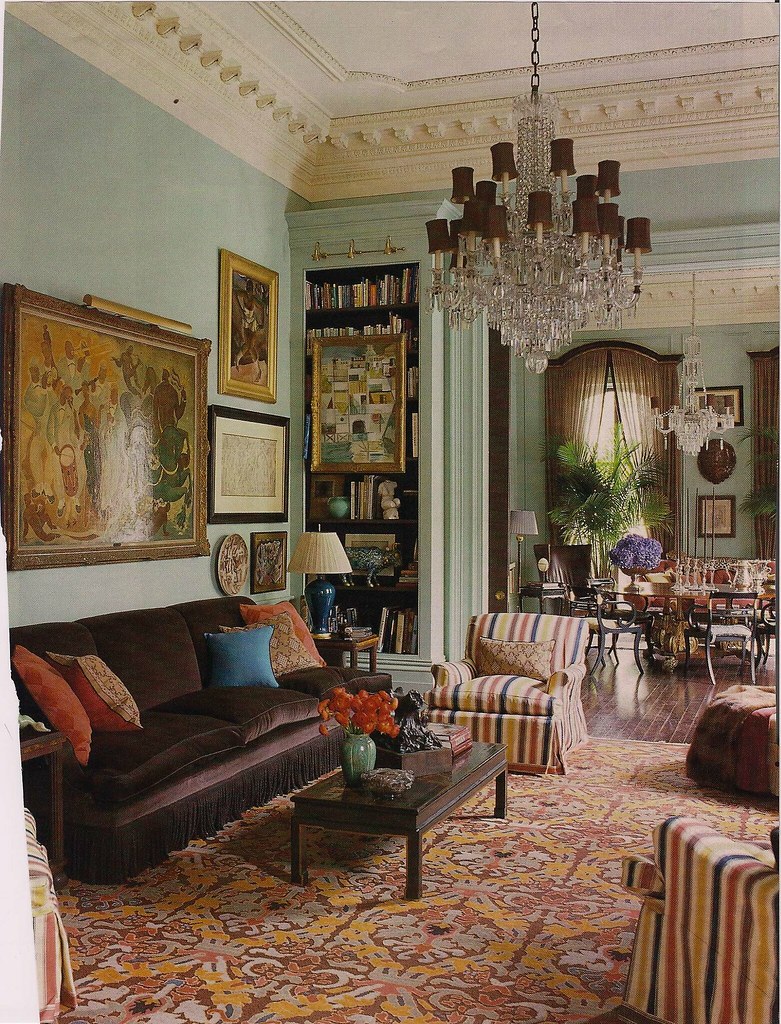
there's an interesting quality to this room that says 'a small country's economy can't hold a candle to all the money/labor/choices/planning/contractors tied up in here'.
i don't know if i love how it looks, but i love what it says: we hired a decorator who spent shit tons of our money but lordamercy look what we got for it. this is opulence at it's calculated best. from the trim on the chairs to the tassel on the sofa. oh, and there's a bookcase. i like that.
this room says we've got money to spend, we're a little nutty and we'll serve you a cocktail at 4:00 and give you a sweahrtuh if you're chilly.
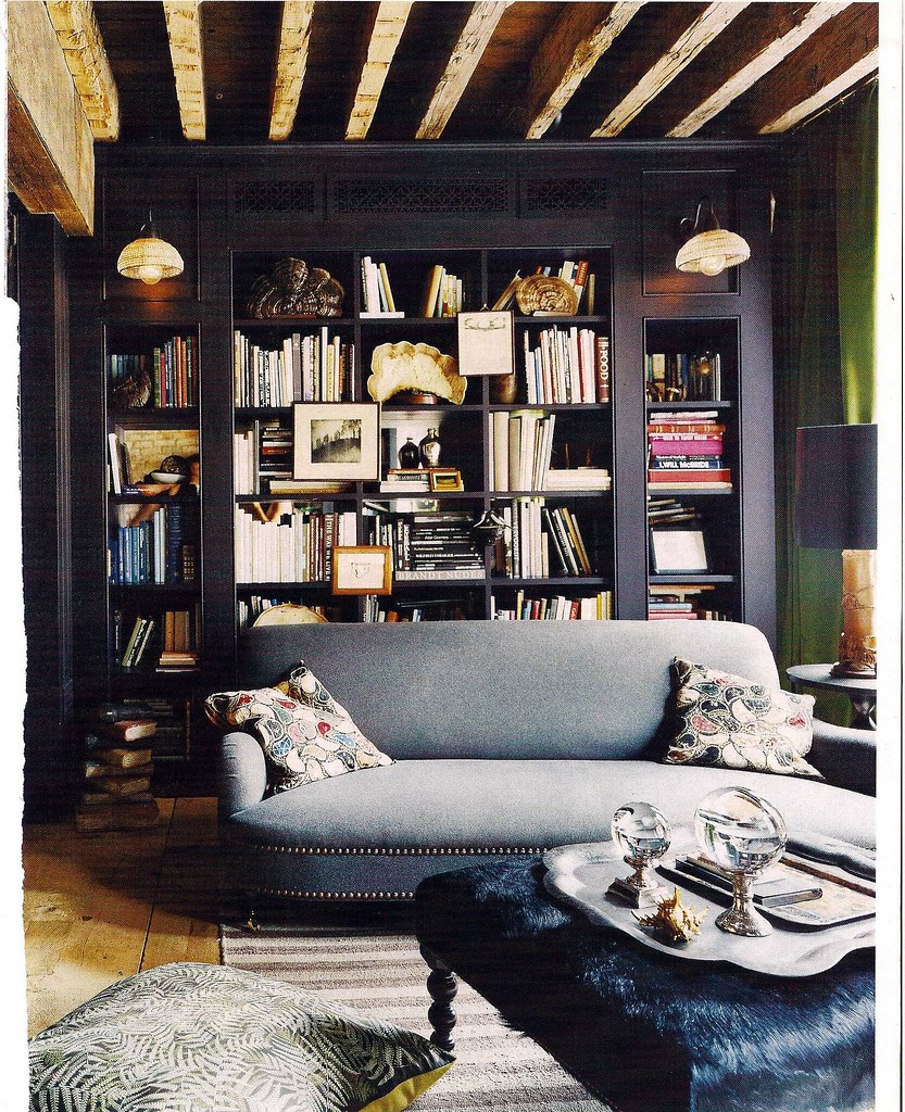
you dark and lovely room. look at you - all masculine and luxurious. i'll never in a million years be able to put glass orbs on a silver platter atop a furry ottoman, but man - if i could.
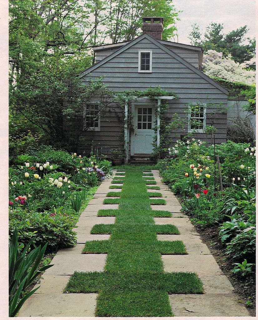
minimal grass mowing - yes
overall approval rating = high.

in general a mural is never a good thing. but this!
where the wild things are = this kitchen. this is wonderful.
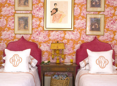
matching twin beds are all the rage lately, and here's my fave of the pack. i can't imagine where this would exist -- who has rooms, (that aren't kids rooms) with two twin beds, and then, they decorate them like this - to BOOT!?
it's perfectly crazy and over the top.
symmetry makes me happy. it says yes, all is right and balanced in this room - so just soak in my orange and pink toile and delight in my expensive monogramming and rest easy, because the left side is just a perfect as the right.
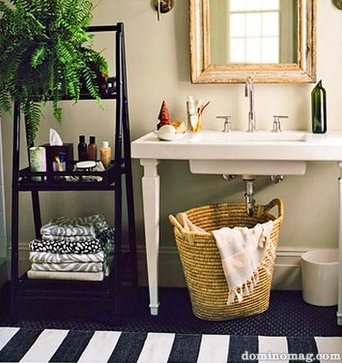
i'm very interested in how people solve bathroom crisises that revolved around not having sink storage. i'm also interested in where exactly people put their deodorant, because you see all these carefully styled products on trays and in pretty tins and glasses but where's the deodorant?
love the mix of towels, the texture with the basket, the stripe on the rug and the FERN! the glorious fern. every bathroom should have a plant. it will soak up your shower steam and give you green.





20 comments:
haha, Jamie is so funny - love this post and this series Paloma! Great idea
Love the idea of putting a green plant in our bathroom - off to find the perfect one now!
Fabulous post - it reminds me that "looking" and "seeing" are two very different things. To really SEE a design is to disregard your own personal taste and understand why someone else loves it or just realize why it works. A pretty picture often translates into someone's day-to-day life, and I love that you've broken down those componants into bite-sized pieces.
Fantastic! She is brilliant!
Paloma! THANK YOU for bringing this series back, I love it! Jaime is so funny and has a good eye. I love the photos she's chosen! That Keith Langham one in NOLA is just so so so over the top! My sister worked at a party in that house and said the magazine oics didn't even do it justice!
Gotta love her style!! I'm off for a visit right now! Thanks Paloma!
Love her style- and whats even better than that is that she makes me laugh out loud! Glad to have this series back!!
I love this series! I'm so glad is back. Thanks for all of the fantastic tips Jamie.
Great post! It definitely takes time to study all the intricacies of very well designed rooms... but so much fun. BTW, I was reading by BH&G at the gym this morning and was so excited to see you there!
this is still such a fun series. Jamie is always great for a laugh and a picture of something pretty that I haven't seen before -- which is getting to be a rarity in blogland!
The fern is really just to hide the unsightly B.O. Juice. Beautiful rooms.
as always great rooms.
We live in Germany and our bathroom is very large but lacks any sort of shelving or storage space. We threw an old dresser, nightstand and shelving unit just so we had a place to put towels and toiletries.
Great series! Love your blog!
Am a professional credentialed commercial designer who loves receiving your e-mails - they let a little bit of residential glamour into my hectic and hurried design work life! Love the comments on this particular post - we are of the same mind - I wonder the same things as I peruse my home design magazines (yeah, it looks fabulous, but where do you keep the toothpaste?) Love the humour and whimsy in your posts - keep it up - such fun! Thanks.
Wow is she good and funny to boot! Jamie's pictures are amazing and we like how she walks us through them and really teaches us how to look at an image. Great post.
I love how she has a sense of humor about decorating- because rooms that make me smile are the best rooms.
And I TOTALLY get the obsession with figuring out where is the deoderant in open bathrooms. I look at pics of open shelving in kitchens saying "Where is the bottle of advil? And 40 outdated Nyquil bottles that only have 1 TBSP each in it?"
Great post - love the pictures she chose. I need to visit her blog often!
I had to smile when I saw my blog in the LinkWithin because I just finished painting my living room! Now it's a pale gray w/slight hint blue - and I've also painted a bunch of furniture in F & B's Pavilion Gray.
I laughed out loud when I read this because I did the EXACT SAME THING with that kitchen. So interesting of a room, isn't it? LOVE. (Except the floors. Gawd, I want to demolish those floors...)
Kelly
Love your post, not so sure about the mural though!
All these rooms are beyond beautiful. They aren't just rooms. They are true works of art.
Post a Comment