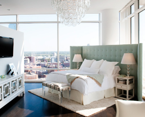
I came across this image from D Magazine earlier this summer and stumbled upon it again this afternoon and it got me thinking. What are your thoughts on such a massive, all-encompassing headboard? Given the layout of the room and the fact that there are no real walls to anchor the room, I can certainly see why Jan Showers opted for such a large headboard angled in such a way. Would you have taken the same approach? I have to say, I absolutely love the subdued color palette and the fact that it doesn’t detract from the amazing views. But back to the question at hand, do you love the layout or would you leave it?
Tuesday, August 17, 2010
Love it or Leave it?
Subscribe to:
Post Comments (Atom)


38 comments:
Love it!! And I agree about the colors...pretty and not distracting!
www.rachaeldiab.blogspot.com
I think for this room -- clearly in a high rise building with windows all around -- it is FANTASTIC. It looks like a great place to watch some TV at night, read a book, or even curl up for a nap and enjoy the afternoon sunlight. Love it!
I think it is quite an ingenious solution to creating a bit of privacy within a "glass box"...while maintaining a sense of openness.
Janell
Um, LOVE IT!
Normally, I'd hate it.
But in this giant, expanse of a room, it needs the feel of some cozy and of an actual "room" where there kind of isn't one.
I love it. The color, the styling, the accesories. Everything about it.
I have to say I think I like it!! It makes a very open space seem a bit more cozy!! Love the colors!!
I think it works in the space. I kinda like it...even for my Houston/Cypress home!
Love it.
In this space I love it. The open layout and the views are amazing. I love how this makes the bed area cozy without losing any of that!
I love it. I think it creates a bit of cozy and privacy in a very open room. I definitely would not have picked this layout on my own but it looks fabulous!
I think this is a perfect solution when faced with a wall of windows. It afford the sleeper the luxury of a plush cocoon.
I love it! The headboard almost creates its own little room in such an open space.
Love the colors - not a fan of this large headboard angled in this space though - sure it gives them some privacy I guess, but I think the whole allure of a home like that is all the floor to ceiling windows.
Love the way it looks. But I would never watch HBO again...the entire world would see whatever smut was on that TV!
PLEASE tell us what the side tables are! I've been looking for something like this for a year and these are PERFECT!!!
This room is stunning, but I do understand why she would choose such a massive headboard. Seeing how there are such large windows and nothing to enclose you from view when in bed, this headboard acts as somewhat of shield from sight. But what about the use of beautiful window treatments not to block out the light, but merely add privacy to an intimate room such as a bedroom. I came across your post this afternoon while browsing interior design blogs and the topic of window treatment selection was very interesting to me. It is true that you must dress your windows appropriately to bring out their true beauty. Thank you for writing and as a special thanks to you and your readers, I would like to offer a 20% off coupon using this code upon checkout: BLG20.
I think it's a rather brilliant application, to take such an open space, and create a little nook of a bedroom with that grand headboard. Love it!
I love the headboard but I would never angle the bed, it seems to be floating with no real connection to the left side of the room. Maybe there is a desk back there that I don't see.
give-it-to-me!
I looooove the color of the headboard and the big windows.
Perfect in every way!
Love it! Makes the room more intimate (and, hey, when you're watching movie in bed, late at night, that tall headboard blocks the lights from outside. Practical, too!)
I love the headboard in this situation because it adds privacy without distracting from the view. However, it leaves me wondering...what's behind it?
didn't john saladino show shelter sofas about 20 years ago?
wing chairs and settles have been around for hundreds of years, for draft protection, but also to satisfy a need to feel safe and enclosed.
especially now with areas of great glass windows and tall buildings, there's an urge for a bit of cocooning. this is a lovely solution to the need.
thanks for showing this, paloma.
I think it's absolutely beautiful. As others have said, it anchors the space in a room that appears almost without borders. Plus, the color works really well. I also love that they have put it on the bias of the room. Gorgeous.
I love the headboard, but I sure hope there are some shades on those windows. Nothing like rising with the birds.
I'd like it to visit, but maybe not to stay.
It works in this room, but I still don't think I would do it myself.
I LOVE it and think it's such a great solution to this open space. Is the backside closed off? I can't tell if there is an awkward triangle of space left, or if it is angled where both ends touch glass.
definitely love it!
As many people have commented, we can see why she did it, and it does "function" as a way to get some coziness and privacy...But we don't think it "works." For one, based on that photo, it doesn't look like there are any building anywhere near there, so why the need for such privacy? And, if we lived in a place that had such great open views, we would certainly WANT to see them from bed, not orient the view away from there.
Having said that, the funny thing is that the furnishings and color scheme of the space look VERY similar to the style of design work that we do...Except that our projects are in the Hamptons, not in a modern high-rise apartment!
I'm going to have to disagree with everyone here. While I will say that the furniture selections and color palette are quite pretty, the oversized headboard makes this look like a bedding display in a furniture store. It also distracts from what should be the focal pointof the room - the view. Creating privacy and coziness in spaces this open can be challenging, but I don't think this is the way to go about it.
I really like it. Only because the room is so big, the colors aren't loud and the floor to ceiling windows make it feel that much bigger. When my husband an I bought our house the person before us had a massive headboard that took up the entire back wall. It was way too big and an eye sore. I really think that Jan Showers did a great job.
Stunning headboard! But, in this space NO. Too big and bossy for the otherwise airy, floating quality of the space. I would have addressed the obvious privacy issie with window treatments. Also, not a fan of the diagonal placement. I always want to straighten things out when I see this! Awesome credenza/cabinet and I love the softness of the room against the raw industrial view.
LOVE! How could you not. =)
obvi i am in love with it, but what really got me was the light fixture...so glam.
Love, love , love it!!! This is the exact vision I have when we buy our house. I love the nice crisp colors and everything has a clean airy feel. I bought this very magazine and saved it!
I'm OK with the layout, but I would DEFINITELY want floor-to-ceiling curtains for some privacy/light control!
actually i would love to see the actual city view while i'm in bed so i would move it toward where the camera is taking the picture from...lovely pallete for sure though..very calming
I really like. Although it depends on the arrangement and colors of the pieces, this one is pretty on key. You're right that it also doesn't distract from the view.
Pretty!
Post a Comment