 In yesterday's recap of my trip to Northern California, I mentioned that I was able to visit Erin Martin's showroom in St. Helena. My friends and I were only there for a few minutes because we had to hurry to make it to our wine tasting appointment on time (priorities, people!). I snapped a couple of pictures of the showroom, which you can see here, but I was left wanting to explore Erin's style a bit more.
 I loved the overall feeling of her showroom and her aesthetic in general. It isn't pretty in the traditional sense and I mean that as a compliment. Her style is provocative and a bit subversive. She often plays with scale and does so quite masterfully. There is a sense of humor in Erin's design work and I think it goes hand in hand with the scale of the objects she often uses. It is evident that she doesn't take herself too seriously as her work frequently features whimsical elements, like a playful use of lighting. I like that Erin's work feels unique and seems to embody the spirit of Napa: elegant, relaxed, and rustic in a refined way.
 I love the idea of using wingback chairs in the dining room. Again, everything is very big. You would need a rather large living room to accommodate all of these chairs.
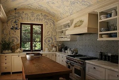
Do you remember seeing this in House Beautiful?










11 comments:
Beautiful lighting in every picture, and I think using all those wingback chairs in a dining room is perfection!
Erin's choice of lighting is incredible. I truly think lighting is the cherry on top of a great design cupcake! Thanks for sharing these fabulous photos.
Thanks for sharing. Erin's lighting choices are just so spot-on.
Hello...thank you! I've been meaning to get up to St. Helena this fall and always get thwarted. I did a post on Erin recently with lots of the HB photos, some of my very favorite torn-out pages. She usually does a much more modern take on design than the HB homes I showed, which all your great shots demonstrate. Love the articulating lamps, over bookcases and sink! Merci! Trish
That bathroom with the telescopic lights! {swoon}
love......especially the bathroom w/ the reading lights coming down.
Love, Love, Love...while not typically a fan of massive furniture, I think her lines being so clean and the materials so raw, it works beautifully...
Ooh, I am taking notes and making copies!
Pretty much the most fabulous barn I ever did see!
xo
Fabulous photos!
Very cool! I love the dining room with the wing chairs :)
Post a Comment