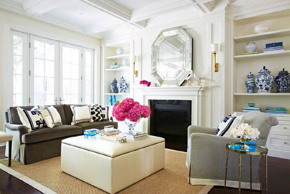
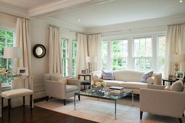
You can't start off better than to create good bones in a space. If a coffered ceiling and built in shelves are out of your budget, how about a simple DIY paneling project to get the effect of the room above?
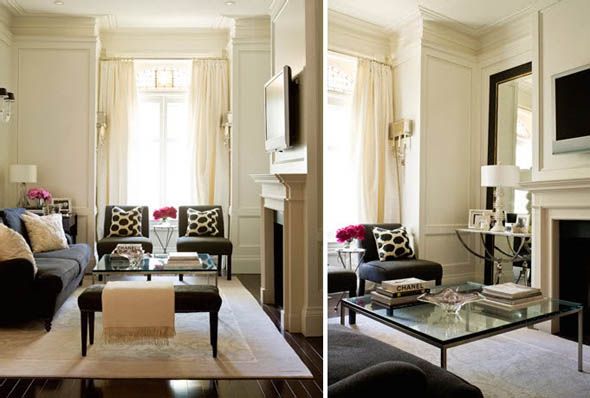
A living room should have at least 3 'tiers' of lighting: ceiling fixtures, wall sconces a level below, and then table lamps even lower. This effect of various levels of light brings interest, depth and warmth to the space.
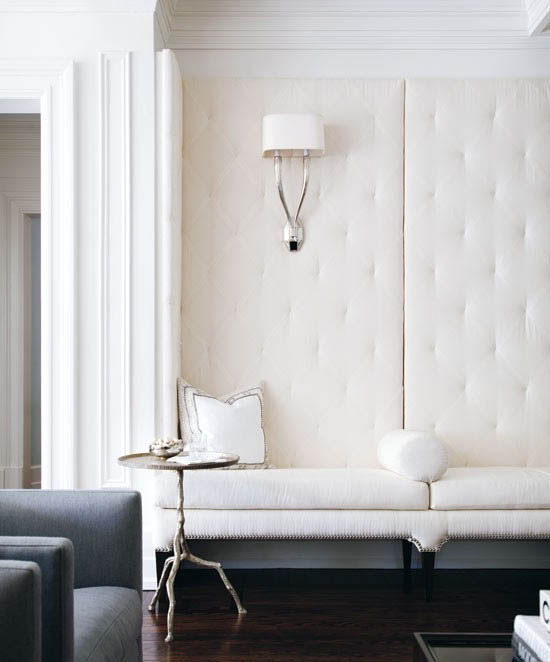
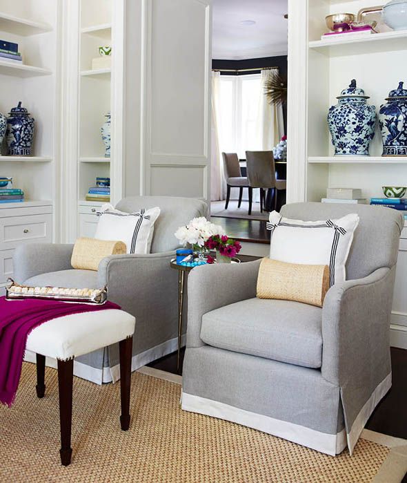
A pair of side chairs, benchs, ottomans that double as extra spots to perch; all of these are chic ways to bring in more seating and create a very inviting space. And seriously, how inviting is that built-in tufted bench? Beauty!
Colleen's signature style is definitely a neutral back-drop with just a dash of color and pattern brought in with accessories, like the Madeline Weinrib pillows and blue and white ginger jars above. How easy would it be to change this up with the seasons? Love it.
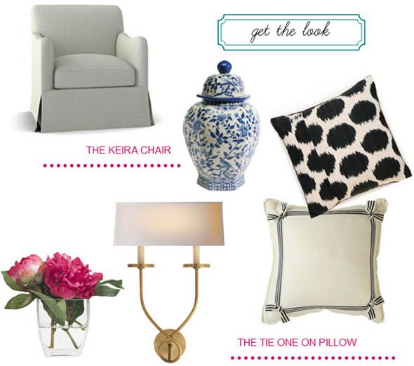
Colleen's new line of furnishings includes this fab keira chair, and the tie one on pillow. A ginger jar collection will never go out of style, and the ikat pillow from Madeline Weinrib adds graphic pattern to keep neutral far from boring. And finally the symmetric twist sconce from Circa Lighting would add glamour to any living room. Now I've got myself dreaming of changing up my entire living room decor!












6 comments:
This has to be one of my favorites! All of those neutrals beautifully layered. I am in love with that white pillow with blue applique..am wondering if it's also Madeline Weinrib?
overthemoonbyla.blogspot.com
All of these living rooms are so inviting! The lighting and set up add so much to the place.
LA Daly, to answer your question, that blue pillow is actually from Colleen's furniture line as well. You can check it out here: http://www.myplumdesign.com/content/dont-fret-pillow-1
Nancy x
Hi, Nancy, I am a fan of your blog! I have a question - where did she ( the designer) get those blue boxes? Are they opaline? Thank you so much! Merci beacoup!
Zoe from Montreal
I'd move in now if I could! Can anyone tell me where the small side table next to the gray chairs came from? Thanks!
These are gorgeous spaces that are definitely calming. I would love to take this approach when re-designing our den but for now, I have very non calming black and white stripes on the wall. Kind of the antithesis of these rooms. haha.
Post a Comment