{Bold Patterns and Rich Colors Come Together in a Vignette by Lorenzo Castillo}
There is a special species of eclectic elegance that European decorators and designers seem to have mastered. Spanish designers, specifically those based in Madrid such as Pablo Paniagua, Luis Bustamante, and Lorenzo Castillo whose work is profiled in this post, are especially gifted at achieving this style. Perhaps it stems from their rich heritage and the proximity to top-notch antiques dealers and one-of-a-kind finds. They design spaces that are filled with magnificent antiques juxtaposed with modern furnishings and abstract art. Each piece seems to tell a story, setting the stage for the characters that surely live in such divine homes. These are the type of layered interiors that make me wish that walls could talk. The look is thoughtful and deliberate, yet each space resonates with an effortless nature. These are not spaces for those whose aesthetic veers towards minimalistic. These are spaces filled with eclectic pieces, bold patterns, rich colors, and art from a cross-section of periods, all composed with brilliant panache.

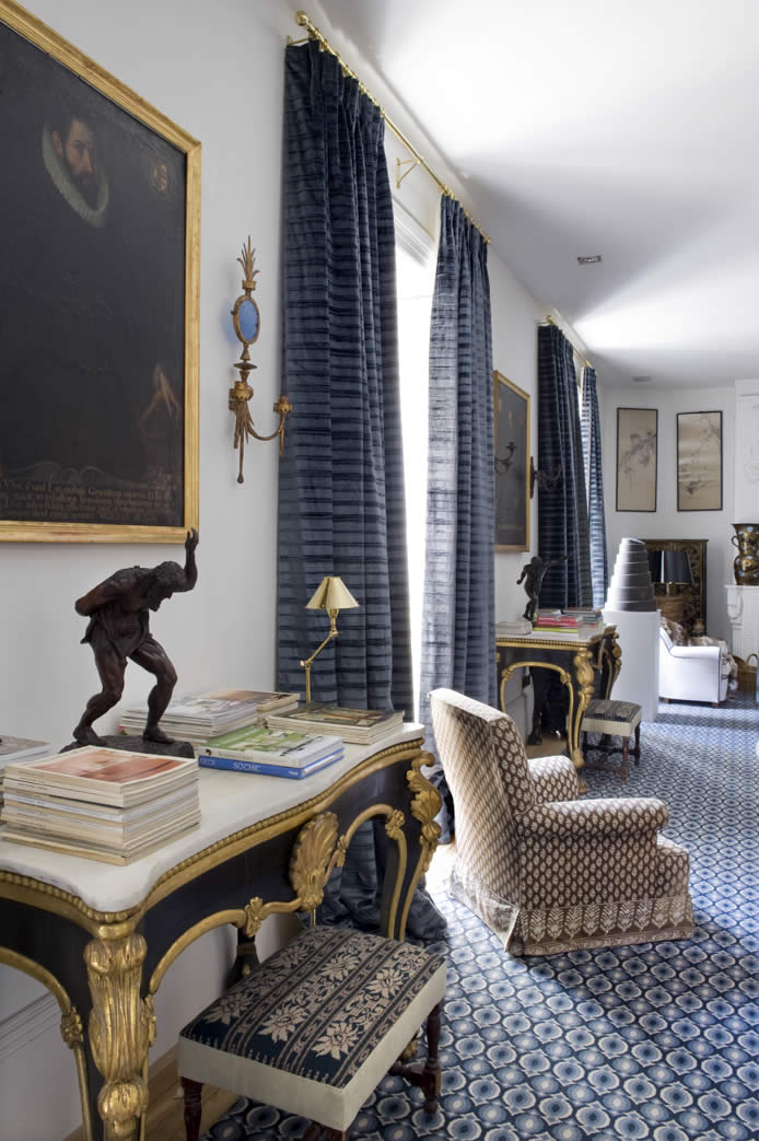
{How gorgeous are these marble and gilt tales? I love the striking contrast against the blue rug.}

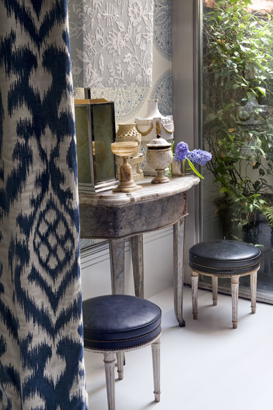
{Each of the elements in this vignette is clearly special, yet the way in which they are arranged makes the space feel so easy and inviting. I love the reach blue hues of the ottomans and the ikat drapes.}
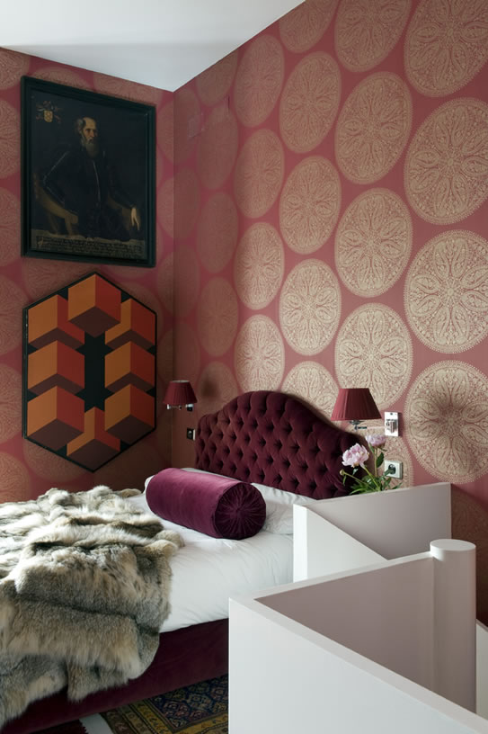
{This is such a chic, eclectic bedroom. I normally don’t love this color, but the burgundy looks beautiful on this bed. The contrast in the artwork displayed is so chic. It wouldn’t work in an average home, but in one as layered as this, it looks fantastic.}
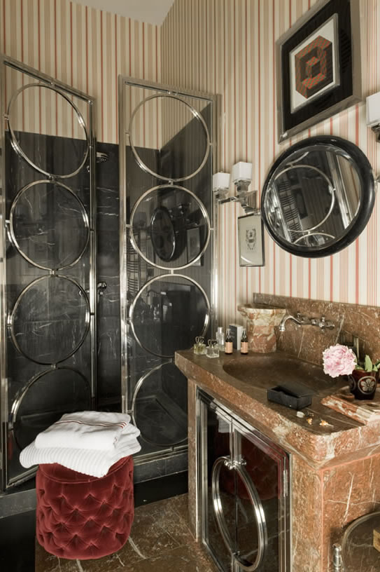
{Are these the coolest shower doors you’ve ever seen? So glamorous!}
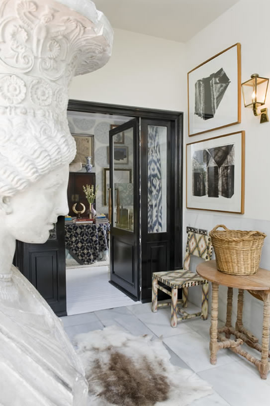
{This corridor is so chic. The contrast of all of the materials is unexpected, yet it all works so well together.}
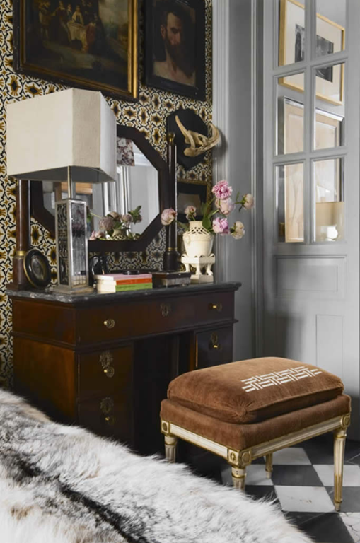
{Can this be my office? Pretty please? Aside from the taxidermy, the space is beyond fabulous. It’s the perfect dose of masculine style with a bit of glamour for balance.}
Could you see yourself living in a home designed in this style or is it something you prefer to admire from afar?

{Images via Lorenzo Castillo}










4 comments:
I love the shower doors! Although, I'm not as big a fan of them under the vanity.
Loving these spaces - it's almost like visiting a museum, there's so much to look at!
xoxo
Beautiful graphics, environments very elegant and chic! :D
http://www.fenixdesign-decoracao.blogspot.pt/
Paloma this kind of design is such a gift! Gorgeous!
I have given you a shout out at the bottom of my latest post!
I am having an amazing Giveaway of Plush Pumpkins from Love Feast!
xoxo
Karena
Art by Karena
Post a Comment