 You’ve probably noticed that La Dolce Vita had a little facelift recently. Last year, I decided that I wanted to revamp things a bit. I didn’t necessarily want to go the Heidi Montag route and make the blog unrecognizable, but I wanted things to look a bit more streamlined and polished. That is where Jessica Graves comes in. I had admired her graphic design work through Front Porch Studio and read her blog, The Lovelist for some time and knew that I absolutely loved her feminine style(I like masculine interiors and feminine typography…go figure!).
Anyhow, over the past few months, Jessica worked diligently to deliver the vision that I had for La Dolce Vita and she did just that. I honestly couldn’t be more pleased with the final result. I hope that you all like the new look since you are kind enough to visit “my home” each day.
If you like the new look on La Dolce Vita, then chances are, you will love the rest of Jessica’s stylish work.

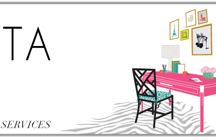
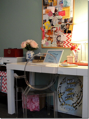
First up, Jessica’s fabulous studio! I love the beautiful white ostrich print. Her stacked boxes are all so chic!
 I love the beautiful white ostrich print. Her stacked boxes are all so chic!
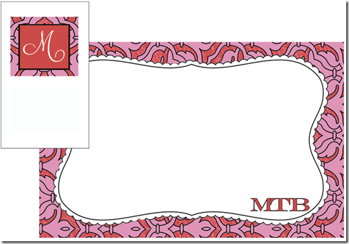
Jessica’s Front Porch Studio does websites, print materials, stationery, and blog design and installation, and branding for small businesses. This is just a small sampling of Jessica’s work and part of the reason I fell in love with her aesthetic.
![maemillerheaderproofjan25[1] maemillerheaderproofjan25[1]](https://blogger.googleusercontent.com/img/b/R29vZ2xl/AVvXsEhYqsTovRDQ3xdqhQhHG38bGmT5Xe2uv9e0rhZe9JJFLl2LXpsOtkhRPD0QAgBWUnRlc05YlQXdfF0v8SvZaN5gCpV_bo28v7ZvrmmFgAKwWc3H1C3EnhcbCUXg5GYSOqfpD96_ez-zLJU/?imgmax=800)
![glamourousnewlywed[1] glamourousnewlywed[1]](https://blogger.googleusercontent.com/img/b/R29vZ2xl/AVvXsEgad-9wLfBRYgX3Bk8mUqbiahjED6NIfye2QAg6-UbXlJJoXk0q5gMzkPftF3336xuYkrj8HjMpkmKZ7BRL-V8lHBxBaX5zCnPXNIKnqPPYSuXeBzpNjUGjDSfVmBvHlUfer-UxH2HjHlk/?imgmax=800)
![spiceandsassheaderfloursihes[1] spiceandsassheaderfloursihes[1]](https://blogger.googleusercontent.com/img/b/R29vZ2xl/AVvXsEgSFCY771TBrCem9ElRK6WQhCq-gMqS_LqpROqM8YO6-iCdAJlVx1Ui_sSRFqLC6tj4AEqclPRxEkpL0_Rbq6s3TZp-dqmSZhwZRLNNJJ2i9CZYbufqzwf-PmKNxd5u8QJCzbueLzPDFZIt/?imgmax=800)

![camelianotes[1] camelianotes[1]](https://blogger.googleusercontent.com/img/b/R29vZ2xl/AVvXsEiFYLO8r6IW3dKbQEFM1F6YPBL2aPMJkg9AsLISAPLNSYZ8OidzHTrmOY628pktiLcRMYRcQCfV7CQrMNICGzOVCRLf7uS9rY4GsY3u7Rwn0sZFakJfiOl77x7Ngoqh3BAIP5v2U_GwpmU/?imgmax=800)

![jcorbettpreview[1] jcorbettpreview[1]](https://blogger.googleusercontent.com/img/b/R29vZ2xl/AVvXsEhWzvlEAq9v7hZJLJEHqY9q0aXoeTAznP8JGDF8OptiPs7Mv7NOEihalDq6RAKT_E6tFloXnuttOHwypvTTtmmqtB0Zn1GmgAWRbXbkQaTpP-BB7zzTDI83AP4u87ZOYlSVDZWmhSvR9A0/?imgmax=800)
![sugarstudio[1] sugarstudio[1]](https://blogger.googleusercontent.com/img/b/R29vZ2xl/AVvXsEiZxZxjSuEp_SpsgRswUm9Lik5cFga9F9lAizoGludd_dc3lIZVv2j6O7npHLPCzDETY2ufajdkUbCiDNqXlvgL3DDM2cICYW-sso4SRueV-6cKR8oRXEtezxb0F-vvTCzcND7Eiv2fdD4/?imgmax=800)
![darkdustypink[1] darkdustypink[1]](https://blogger.googleusercontent.com/img/b/R29vZ2xl/AVvXsEi9r9pZ3zL-149SyBMBki2r6Q_2LaUG0UTSjfD0VImiY0rI4hE2sYsGwc6W5E3lMtpSVDOcZL01wx5NaoeZHYfWin8Y4LLPiedPuiqHru0SAjmwFu76i9D-mwJ3N6QgavmaF4GJoRG67bGZ/?imgmax=800)

So, do you like La Dolce Vita’s new look?
To see more of Jessica’s portfolio or to contact her, please visit Front Porch Studio.


31 comments:
Yes, I love your new look. I could really use one myself and will keep Jessica in mind for the day when I finally make time to take care of it. Beautiful inspiration pics today too. Thanks!
I love the new look! She did a marvelous job!
Jessica is great! She's always so sweet in the blogosphere and she does amazing work.
Lovely! And I have the same desk and Philippe Starck chair--how funny!
As a graphic designer, I admire and adore Jessica's talent. As an interior design obsessee, I looove her studio. I've seen her work on another blog redesign but can't remember which one... La Dolce Vita is looking fab! And love the Heidi Montag reference.
Cheers from Mexico,
Alaina
I think you were brilliant to keep a strong influence from your previous header - like you said, you didn't want LDV to be unrecognizable. Nice move - looks great!
you look great!! jessica's work is amazing and she did such a beautiful work on la dolce vita!!
Love her designs! Thanks for the heads up. Your blog looks great.
Love the new look!!!
Looks great!
Jessica also helped me upgrade my blog, Southern Gent, as well. Pleasure to work with and helped create what I articulated.
www.SouthernGentBlog.com
What a great post! Jessica did such an incredible job for me with Spice & Sass. Her work is fabulous, and you rnew look is great.
Congrats on the facelift! You're looking fresh and fabulous darling :)
The makeover is perfect, love her desk and her designs! :)
I love the new look, Paloma! FPS did a fantastic job and I'm now sorely tempted to tweak OetA now myself (maybe scale it back a bit...).
PS - Love the Heidi metaphor. Can't believe how bizarre she looks now. It's aged her a decade, easily.
Thanks so much for the big write-up Paloma, it made me blush! So nice to know that your readers like everything, but it was just as much YOU as me! :)
PS.. the ostrich print is a Micheal Sowa -- his art made a fun little cameo in the movie Amelie.
congratulations on your new look and thanks for the tip — her work is beautiful!
Wow, I love definitely love La Dolce Vita's look!!
And Jessica's work is fantastic. Such beauty...!! :)
I love the new look around here- what a great change and you are no Heidi
Love love love the desk
I love the colors in her studio, and your new look is great!
I think your facelift turned out beautifully! I need to make my blog more aethestically pleasing. I have thought about shopping around for a unique design. Thanks for the info and your weekly inspiration for all things gorgeous!
xo
Amy R.
Love the inspiration. It made me go and revamp my header. I'm not an InDesign expert and not a big time blogger, but everyone's got to start somewhere. Thanks again for the inspiration!
http://www.ijustwanttobethere.blogspot.com/
* Now T*H*I*S is talkin'... and I LOOOOOOVE what it says!!!
I got soooo hooked just now~~~ (YES, so quicky!)... 2:, of course!), and here I am, back-reading & just enjoying myself for the LONNNNGGEST TIME! So enjoyable!!! THANK YOU!!!
You writing, the pics, etc., all seem to have a special "spark" now, too... how deeeeeelightful! I can almost feel your joy!
And JESSICA???? Well, I've been leafing thru SO many catalogues & on the internet lately, looking for some kind of "special" stationary~~~~~ while I wish to be high quality & monogrammed, I DO wish too it to be elegant AND rather distinctly "me" (and WHAT woman isnt complex??? WHAT an undertaking/challenge!!!)...
THANK YOU, THANK YOU, THANK YOU~~~ INFORMATIVE, FUN and DELICIOUS to LOK AT ALL, too!
She did a great job. Your blog looks wonderful !
Love her studio...gorgeous.
Im not sure if Im the only one but your header doesn't work properly. About half of it appears and then there a squiggly break followed by white space.
i do i do! looks great! makes me want to change things up for my blog too!
Love all of this!
Looks beautiful!
Tardy to the party as usual, but I LOVE the new look!
Hi, can you please remove the "Le petit cupcakery" logo? Front Porch Designs did NOT create that logo and it belongs to me, I created it in 2007 when I owned the shop in Toronto. Thanks.
Post a Comment