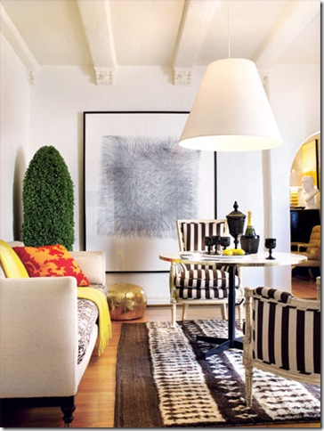
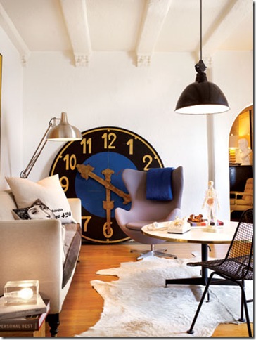
This week’s fabulous room proves that styling and accessories can make an enormous difference in a room. If you are a design-lover, chances are you want to change everything in your house constantly, but of course, that can get expensive. In his own living room, designer Gary Spain shows us how one can make an enormous impact simply by changing out the accessories in a room.
The images in this post are of three incarnations of Spain’s living room. The first, pictured above, is more minimalist in style. You’ll notice the sofa and table are the only constant elements in the room, but he plays upon them beautifully. Here, he pairs an oversized industrial lamp with an Arne Jacobsen Egg chair. A huge antique clock serves as the primary focus in the room. 

I honestly cannot decide which version of the room is my favorite. I think they each speak to my taste and personality. I love the clock in the first version, the accessories and overall vibe of the second, and I think the third room is the most edited and sophisticated. I keep going back and forth! Which version of Gary Spain’s living room do you prefer?
Image Credits: Gary Spain and California Home and Design Magazine


14 comments:
So fabulous - that clock is amazing! :)
I love the clock. Very eye catching!
Ah! This is a difficult one. I like bits and pieces from each room. But I think if I had to choose one it would be the third one....maybe with just a little more color!
hmm, thats a really hard one- I love the second and third rooms. I like the second one for my life now, it's young and fun. Then as I get older I can see myself moving more to the third as I add more forever pieces and refine my taste.
They are all great- this is an awesome post!
Second one!
Love all of them . Second one is fun!
X
V
I love how he layered rugs with various textures and patterns. A fun, eclectic look and he pulls it off beautifully!
xo,
cristin
I think the third one is the most striking, although I do like all of them they are all fun...love your blog, come for a visit I am a new follower of yours...
I agree the clock is amazing! Very eye catching! Beautiful rooms!
wow, just how amazing is that clock!
I love all three of them, but if I had to live in one of them, I'd choose the last one. Although.. that clock... it's breathtaking!
Cute Blog! : )
-The Trendy Fashionista
http://thetrendyfashionista.blogspot.com
They all have so much personality. It's like you're watching a room "grow up" through the three variations. Where does he store everything? How can the rest of us do this?
I have that large light fixture in the last image. It's in my stairway and looks very cool on a dimmer. It glows beautifully..
Best,
Julie
Post a Comment