This week’s fabulous room is a bedroom space designed by Suzanne Kasler for Hickory Chair. If you read yesterday’s High Point Recap No. 2, then you had a chance to see both of the other spaces designed by Suzanne for Hickory Chair’s showroom. The first space we visited was the chic and sumptuous orange room followed by the feminine and glamorous blue room. I was completely smitten by both, but when I reached the final room featured in today’s post, “I literally died” as Rachel Zoe would say.
In a slightly delusional moment, I felt as if the room had been designed especially for me. I connected with it on so many levels. Some may think it’s silly to think that one could connect with a room, but I know my fellow design lovers understand what I mean. I love the creamy grey color of the walls and the neutral furniture. Yes, I usually tend to like colors and patterns, but I like for my bedroom to feel like a sanctuary. Again, the perfect balance of masculine and feminine is achieved, which is certainly a plus when you share your bedroom with your husband. I don’t know any man who wants to sleep in a super chintzy, ruffley bedroom and most women don’t want to sleep in a sea of tartan plaid and duck decoys a la Trey MacDougal from Sex and the City. There are so many details that suit my personality. The lighting, the artwork, the nods to travel through the use of Paris and London-themed objects.

I love that you have a great mix of textures and fabrics in this room. It all feels very soft and inviting. The masculine, trunk-like details of the desk and vintage typewriter add a charming touch.
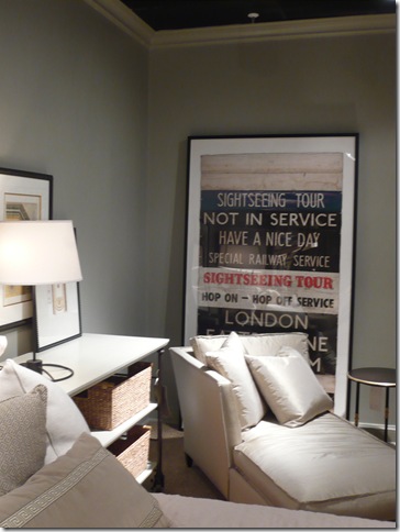
Ever since our trip to London last month, I am obsessed with anything having to do with the city, so of course my pulse started to race a little when I saw this poster. I know my husband would absolutely love it. Again, Suzanne achieves such a great balance in this room. You have the vintage print and its edgy vibe right next to a luxurious chaise and it works so perfectly.
I would love to curl up on the chaise and pour over Suzanne’s new book, Inspired Interiors.

The dark stain on these dressers provides a beautiful contrast to the rest of the furniture in the room. Of course, I love the glamorous touch the dupioni silk drapes add.
Another lovely chaise, this time in a gorgeous leather. The little leopard pillow adds just enough interest and pattern. Does anyone know who the prints on the wall are by? I love them.
I fell in love with the Morris Lantern that Suzanne designed for Visual Comfort. I know I had seen this piece before, but something about seeing it in this context really struck a chord with me. I’m kind of obsessed with it now and would love it for my breakfast room.


16 comments:
I LOVE the desk that is at the foot of the bed. Looks like you had a fabulous time! I am jealous!
beautiful photos..i love the clean look.
Vau, so big bedroom!
My one is so little.
Thanks for your photos.
They are Greats <3
I just died.
Fun, fun! Thanks for all the beautiful eye candy. Especially since I lost of my inspiration files when laptop decided it had enough of me!
Ah I never backed them up!!! Totally upset!
Gorgeous room, indeed. I agree with you on wanting a more neutral/calm palette for my bedroom. I'm usually all for bold colors and prints, but I always prefer a bedroom with darker walls, white linens, and minimal pattern.
Everything about it is absolutely perfect! So my style. If it's this beautiful in picture, I can only IMAGINE how amazing it was to actually be IN it!
Happy Friday,
Crystal
I love, love {love!} that London poster. I lived there in 2007-2008 + would love to know where it's from {or where I might find something similar!}
P.S. I just love this {new-to-me} blog. What a stunner!
Cheers.
I LOVE her work. Thanks so much for showing!!
Those prints are the first thing I noticed...I love them too. Are they pieces of ribbon? They are wondey!
Suzanne Kasler, I think, is speaking at the Denver Design Center. Too bad I won't be able to attend. Sounds like High Point was great. I've gone only once--about 6 years ago as a reporter. I'd love to do it again. They usually have a nice speaker roundup. cheers -s
Fabulous! I so admire Suzanne Kassler- her style is incredible! Such talent!
xx
Michelle
I love how they used mirrors to create the look of windows, that would be a great idea for a basement.
Hey, Paloma! So sorry we didn't get a chance to chat at the Hickory Chair breakfast. The prints you like are actually part of the Suzanne Kasler collection for Soicher Marin - so check them out! For you and Her Name Was Lola, the London poster is also from Soicher Marin, although I don't think that is part of Suzanne's collection. Not sure about that, though. Enjoy!
Traci
www.tracizeller.com/blog
Hi Tracy,
I wish we would have had a chance to chat at the breakfast. Maybe next time! Thanks for the info on the prints.
xo,
Paloma
I at first thought the prints were cuts of paint shades like you'd get at Home Depot. I like them too - maybe I'll make a free custom version of them. :)
Post a Comment