








photo home-76.png photo about-71.png photo contact-65.png photo press-19.png photo LDV.png photo services-7.png
Showing posts sorted by date for query color dose. Sort by relevance Show all posts

Friday, February 28, 2014

Fabulous Room Friday 02.28.14


As I perused the pages of the March issue of House Beautiful, I stopped dead in my tracks when I got to the feature on Boston-based designer, Nina Farmer's stunning home. While I love every room that was featured, I ultimately decided that the master bedroom is my favorite with the kitchen and dining room coming in right behind. I love the color palette of warm mocha with pops of yellow. The room feels warm and luxurious thanks to the Philip Jeffries Manila Hemp wallcovering. It adds a great dose of color and texture to the room. The warmth of the wall covering really allows the saffron-colored velvet upholstery on the headboard of the chic, modern Room & Board bed to pop, doesn't it? The chic Matouk bedding, yellow tile inlay on the original fireplace, and chaise further cement the chic color palette. It is such a gorgeous space! What are your thoughts? Do you like the color palette?

Have a great weekend! 

{Image via Nina Farmer Interiors Blog}

Friday, January 3, 2014

Fabulous Room Friday 01.03.14

{The Look of the Tory Burch Store in Seoul is more "Chic Park Avenue Apartment" than Boutique}

The first "Fabulous Room" of 2014 is unique in that it isn't a residential setting. You may be surprised to learn that this gorgeous space isn't in someone's home. It is actually the Tory Burch store in Seoul, South Korea. I love that Tory's go-to interior designer, Daniel Romualdez (he does not have a website) embraced color in a big way and created a setting that is filled with traditional silhouettes that feel fresh and modern. I am not a big fan of purple and stated my distaste for Radiant Orchid in this week's "Love it in 2014, Leave it in 2013" post. However, I don't mind it at all in this glamorous setting. It looks rich, modern, and feminine, which I love. I am a big fan of doing tone on tone color in a space-- navy on top of navy, green on top of green, or in this case, purple on top of purple in various incarnations. The velvet sofa with its classic shape and tape trim is completely chic. The purple ikat wallpaper, printed entry ottoman, and  the contrasting tape trim on the white chairs in the background keep the look balanced and rich. 


The Tory Burch boutique in Houston is a tiny, little gem, but I love that she treats her larger flagship store as if they were elegant residences. The  Seoul store features several of the signature accents that we have come to associate with the Tory Burch brand and in particular, its stores, including high gloss, lacquered walls, bright, bold colors like orange, purple, green, and fuchsia, as well as a generous dose of gold accents. The look is classic American envisioned by a thoroughly modern woman.


By the way, Tory is totally killing it right now. Check out the video for her 2014 Resort Collection filmed at L.A.'s storied and chic Chateau Marmont. Have a fabulous weekend!


{Images via Tory Burch}

Tuesday, December 31, 2013

Love it in 2014, Leave it in 2013

It's hard to believe that another new year is upon us. Does anyone else feel that the older we get, the faster time goes by? It's crazy. Thankfully, 2013 has been a great year of personal growth, fostering my new design business, cementing new friendships, and a few travel adventures. However, I always welcome a new year with open arms as it seems to be a beacon of hope with its promise of a new, clean slate. It's a great time for introspection, reflection, and goal setting. I'll get into all of that in a more personal post tomorrow about my goals and resolutions for 2014, but today, we get to dive into the fun stuff!  Last year, I did a post called "Love it in 2013, Leave it in 2012" which everyone seemed to really enjoy, so we're doing a new version this year!

What do I think will be big in 2014? You won't find anything too surprising here since my taste is mostly rooted in classic, timeless things. This year, I think you'll see pared down palettes of various neutrals mixed together in both interiors and fashion-- think camel, grey, and white or chocolate, black, and ivory. A touch of sparkle helps to ignite these combinations especially in the form of mixed metals. I also predict that you'll see sleek lines and glamorous pieces done in a very modern way-- think Maison Jansen mixed with Billy Cotton or Apparatus Studio chandeliers. On the home front, I predict that while furnishings will veer towards neutral palettes, cabinetry and millwork will enjoy a dose of rich, classic colors. Imagine grey, navy, and army green kitchen cabinets-- a departure from the white cabinets that have reigned supreme for the last ten years! Radiant Orchid may be Pantone's "Color of the Year",  but I am not a fan of the color at all. I'd rather see various shades of green this year-- moss, emerald, olive, and kelly green. While on the topic of green, I predict that sleek, European-style gardens will gain in popularity stateside. Lastly, on the pop culture front, I hope that we'll see a lot more of Prince George and his lovely parents, the Duke and Duchess of Cambridge in 2014. As I mentioned in yesterday's "Currently Obsessed" post, I am newly addicted to Scandal and can't wait for the show to come back. It is SO good!

I have quite a few things I'd like to see left behind in 2013! I am so over Kim Kardashian and Kanye West. They must be the two biggest egomaniacs on the planet, so they definitely deserve each other. I guess Kanye doesn't care that the fact that he considers himself God's gift to this green earth is incredibly arrogant, but seriously, why do people add fuel to the fire? Why on earth was he allowed to speak as an authority on design and architecture at Art Basel? I feel sorry for their poor baby. While I like some of Miley Cyrus' music, I am sick of her and her act. Yes, she is talented and is obviously a brilliant marketer, but she could have found other ways to push the envelope. I hate that young girls look up to her and emulate her. Miley, please leave the twerking and your ridiculous tongue in 2013! I also hope that the 90's, grunge-inspired style that has influenced fashion this past year is over with. Let's go back to pretty things, please! On the decor side, I don't care for radiant orchid one bit. I also hope that industrial-inspired pieces can be put to rest for a while. With the exception of some pendant lights, this is a style that has been done to death. I also think chevron needs to be retired for a while as it has appeared on just about every surface one could name. It's not that I dislike it, I'd just rather be given the opportunity to miss it. 

If you follow me on Instagram, you may have seen that I put out a call to hear from you on the topic of what to love in 2014 and what to leave in 2013. Here are a few of the things you guys can't seem to get enough of and want to see more of in 2014 along with the things you'd like to leave behind in 2013. A big thanks to everyone who participated!

Nicole Gibbons of So HauteI'm seeing a huge rise in popularity in marbleized prints and patterns as well as products in home decor made of natural stones such as marble, agate, amethyst and malachite. We saw a bit of this trend last year in higher end design and fashion but I think in 2014 we'll see much more of it in the mass market and it will be everywhere, which is great because I think that these kinds of stones and the patterns they create are so luxe and fabulous! What would I leave behind in 2013? Moroccan Rugs and Fiddle Leaf Fig Trees! This is a tough one because these are two things that I think are beautiful but I wouldn't miss seeing another fiddle leaf fig tree or a Beni Ourain style Moroccan rug! I think they will always have a place and somewhat of a timeless quality in home design but I have seen these two design elements used ad nauseum in the shelter magazines and on blogs so I think we need to give them a break! 

Mallory Shaw Design: Love...gold/brass, leopard, colorful ceilings, wallpaper, laid back luxury. Leave..chevron, oil rubbed bronze(maybe it's just a Nashville problem), twerking, Kanye West.

Hitha Palepu: Love smoking slippers, Jennifer Lawrence, and off the beaten path travel in 2014. Leaving skorts, the paleo diet, and the Kardashians in 2013.

House of Pemberley: Love leopard, stripes, monograms and black and white. Leave burlap, distressing and birds.

Jenny Tucker: In 2014 I'm loving gray, gray, and more gray, high heels with bows on the toe, and great books adapted to the big screen ie: Gone Girl. I'm leaving bronze hardware, leather leggings and Miley Cyrus in 2013.

West 23rd Vintage:  Love...intentionally collected and curated spaces that mix high/low, old/new, modern/traditional - and that incorporate vintage and personal artifacts... block print textiles and kantha quilts ... malachite and amethyst ... vintage barware...abstract art and watercolors...burled wood...overdyed rugs. Leave ... Justin Beiber, wall decals and decorating for resale. Decorate for the way you want to live and not for some future buyer!

ellivenstudio: Love: black window frames, grid print, sisal, agate, incorporating vintage pieces, mixing pieces and loving dark walls & lacquer. Leave: rooms without personality.

Susie Bettenhausen: Well personally...I would LEAVE beige walls, stainless appliances, granite, chevron, ikat, quatrefoil, upholstered headboards, moroccan poufs, black electronics, starburst mirrors, vinyl wall decals and Facebook. I would be LOVING sleek, modern, and  minimal furniture mixed with vintage pieces, bold bright oversized minimalist art and accessories, framed maps, bright jeans, mixed metals, navy and blues. At least that's the top few!

happypair11: Love in 2014 - recipes and entertaining from beautifully photographed cookbooks; discovering well written pieces from independent magazines; revisiting classic movies with your love; buying hand crafted high quality finds for home an friends; clogs; more travel! Leave in 2013 - leather jeans, cut off shorts, midriff bearing or cut out tops, Miley Cyrus.

Laura O'Neill: LOVE: dark floors, white walls, super oversized art. LEAVE: open shelving in the kitchen. Reality check, it looks messy and dishes get dusty.

SouthernDistinctions: Loving hand blocked fabrics, vintage Turkish rugs and brass for 2014. SO over chevron fabrics ( let's transfer it to wood floors), white upholstered furniture (beautiful, but short lived in real life) and chunky heels. They can stay in 2013.

FalmouthGirl: I'm sure I will be in the minority here but I'm hating Radiant Orchid. Pantone's Color of the Year. Leaving it already! Loving indigo, and will never stop loving grey and white in any form, texture or pattern. Leaving the Kardashians and hope they take all the Radiant Orchid paint, material and whatever else with them!

elhubs: I think it's time for me to leave chevron behind. Always love Greek key trim, malachite, leopard and hand printed Indian fabrics. Will always love seagrass. Loving dark wood floors and strie walls. Over monogrammed rooms can stay in 2013 in my opinion.

domesticate: I'm loving that everyone else is loving hand blocked prints. Me too! (Especially since my new fabric line will be all hand blocked and painted) I feel the pendulum is still swinging towards smaller run, handmade items.

Marianne Strong: Loving: Natural materials, soft neutral stains, rich color and pattern, anything navy, oversized art, materials that naturally patina, off beat touches that reflect your personality without being over the top, shopping local. Leaving: cheap knockoffs without character and all white everything- pretty in pictures but leaves me wanting more in person.


What are your thoughts? Do you agree with our picks? What will you love in 2014 and what do you want to leave behind in 2013?

Friday, December 6, 2013

Fabulous Room Friday 12.06.13


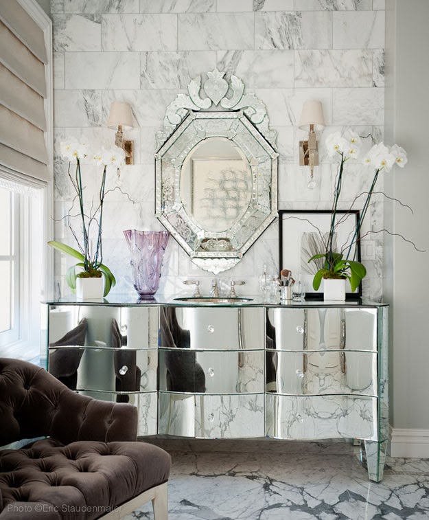
This week's "Fabulous Room" is a striking, glamorous bathroom designed by On Madison in Pasadena, California and photographed by Eric Staudenmaier. The space definitely leans a bit more modern, which I really like. It is a departure on my neo-traditional taste. The crisp, light grey walls are the perfect canvas for the stunning marble floors and modern light fixtures. I like that the designer chose abstract art for the space. The piece behind the tub seems tailor-made for the room. 


{The sole dose of color comes from this lovely, tufted chocolate velvet chair. The glamour quotient gets a major boost from the custom mirrored vanity and Venetian mirror.}

Have a wonderful weekend!


Wednesday, November 13, 2013

A Dream-worthy Bathroom

bath mark williams

I’m currently in the midst of working on a few different bathroom designs for clients, so naturally, I have beautiful bath spaces on my mind. When I came across this gorgeous bathroom by Mark Williams Design on Pinterest, I stepped dead in my tracks. I love the creative use of three different marble tile patterns. While this could have easily looked a little too “busy”, it works beautifully in this bathroom. I also love this bathtub alcove. It is perfectly framed by the window and arched ceiling.

While I love and embrace color, I tend to use restraint with it when it comes to kitchens and master baths. These spaces should be classic and timeless, while one can have a little more fun in guest bathrooms and kids’ baths. So of course, I love that this bathroom is nearly all white—except for the pale turquoise cabinets which are a lovely addition.

Snip20131112_52 {I typically loathe all of the random niches and cut-outs that builders like to put all over new houses, but the niches on either side of the bathtub nook are done so well. I love that the sconces are mounted on top of mirrors. It adds an unexpected dose of glamour.}

Snip20131112_53 {A View of the Full Space}

bath mark williams4

{So  Details to Love: Mirror-Mounted Sconces and Loads of Beautiful Tile}

bath mark williams5

{The Pale Turquoise Cabinets}

bath mark williams6     {I love the large marble tiles used in the shower. I am planning to use them in an upcoming project!}


Signature-3

Friday, October 25, 2013

Fabulous Room Friday 10.25.13


This week's fabulous room is a chic, inviting living room by Brazilian design firm, Bick Simonato. I love the pared down black and white palette. Rather than feeling stark, it feels warm and luxurious when accented by shades of cream and a mixture of textures-- a sisal rug, a piece of coral, a fiddle leaf fig tree. The striped Madeline Weinrib and Madeline Weinrib upholstered pair of Bergere Chairs add a dose of modern glamour to the space. I love that this beautifully layered room is beautifully designed, but feels completely livable and accessible. 

{I'm mad about the fireplace wall. You'll notice the wall surrounding the fireplace is painted a beautiful chocolate color and the walls on either side of the fireplace are mirrored from floor to ceiling. The effect is super glamorous and makes the room feel much larger.}

{Details in the Living Room looking towards the Dining Room}

Thursday, August 15, 2013

The Gorgeous Home of Dave DeMattei and Patrick Wade

{The Beautiful Beverly Hills Living Room of Dave DeMattei and Patrick Wade}

The September issues of the shelter magazines are serving up major style in big, big doses and Architectural Digest is no exception. The new issue of AD features Ralph Lauren's various homes-- it's interesting to see how his personal lifestyle is translated into his brand-- and along with Lauren's houses, the home of fashion executives Dave DeMattei and Patrick Wade. 

DeMattei and Wade moved from San Francisco to Los Angeles three years ago when they took over as CEO and Vice President/Creative Director of Lucky Brand. After living in a Mediterranean-style house in West Hollywood, they eventually settled in this stunning Beverly Hills home. This is the type of style that resonates so deeply with me. Their home features the perfect mix of masculine/feminine, modern/traditional, vintage/new. The house is beautifully layered and I love that they were fearless in using bright colors and bold prints. The 5,000 square foot 1920's Italianate house was remodeled in the best way possible-- paying reverence to its architectural provenance while adapting to the couple's modern lifestyle. Each room is more stunning than the next. Which space is your favorite?
{The dining room is gorgeous, without feeling overly formal. I love the mix of furniture and accessories in this room.}

{How amazing is this kitchen? The Charles Edwards pendant is perfection and the open shelving looks fantastic.}


{The study really exudes California style to me. It features such a great mix of prints, textures, and colors. I don't know if I would be able to get much work done in here though. I would just want to look at my pretty surroundings all day!}
{I adore this bedroom. It is tailored, veers a little more towards the masculine, but features the perfect dose of glamour. David Jimenez has this same bed from Williams Sonoma Home-- it's a classic! The beautiful peacock blue stool is from Todd Alexander Romano.}

{The Fabulous Dressing Room}

{Did you notice all of the great paint selections inside the house? I love the color of the exterior paired with the grey and white striped awnings as well.}


{The Stylish Couple in their Chic Vintage Mercedes}

{Photography by William Waldron for Architectural Digest}

Friday, February 22, 2013

Fabulous Room Friday 02.22.13

sasha adler5

This week’s fabulous room is a peek into Sasha Adler’s fabulous Chicago living room. Sasha Adler is one of the design directors and Nate Berkus Associates and I have admired her undeniably chic style for several years now. Her beautiful Chicago home is featured in the current issue of ELLE. While there is plenty of eye candy, I wish there were more full room shots because I just can’t get enough of Sasha’s amazing style. In the living room of her one hundred year old apartment, Sasha added new bookcases designed to look old and had the built-ins and millwork lacquered in Farrow & Ball’s Pitch Black creating a dramatic effect. The brass grates and picture light balance out the darkness and masculinity. I love how Sasha has mixed silhouettes from various periods and has layered in multiple textures to create a collected, highly personal look with a dose of glamour.

Would you ever try a color like Pitch Black in your home? I will be tackling some design projects at home this weekend and actually can’t wait to get started. Have a wonderful weekend!

{Image Source: ELLE.com}

Thursday, October 11, 2012

Color Dose: Green

Hello, LDV readers!  Kelly here, back with another edition of Color Dose.  Green has long been one of my favorite hues; I adore it in fashion and decor.  I find that it can be bright and cheerful or sophisticated and dramatic, depending on what it's paired with.  
inspiration via

SHOP: (1) Horne Acquamiki Suspension Lamp  (2) Furbish Faux-Malachite Clock (3) Design Darling Green Leaf Pillow (4) Society Social Malachite Pillow (5) Zhush Waylande Gregory Green Leopard Print Coasters (6) CB2 Luck Sidetable (7) Furbish Tribal Basket

Tuesday, October 2, 2012

Eclectic Elegance

lorenzo castillo6

{Bold Patterns and Rich Colors Come Together in a Vignette by Lorenzo Castillo}

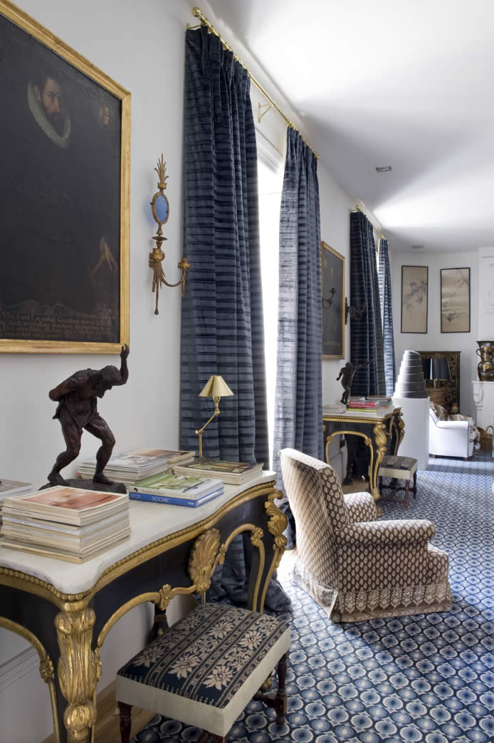
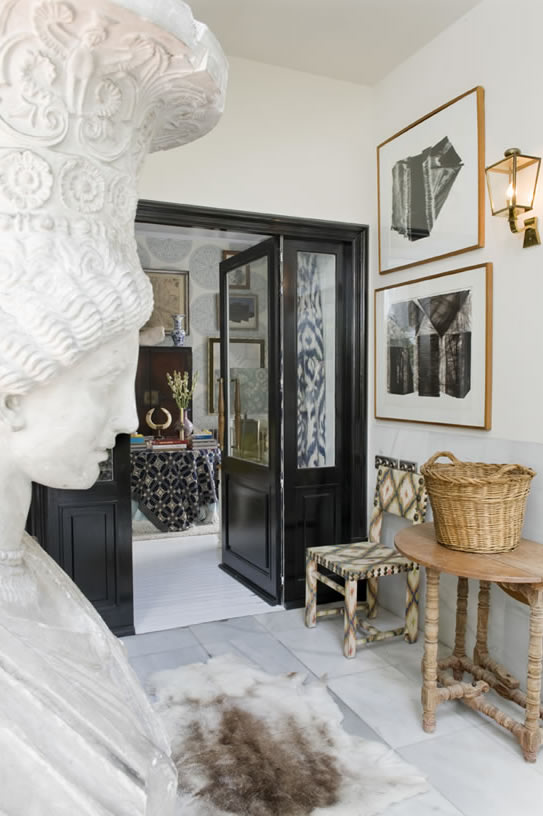
There is a special species of eclectic elegance that European decorators and designers seem to have mastered. Spanish designers, specifically those based in Madrid such as Pablo Paniagua, Luis Bustamante, and Lorenzo Castillo whose work is profiled in this post, are especially gifted at achieving this style. Perhaps it stems from their rich heritage and the proximity to top-notch antiques dealers and one-of-a-kind finds. They design spaces that are filled with magnificent antiques juxtaposed with modern furnishings and abstract art. Each piece seems to tell a story, setting the stage for the characters that surely live in such divine homes. These are the type of layered interiors that make me wish that walls could talk. The look is thoughtful and deliberate, yet each space resonates with an effortless nature. These are not spaces for those whose aesthetic veers towards minimalistic. These are spaces filled with eclectic pieces, bold patterns, rich colors, and art from a cross-section of periods, all composed with brilliant panache.

lorenzo castillo4 {This room is the peak of eclectic elegance. It’s quite chic isn’t it?}

{How gorgeous are these marble and gilt tales? I love the striking contrast against the blue rug.}

lorenzo castillo {A Glamorous Library}

lorenzo castillo3 {Rich, Layered Details}

lorenzo castillo7 {There are so many amazing details in this one photo—the black and white checkered marble floor, the stunning buffet, and the interesting artwork. I love the frame within a frame.}

{Each of the elements in this vignette is clearly special, yet the way in which they are arranged makes the space feel so easy and inviting. I love the reach blue hues of the ottomans and the ikat drapes.}

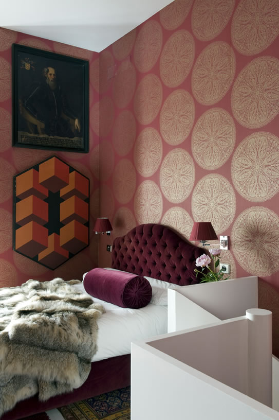
{This is such a chic, eclectic bedroom. I normally don’t love this color, but the burgundy looks beautiful on this bed. The contrast in the artwork displayed is so chic. It wouldn’t work in an average home, but in one as layered as this, it looks fantastic.}

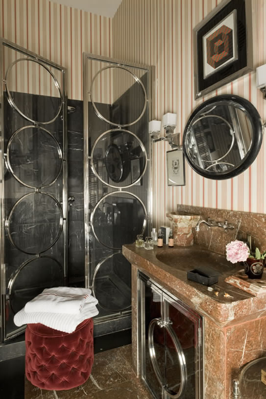
{Are these the coolest shower doors you’ve ever seen? So glamorous!}

{This corridor is so chic. The contrast of all of the materials is unexpected, yet it all works so well together.}

{Can this be my office? Pretty please? Aside from the taxidermy, the space is beyond fabulous. It’s the perfect dose of masculine style with a bit of glamour for balance.}

Could you see yourself living in a home designed in this style or is it something you prefer to admire from afar?

{Images via Lorenzo Castillo}