I often like to play a little game with my husband or even on my own, where you are faced with two options and must choose the one that appeals to you the most. For example: Paris or Barcelona? Chanel or Dior? The Beatles or The Rolling Stones? You get the drift. I thought it would be fun to do “This or That?” features on La Dolce Vita from time to time because I love hearing your opinions and learning more about my readers.
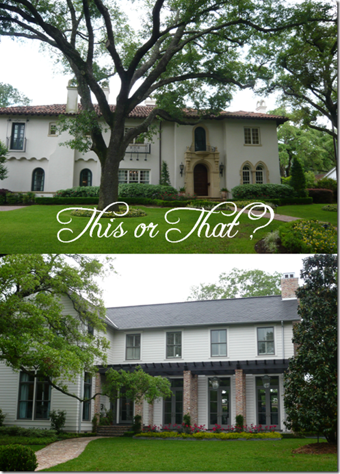
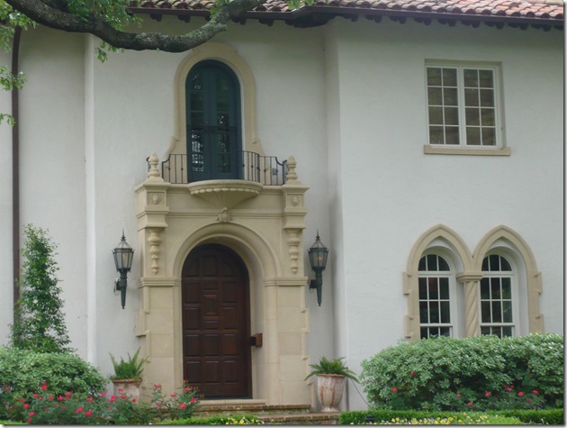
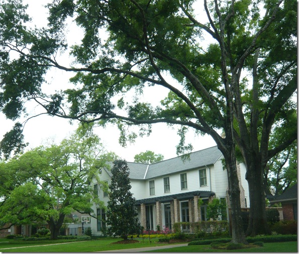
Today’s “This or That?” is a toughie. It presented itself to me when I was driving through one of Houston’s most exclusive neighborhoods, Tanglewood last week. I turned onto this particular street and didn’t know whether to look to my left or my right! On the right, there was a gorgeous Spanish Mediterranean house and on the left another beauty in more of a Coastal style. I asked myself, “Paloma, if you could have either of these houses, which one would you choose?”. It really was a nearly impossible decision because they are both so gorgeous, but as you can see, they are completely different.

{More Details}

{I have to say that pictures do not do this house justice. While it is undoubtedly an attractive house, it is even more stunning in person. Notice all of the French doors. They are on the backside of the house as well. Just imagine all of the gorgeous light that must flood in. Outside, in front of each set of doors, hang the most beautiful turquoise lanterns.}
{Another Lantern in the Port Cochere}
{This house reminds me so much of Erika of Urban Grace. If you are familiar with her work, then you know that is a very good thing!}
So, it’s definitely a tough choice. Both homes are gorgeous, but are obviously very different in style. I wish I could see the interiors! Did you have a visceral response to either one or did you go back and forth like I did? Which would you choose?


54 comments:
this is a hard choice, you are right!! I think I would have to choose, number 2. It is more my taste. I am fairly traditional and love a Coastal look in parts of my home so this house would fit that aesthetic for me. Plus all the French doors would give me the light that I require in a room, love that.Fun post and great idea, Kathysue
I would definitely choose #2. It's more my style and I LOVE french doors and brick columns.
I love option 2, which is perfect since I love sweet Erika! This is a fabulous idea for a new series on LDV. Can't wait to read all the other comments once people weigh in.
You are SO right! Such a difficult choice. Both are stunning! Living in Florida I have come to love an appreciate the true beauty of mediterranean style homes, but those french doors on the coastal style are just asking for the doors to be opened and let the spring breeze through! Absolutely lovely places!
I must say, I am much more drawn two number 2! I love the french doors and the way they let the light in, and the way they are on both sides of the house! The pergola makes this house more warm and inviting than house 1. Don't get me wrong, one is beautiful, but it lacks the warm,home-y feeling that number 2 has!
I'll choose No.1...it's definitely sort of a dream home of mine and I can easily see myself living there! Just like the architecture, those rounded windows make my heart hurt! xo
I'm going with #1, though I could be very very very happy with both!!
I'm a sucker for Spanish Mediterranean, done right. It's really easy to go wrong (and I see it wrong a LOT here in CA).....
No2 No 2 No2!
No 1 is a bit to Disney for us Brits I think, kinda looks like it's made from marzipan ;-)
But, let's face it, who would say no to either of them.....
No2 No 2 No2!
No 1 is a bit to Disney for us Brits I think, kinda looks like it's made from marzipan ;-)
But, let's face it, who would say no to either of them.....
No question - Home #2 for me. I love the French doors and that it gave me a home-y lived in feel. House #1 is just too formal looking for me and my three crazy boys!
#2!
I choose #2. I love all the windows, I have a thing for windows I would be happy if the backside of our house was glass. I love playing the would you rather game.
with only looking on the outisde of the homes, I would choose number 1. This may change though to see the inside.. you never know what your can do in there!
Paloma, this is really tough! I like both for so many different reasons! The architecture styles are so different but each equally lovely....I think I'd have to see the insides to really choose, I've spent 5 minutes staring at the photos and if I HAD to choose, it would be number one...no wait, number two..OH I just can't decide!! :) Fun post though!! xoxo
My gut choice is definitely #2 -- it just feels right. I would love to see the inside though too!
I so love your Houston posts! A perfect little taste of home...I would have to go House 2, mostly because I grew up in a Spanish Style house that I LOVE but for some reason in my (semi) adulthood I always want to try other styles
Home #1 for sure !
Home number one would be my home of choice. Though I'd be happy with either.
Number 2 is gorgeous and more laid back feeling.
Definitely #2, I love the clean lines and the french doors are to die for!
I'd happily live in either, but if I had to choose, I'd go with #2. I can't get enough of all the windows and natural light!
#2 is more my taste, but I think I'd go for #1 -- absolutely love the large oaks on the lot and that entrance is completely divine. (And you're so right: most Mediterranean inspired homes in Houston are a bit tacky...especially in SL!)
i can't believe i'm in the minority, i'd go with #1...without a doubt!!!
think of all the funky yet chic ideas you could incorporate inside :)
Absolutely No. 1 for exterior appeal. Could change my mind after seeing the interior. I like No. 2 but it reminds me of an old farm house that someone has tried to give a coastal appeal to. It is pretty but not georgous.
I think #2 is beautiful! What street are the homes on, I live in the area and was interested in checking them out!
#2. Love all those glass french doors! Love your blog! Have a wonderful day!
just based on looks, i'd go w/ number 1!
There's absolutely no question! Number one for sure. The California Mediterranean style has such an easy elegance. Guests feel at home and comfortable, but the style of the house still allows you to mix formal and casual elements!
Home #1 please, I'm packing my bags as I type!
This would be an extremely easy choice for me...Option Number 1. Even though Option 2 has the clean lines and symmetry throughout which is defined in the fact that this house is a great example of Colonial Architecture, I am innately drawn to the romaticism of Spanish-Mediterranean Architecture. So, Option 1 is what fills my fancy. I so admire the arch primary entrance with its hint of ionic columns. And, the detail of gothic inspired arches over the lower windows also drawns my attention, which are reminiscent of gothic churces whose flying butresses supported the center arches. Love this game!
This would be an extremely easy choice for me...Option Number 1. Even though Option 2 has the clean lines and symmetry throughout which is defined in the fact that this house is a great example of Colonial Architecture, I am innately drawn to the romaticism of Spanish-Mediterranean Architecture. So, Option 1 is what fills my fancy. I so admire the arch primary entrance with its hint of ionic columns. And, the detail of gothic inspired arches over the lower windows also drawns my attention, which are reminiscent of gothic churces whose flying butresses supported the center arches. Love this game!
hands down #1. its my fantasty home. :)
this was such a fun idea! i definitely went back and forth but i think my mind has settled on house number two. you say the words "french doors" and i'm there!
I love them both, but I think out of those two I would choose the first one! I love it!! :)
Home number one has it all. It was conceived in totality whereas home number two is a remodeled farm house. Skinny brick pillars do not an architectural statement make. The windows vary in style from the first floor to the second. The brick chimney and details by the parking area are "underlining" not intrinsic to the integrity of design shown by the first house. The second house is a wannabe, that's all. Ann
Linenqueen, you make some interesting points, but the house is in fact a new construction. The windows on the second story are different because the first one has french doors instead of windows.
9 times out of 10 I'd choose a coastal house - shingled and reminiscent of Nantucket. But this one just doesn't do it for me. I think that almost looks more like the back of the house. I think it's missing shudders or something... So I've got to say the mediterranean style!
Which did you end up choosing?! Did I miss where you said that...?
Alaina
Hi Paloma -
I love doing this and always imagine what I would do to it if it were mine, like flowers, mailbox, lights - all the curb appeal to give the house a bit of my personality. House # 2 would be my choice - love the french doors. It just looks like an easy living, but modern home.
I have an weakness for Spanish Mediterraneans built in the 20's and 30's, so I'd choose the first house-hands down.
I love your blog, but I'm disappointed to see a couple of McMansions featured in this post. There are countless streets in both Houston and Dallas filled with houses that look just like these.
'who does #2 work for?' :) I pick #2..add a few solar panels and it is totally me.
No 2 please...
#2! Love it. I would take either though.
This is a no brainer for me...definitely house #1!! It's dreamy!! But house #2 is lovely as well. If only this were a real choice!! *sighs*
Home #1 for sure. I'm obviously biased though since I live in a Spanish Mediterranean house. :)
#2
X
V
Both are equally lovely, but if I HAD to choose, it would be #1.
I can't really decide which one but I guess I'll just go for house #2. Nevertheless, they are both wonderful.
Coastal home for me, definitely. The Spanish/Med home is gorgeous but not my style. I'm a New Englander at heart.
House #2! The first one is beautiful, but not my style.
Number 1 for me : )
Love you all, . . . and I know you mean well. But, as an architectural historian with extensive background in historic preservation, the answer is clear and definite. The proportions of #2 leave a lot to be desired -- not to mention the mixed design styles. Nice house? Sure! But, the clear winner, for just too many obvious reasons having to do with comprehensive design considerations and detailed embellishments, is #1!
It looks like house Number 2 was just featured in the June/July Traditional Home. It's gorgeous inside!
I absolutely love number ONE!! I can actually imagine (or dream) what the interior looks like! Beautiful tile, wood beams and warm details. Only one question...when can I move in ?!!
Post a Comment