
I have loved Adventures in Renovating a Brooklyn Limestone since I came across it for the first time. Not only is Stefanie, the blog's author completely engaging, but she has excellent photography skills and lives in a gorgeous limestone townhouse in Brooklyn. She frequently shares before and after pictures of her projects in which she showcases her beautiful taste. In addition, Stefanie hosts the most incredible soirees with the most thoughtful attention to detail.
Stefanie has showcased the renovation of her office, bedroom, living room, and kitchen among other rooms. Her kitchen is undoubtedly my favorite room in the house. I love that it feels modern, yet remains in line with the original sensibility of the house. Stefanie and her husband stayed true to the bones of the house without being literal about it. However, the kitchen is completely conducive to modern living. All of this is especially remarkable considering the fact that what is now the kitchen was once a bedroom. Simon and Alex, take note. This is what a Brooklyn Limestone should look like! Thank you so much for being a part of this series, Stefanie!
First off, thanks so much to Paloma for asking me to participate in the series. The idea that anyone reads my blog still surprises me but when its someone so universally respected, I just had to do a happy dance. Thanks again!
On to the task at hand. I'm going to come right out and say it - I have no idea how to define my personal style. I am old enough to know that my personal style is still evolving. What I thought was the cat's pajamas 10 years ago turns my stomach now. I chalk some of that up to maturing but some is just time and exposure. So instead of summing it up in esoteric terms, I thought I'd share a favorite room along with the some of my "rules" I used while renovating my home.
Welcome to my kitchen (look, I bought some bodega flowers just for your visit!)...
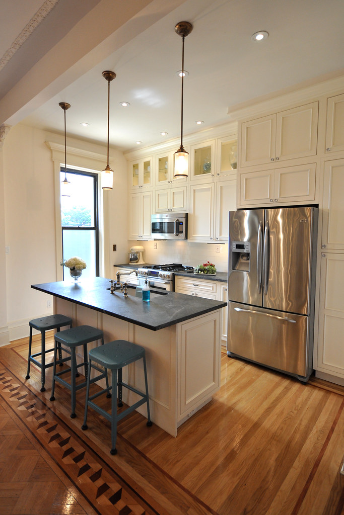
Like in most homes, it’s the nerve center. Its where my husband and I cook, eat, discuss our day, make big decisions and entertain. Is there anything more to life than that? But it didn't always look like this. I give you the "before":
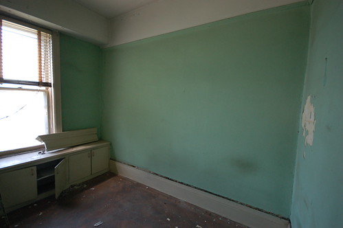
(In case you're curious, it used to be a tiny bedroom.)
How we'd get it from then to now?
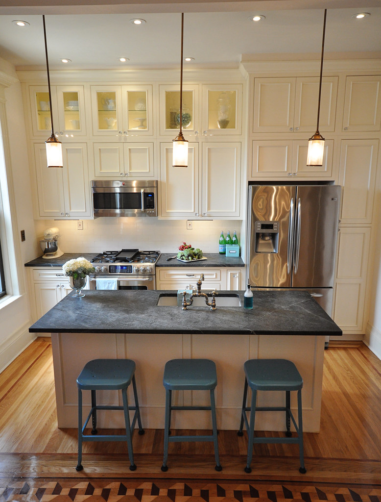
Mixing Old with New: There is no more challenging room to renovate in an old home than the kitchen. How do you introduce all that new fangled equipment into a house that was built when coal stove in the basement was all the rage? What we attempted to do here is to honor the past but embrace the present. We didn't hide all of our appliances or recreate a dark Victorian scullery. We selected cabinetry and materials that gave a bow to the more interesting architectural details of the house but didn't pretend to be originals. We added modern appliances, display and storage. Together it creates a space that immediately feels like home to us. We tried to follow the same idea when renovating the rest of the house as well.
Time travel.: I'm sure this sounds insane but I'm going to share it with you anyway. Before we made most decisions I consulted with my future self. (You can rest easy in knowing that future me never answered back.) The question was always the same: will this still be appreciated down the road? Will I be sick of looking at a certain finish or feature? I can't say we made the right decisions but the intent is to be as timeless as possible. We weren't going to be renovating again anytime soon so it better be right! Anything deemed a fad was nixed with the idea that trends can always be added as accessories.

Use What You Have: Its the oldest form of being green - using materials we already had. Our house was in pretty bad shape so there wasn't much to salvage but took what we could. Case in point the subway tiles we used in the backsplash were the original bathroom tiles. A lot of sweat went into getting those off the wall and ready for reuse but it was worth it.
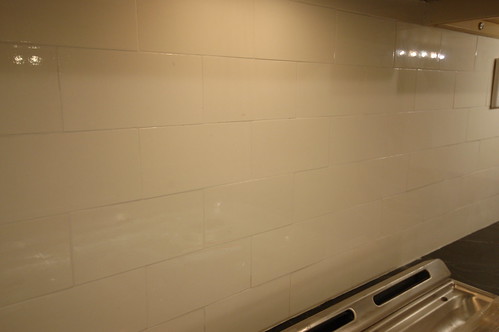
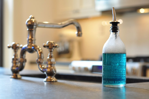
Mix Metals: I struggled a lot with the mixing metals concept. It went against what so many people were telling me to do. Finally I just said enough - I was doing it. And I'm so happy I did. Mixing old brass, bronze nickel and stainless looks just right to me. It added that extra personality and texture I wanted while giving me the a lot more freedom to add vintage and new in the mix.

Lighting: I tend to stick with the idea there can never be too much light. The cost of having a few more lights added while the walls were open is well worth having just the right illumination for any occasion.

Sometimes form does beat function: I don't recommend living by this one but sometimes there is something so important you throw caution to the wind. What am I talking about? Two words: Crushed Ice. Had to have it so I accepted that the fridge sticks out a bit more than I would have liked.
Stefanie has showcased the renovation of her office, bedroom, living room, and kitchen among other rooms. Her kitchen is undoubtedly my favorite room in the house. I love that it feels modern, yet remains in line with the original sensibility of the house. Stefanie and her husband stayed true to the bones of the house without being literal about it. However, the kitchen is completely conducive to modern living. All of this is especially remarkable considering the fact that what is now the kitchen was once a bedroom. Simon and Alex, take note. This is what a Brooklyn Limestone should look like! Thank you so much for being a part of this series, Stefanie!
First off, thanks so much to Paloma for asking me to participate in the series. The idea that anyone reads my blog still surprises me but when its someone so universally respected, I just had to do a happy dance. Thanks again!
On to the task at hand. I'm going to come right out and say it - I have no idea how to define my personal style. I am old enough to know that my personal style is still evolving. What I thought was the cat's pajamas 10 years ago turns my stomach now. I chalk some of that up to maturing but some is just time and exposure. So instead of summing it up in esoteric terms, I thought I'd share a favorite room along with the some of my "rules" I used while renovating my home.
Welcome to my kitchen (look, I bought some bodega flowers just for your visit!)...

Like in most homes, it’s the nerve center. Its where my husband and I cook, eat, discuss our day, make big decisions and entertain. Is there anything more to life than that? But it didn't always look like this. I give you the "before":

(In case you're curious, it used to be a tiny bedroom.)
How we'd get it from then to now?

Mixing Old with New: There is no more challenging room to renovate in an old home than the kitchen. How do you introduce all that new fangled equipment into a house that was built when coal stove in the basement was all the rage? What we attempted to do here is to honor the past but embrace the present. We didn't hide all of our appliances or recreate a dark Victorian scullery. We selected cabinetry and materials that gave a bow to the more interesting architectural details of the house but didn't pretend to be originals. We added modern appliances, display and storage. Together it creates a space that immediately feels like home to us. We tried to follow the same idea when renovating the rest of the house as well.

Time travel.: I'm sure this sounds insane but I'm going to share it with you anyway. Before we made most decisions I consulted with my future self. (You can rest easy in knowing that future me never answered back.) The question was always the same: will this still be appreciated down the road? Will I be sick of looking at a certain finish or feature? I can't say we made the right decisions but the intent is to be as timeless as possible. We weren't going to be renovating again anytime soon so it better be right! Anything deemed a fad was nixed with the idea that trends can always be added as accessories.

Use What You Have: Its the oldest form of being green - using materials we already had. Our house was in pretty bad shape so there wasn't much to salvage but took what we could. Case in point the subway tiles we used in the backsplash were the original bathroom tiles. A lot of sweat went into getting those off the wall and ready for reuse but it was worth it.

Mix Metals: I struggled a lot with the mixing metals concept. It went against what so many people were telling me to do. Finally I just said enough - I was doing it. And I'm so happy I did. Mixing old brass, bronze nickel and stainless looks just right to me. It added that extra personality and texture I wanted while giving me the a lot more freedom to add vintage and new in the mix.

Lighting: I tend to stick with the idea there can never be too much light. The cost of having a few more lights added while the walls were open is well worth having just the right illumination for any occasion.

Sometimes form does beat function: I don't recommend living by this one but sometimes there is something so important you throw caution to the wind. What am I talking about? Two words: Crushed Ice. Had to have it so I accepted that the fridge sticks out a bit more than I would have liked.




22 comments:
* What a MAGNIFICENT "DO", my friend!!! Just WUNNNNNAFUL!!!!
Best,
Linda in AZ *
Oh. My. Goodness. What an incredible, droolworthy makeover! I can't imagine all the hard work that went into creating such a dreamy kitchen. SWOON!
Love the kitchen re-do. I think my cooking skills would greatly improve if I could cook in that kitchen!!
WOW! Let me tell you, I would be one helluva happy girl if I had a kitchen like that!
Kudos to you! :D
Cheers,
Crissy
Oh WOW. That kitchen is an absolute dream! What an amazing makeover :)
What an incredible renovation!!! Seems so bright an open which is awesome. I've lived in a historic home and that was my major gripe.
wowsa...nice reno. proof that simple is best. I can also relate to the ice thing...especially this time of year. I hate ice trays.
Best,
Michelle
I think that Stefanies house is my favorite before and after I have ever seen- every detail they did to that place is just beautiful! Stefanie, the blue stools look great, I LOVE the color you went with :)
What a sophisticated, simple design. Perfection!
What a sophisticated, clean and simple design. Absolute perfection!
I have loved all of Mrs. Limestone's renovations. Her classic taste shines through her entire house.
When I grow up, I'd love a kitchen just like Mrs.L's. =]
I remember discovering her blog last year and whittling away the afternoon hours perusing her archives. I can honestly say that I used to eschew anything old and vintage until I saw these elements thru her eyes!
Fab feature, Paloma!
Great read - I really enjoy Stefanie's blog and I love this series Paloma, xv
love Stefanie's kitchen! One of the best "real" kitchens in blog land!
A great look in this kitchen. I love the idea of using materials from other parts of the renovation from other rooms...repurposing at its finest!
Leslie
Gorgeous!!! What a wonderful remodel and I loveeee the floor to ceiling cabinets!
That is my new dream kitchen! Not too big with lots of storage!
Ok, Missy...I already loved the kitchen....but that old push button light fixture!! Swoon...NOW i am ready to propose to your kitchen.
Yeah...don't worry about it...It's just me in the middle of the night wooing your kitchen. Go back to sleep.
Yes I follow this blog and I just left A Brooklyn Limestone
I love BL and her kitchen and everything she does, she has such a fun way, and does a ton of DIY! I love that!
Okay, I'm lame, but I really want to know where to get the cool bottle to store your soap. I HATE those giant plastic Ivory bottles but I use it so often, it's just silly to put away!
BL is one of my favorite blogs. I ordered the multi-candle candlabra from Wisteria that is taking up space in my closet and it's all her fault. ;-)
That kitchen is absolutely TDF. Does anyone know where to find those stools shown with the kitchen island? They are so charming!
Post a Comment