Hello lovely LDV readers! Nancy of Marcus Design here, happy to be back with another Dissecting the Details installment. Today we are analyzing the fabulous bathroom spaces by New York-based designer Jamie Herzlinger. Let's just say Jamie's designs are polished and refined, yet she is not afraid to make a bold statement! Here are 4 elements that she uses when designing dreamy bathrooms:
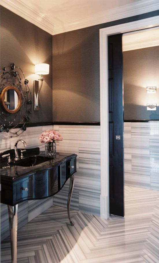
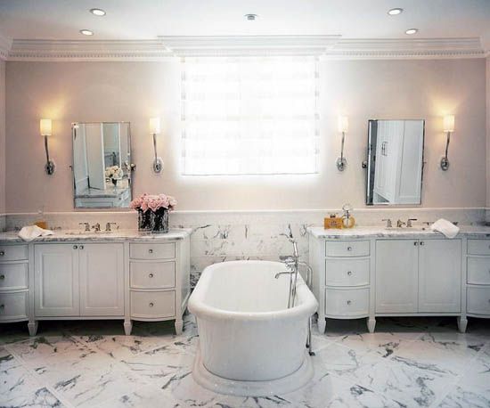
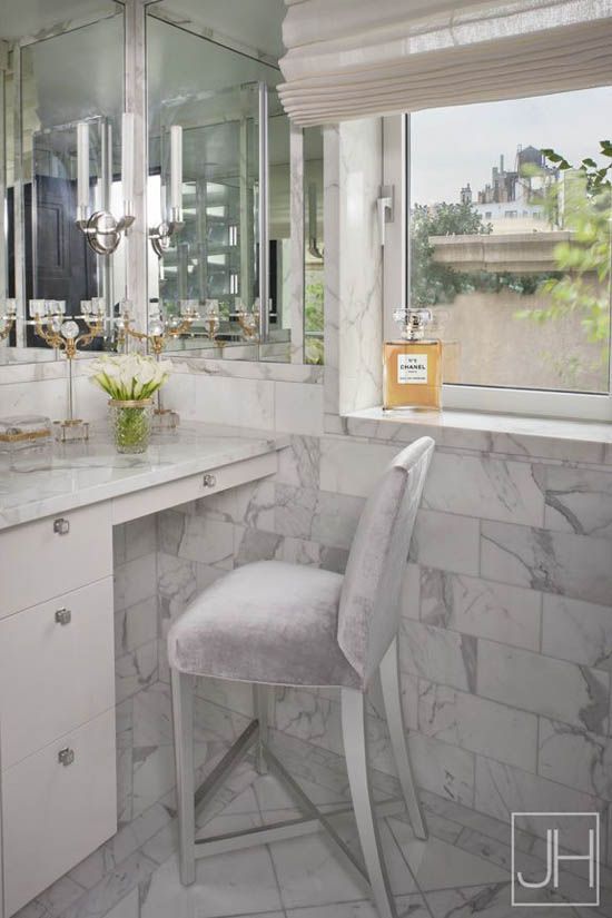
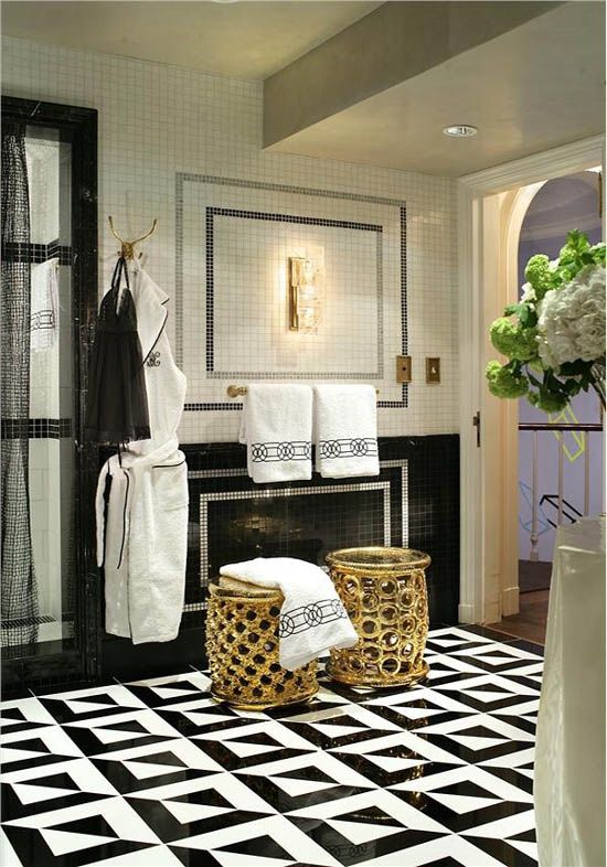
Ok, this detail is my favorite on the list. I adore the natural stones and marble that Jamie selects for her projects. Slather half of the wall in them, and I am in tile heaven!! Half the wall makes enough of a statement without the cost of completing the entire wall.
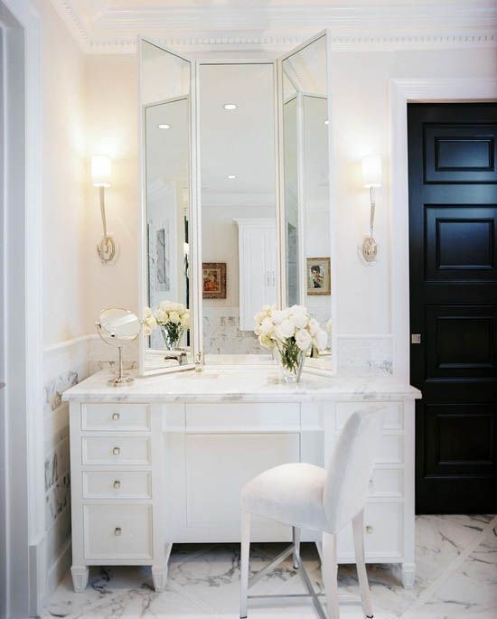
The ultimate luxury; a well-lit designated space for make-up. Whether it's by a window or there are chic sconces just above, this space would be every girls dream! I also love the idea of the wrap around mirror in the first space above, how convenient would that be?
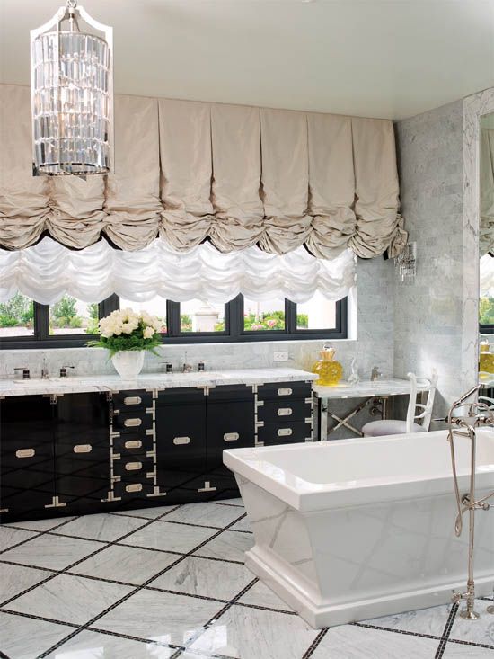
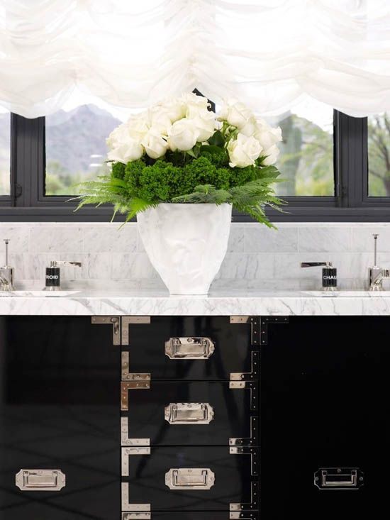
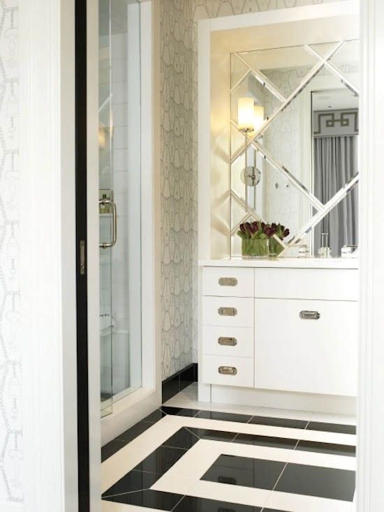
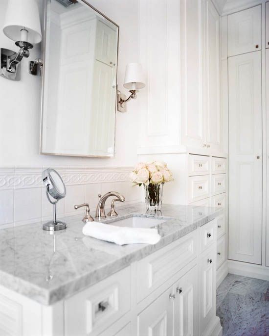
Love the statement that the details on these cabinets make. Bold yet über sophisticated. Whether lacquered with campaign hardware, or covered in creatively designed handles, Jamie tends to stick with a classic black & white palette for all of her bathroom cabinetry designs.
You're probably starting to see a trend throughout these images; black, shades of white, grey, and natural stone - Jamie loves to work with a simple neutral palette. There is nothing more chic and timeless in my opinion, and fixed elements in a bathroom should be as classic as possible in order to stand the test of time.
And there you have it, a few of Jamie's elements that she incorporates into her bathroom designs. Hope these 4 special details inspired you!














6 comments:
That's a great idea to half-tile a wall, especially if you're concerned about costs. It looks so stylish and intriguing. I agree that it's good to keep bathrooms nice and neutral. You can add pops of color if you want in small ways that can be easily changed, but these neutral palettes look so pretty!
Wow, absolutely beautiful. I love how the stone in the first picture is used in different ways to make a chevron pattern.
These are stunning! I would kill for a bathroom with good makeup light!
Lily
http://whilemyboyfriendsaway.blogspot.com/
Wow those are all beautiful, but I keep coming back to that first photo with the half tile... amazing!!
Stunning post! I am beyond flattered!and Thank You does not do it justice!
You made my week!
Tons of hugs and thanks for all the lovely comments,
Jamie Herzlinger
I love the timeless look in the bottom pictures! I didn't know how I would like the half-tiled wall. I like the statement it makes though. It's really eye-catching! http://www.capizzihome.com/services/cape-cod-bathroom-remodel-and-design/
Post a Comment