photo home-76.png photo about-71.png photo contact-65.png photo press-19.png photo LDV.png photo services-7.png

Sunday, May 31, 2009

Wishful Thinking

Do you ever wish you were somewhere else? For no reason in particular, I have been itching to get away. I feel like a need a break... a change of scenery. I think everyone feels this way at some point. I was looking through the pictures on my computer and came across this image from Flickr of a street in Portugal. It would be so great to be riding through the cobblestone streets on that adorable scooter!

If you could be anywhere else right now, where would you be?

Friday, May 29, 2009

Fabulous Room Friday: 5.29.09


I will be starting a new, regular feature entitled "Fabulous Room Friday". Each Friday, I will post a fabulous room that I find inspiring. Hopefully, it will brighten your day or maybe even inspire you to start a weekend project. Please accept my apologies for not posting very much this week. I have had my hands full with my new pup and it has been a very busy week with work.


Back to the subject at hand, the first fabulous room to be featured in this series is by none other than the amazing Amanda Nisbet. I was browsing through her portfolio the other day and noticed that she had uploaded some new projects. This fantastic room was one of them. I think it is just the coolest room for a young girl. I love how the drapes play upon the height of the room. The colors are so bright and cheerful. Would Amanda have it any other way? Of course not! The pillows are very fun and add texture. I think the bedspread is fabulous and the monogram style is not only unique, but age appropriate. Amanda finishes the room off with little details like a silver Moroccan poof, a little yellow end table, pink lantern, and a stream-lined desk and chair. I think any girl would be lucky to have this room!

Images via Amanda Nisbet Design


Wednesday, May 27, 2009

Little Man Tate

This past Saturday, we brought home our new Cockapoo puppy, Tate. We started off on shaky ground despite the fact that we were instantly smitten with him. After extensive research, I found someone I thought was a reputable breeder. I asked her all of the hard questions and everything checked out. It wasn't until we brought him home that we realized she had not been as ethical as she made herself out to be. Upon taking him to the vet for his new puppy exam, we discovered that he has both Giardia and tapeworms. Luckily, both conditions are completely treatable and he should be fine by the time he gets off of his medicine tomorrow. At first I was crushed, I hadn't anticipated a sick puppy and I didn't fully realize how much work it would be until we got him home. I had a few "What was I thinking?" moments, but he has definitely captured our hearts and I am excited to have him as part of our family.

When I contacted the breeder to let her know what the vet had found so that she could check the other puppies she told me that she knew I would be trouble from the beginning. Come again? I can't wrap my head around that. Was I trouble because I asked her so many questions and because I actually take this commitment seriously? Was it because she probably had to go looking on the internet for the answers to my questions? Who says that to someone? I am so glad that I will never have to deal with her again. I feel like we rescued him in a way from someone who obviously didn't really care for him as much as she said she did. I guess things aren't always what they seem and you live and you learn. Luckily for us, we have a sweet little guy who is going to grow big and strong and has a great home now.

Tate is very playful and extremely sweet. He follows us everywhere and likes to lay at my feet when I am at the kitchen sink. He has done a great job of staying quiet throughout the night for the past two days. We are thanking our lucky stars because he literally cried all night the first night he was home. I read that they are crying on that first night to send a signal to their litter mates to come find them. Doesn't that break your heart? Tate quickly learned that he ended up in pretty good hands and he has really warmed up to us.

We are looking forward to our adventures with our little guy!

Tuesday, May 26, 2009

Personal Style, Defined: Lauren of Material Girls

Lauren Haskett is a phenomenal kitchen and bath designer who just so happens to be a fellow Houstonian and a founding member of the fabulous blog, Material Girls. I am sure you are probably already familiar with their coast-to-coast blog, but if you haven't visited in a while, be sure to check it out soon as the entire blog has been completely revamped and is easily the most visually appealing blog out there right now! Lauren is as talented as she is sweet and I am happy to call her a friend. I knew that she would be perfect for this series because she has a great sense of style when it comes to both fashion and interior design.


{Paper City February 2005; Photography by Tria Giovan; Design by: Renea Abbott}

First things first, I would like to thank Paloma for including me in this group of fabulous bloggers and designers. I am certainly in esteemed company!

My personal style has greatly evolved since the days of drooling over plaid sofas (hello, early nineties) followed by my poor rendition of Shabby Chic (no offense, Rachel). Let's just say to this day I could never, ever do a plaid sofa or plaid curtains and any piece of furniture that resembles shabby chic makes me shudder.


I've thought long and hard about how I design and what draws me to certain spaces. What did they all have in common? There are certainly some common denominators that kept popping up... neutral upholstery (preferably cream or white), animal print, lucite, modern art, fabulous old mirrors, Murano glass lamps, seagrass rugs, vintage furniture/accessories, and ALWAYS a graphic or geometric punch.


{Room by Mary McGee via Turquoise Chic}

The phrase I've come up with to define my taste is "comfortable glamour." Two words that could be argued could never co-exist in the same house. I need a room with SPARKLE, whether it be the ever-so-subtle gleam of polished nickel bath fixtures or a ginormous venetian mirror. The practical side of me says, "but wait, I need a comfortable couch that I can eat ice cream on and watch 'Real Housewives' marathons." To me, glamour and practicality must find harmony in my spaces.

{Gerrie Bremmerman via Things that Inspire}

I think you must, must, must mix the old with the new. I love that designer Gerrie Bremmerman paired blue blood antiques with the more modern Barcelona Chair. Those huge mirrors aren't too bad either...
A room full of antiques may look "expensive" or uber-traditional, but to me it's often stale and stodgy. On the other hand, a room designed with only brand new pieces from chain furniture showrooms and accessories plucked from the shelves of discount super stores has no soul.


{Room designed by Jan Showers; Photography by Ka Yeung}


It's really hard for me to pin-point why I love this living room so much. It's eclectic vibe is sophisticated but at the same time, I'm sure this room has seen it's fair share of crazy parties.


Finding personal style is all about experimentation. High risk can yield high rewards - don't be afraid of failing...my ghosts of design pasts only strengthened my decision making ability today.


Lauren, I couldn't agree more with your philosophy on personal style and interior design. I love your idea of "comfortable glamour". I think it is the look I gravitate to the most. Thank you so much for participating!

Friday, May 22, 2009

Happy Memorial Day Weekend!

This weekend seems to mark the official start of summer! I am excited for swimming, lemonade, cute sandals and the sound of cicadas. Whether you are taking a trip for the long weekend or staying home and relaxing, I hope you have a wonderful three days.

We will be taking a little road trip tomorrow to bring our new puppy home! We finally found the perfect little guy for our family. He is a Cockapoo (Cocker Spaniel/Poodle mix) and he has already stolen our hearts. I have been busy with preparations for his arrival and doing as much reading and research as I can in order to be a good puppy mommy. It is sure to be an adventure! I will have plenty of pictures and details on our little guy on Monday. I am still debating between naming him Tate or Oliver. I love both names. Maybe Oliver Tate? The previous contenders were Milo, Rufus, and Baxter, but we've narrowed it down to two options. What do you think?

Image via Country Living

Thursday, May 21, 2009

High Fashion Home: Max Azria

The home of fashion designer Max Azria and his beautiful wife Lubov is nothing short of show-stopping. Over-the-top and dramatic to the core, the home almost feels like a movie set. This has to be a fantasy, right? Wrong. It is real! Max was dubious when his wife first announced that she wanted to design the L.A. mansion in the Holmby Hills neighborhood herself without his help, but she did just that after their decorator quit upon her insistence to use a piece of petrified wood in the foyer. The petrified wood is just the beginning. The house definitely takes its roots in fashion and it shows. Each room is larger than life and filled with the fun details that characterize Azria's designs. It is not a classic or timeless house by any means, but it is fashion-forward (for the time being). I suspect that the décor changes with the seasons just in time for the new collections. I certainly don't love the entire house, but there are specific rooms and elements that I think are fabulous. Honestly though, it takes a lot of moxie to live in a home with such a huge personality and that is most definitely something to admire.

The entire Azria Clan pose in their living room complete with an orange horse and laser-cut floral garland hanging from the ceiling.

Max and Lubov Azria lounge in a bubble chair amongst the stars, or starburst mirrors.

Bold Pillows Play Against the Silver Bergere Chairs in the Foyer

This piece of petrified wood served as the inspiration for the house. Lubov eventually had a cascading crystal chandelier built into it to mimic a waterfall. See what I mean? Doesn't it feel more like a movie set than a home? I just can't imagine getting used to this and feeling at home, but to each his own.

Azria's office features a full spectrum of colors, including a Paul Smith-designed rug from the Rug Company.

"A built-in banquette anchors a wall of colorful artwork."

Lubov and daughter Agnes pose in the spa. The doorway is great!

The library is my favorite room in the house. It is much more subdued. I love the use of soft grey as well as the fantastic monogram pillow.

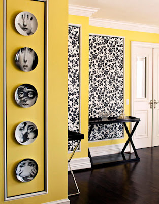
This bold corner features lively yellow paint, contrasting wallpaper and Fornasetti plates.

In the end, interior designer Aly Daly helped Lubov and Max to carry out their vision for their home. Daly designed this custom series of light fixtures for the dramatic sitting room.

The dining room features a mirrored sideboard and silver walls.

It also features a Tord Boontje for Swarovski Crystal Palace Chandelier and a mirrored fireplace.

The Moroccan-inspired outdoor living space features a group of Moroccan lanterns and metallic poufs.

How do you feel about this glamorous home? Do you love it or hate it?

All images via Harper's Bazaar

Wednesday, May 20, 2009

Personal Style, Defined: Julie of Shelter

I am so excited to bring you the second installment of my "Personal Style, Defined." Series! This time around, the incredibly talented Julie Richard of Shelter will be sharing her favorite space with us. I started reading Julie's blog earlier this year and was instantly smitten. I couldn't believe how many images I loved on her blog. It was like finding my blogging soulmate! Needless to say, I love her taste and think her work is amazing. Today, she will be sharing her son's amazing nursery with us and I must say, this one is going in the inspiration files for the future. I think it is quite possibly my favorite nursery ever! Thank you so much for participating in this series, Julie!

First off I want to thank Paloma for including me in her group of wonderful bloggers to take part in this series.

My personal style is always evolving, it truly can change with my mood. Usually when I create rooms, I work more on feeling and emotion. My ultimate goal is create rooms that reflect my client's desires both aesthetically and functionally. On the same note, I don't think I could create a room without infusing some of my personal style.

Stylistically I am drawn to designs {fashion, interiors + landscape} that contain an interplay of classicism and modernism. I appreciate both alone, but when paired, they soar.

The rooms I design are all about balance and the art of layering! Contrast in materials, texture, color and shape are key. Comfort is also very important. I love rooms that look inviting, have depth, and contain a hint of glamour. The glamorous facet can be introduced in the subtlest of ways, but if you remove it, I think you tend to loose some of the "wow" factor. I also love a room that hasn't been taken too seriously by the designer. I think that is why I loved Domino so much.
I wanted to share a personal space with everyone. Pictured is my son's bedroom. The architecture of my home is classic so I wanted to create a room with modern influences.
I approached the room with an object that inspired me. In this case the launching point was a graphic print elephant pillow by Dwell Studios. I didn't want a room that screamed sweet baby. I wanted the space to have some longevity. So the color palette stemmed from the pillow. I used greens, turquoise, a smokey aqua blue, chocolate and a warm white. I don't like rooms that feel too perfect, so I usually try to throw them off a bit if they start to feel contrived. I wanted to balance the organic shapes of the carpet and pillow with something cleaned lined, hence the graphic stripes. This room is really about the relationship of each chosen object to the whole.
My son's room exemplifies my personal style because it's an interplay of shapes, colors, textures, materials and forms. I tried to keep it from getting predictable. It contains color, new pieces, old pieces, self made and found objects. It's classically modern with a touch of glamour. The lucite and mercury glass lamp provide the needed pop. I enjoy designing rooms that look as if they have evolved over time. I approach my wardrobe in the same way. Anyone can walk into a clothing store and purchase the outfit on the mannequin. The most enjoyable aspect of design is making your style feel unique! I really wanted to create a fun, dynamic, graphic but comfortable space for my son.

To answer your question Paloma, my favorite thing in the room besides my little guy, is the changing table. I love to design furniture. Most of my interiors will contain at least one piece that I either re-vamped or created from scratch.

I designed the changing table and my father constructed it. The top can be removed, so the bins can be filled with books, toys and whatever my son collects as he grows older. It's a special piece for me because it was truly a collaboration between my father and I. I believe rooms should have the ability to evolve over time. They should have a sense of meaning for the owner.

I always tell clients, let's choose what you love, because you will be enjoying this space after I am long gone {as in, finished with the job}.


Thank you for sharing your son's fabulous nursery with us, Julie!

Tuesday, May 19, 2009

Style Profile: Moises Esquenazi

I recently learned of Colombian-born designer, Moises Esquenazi for the first time and have been mesmerized ever since. The jack of all trades has been an architectural renderer, animator, photographer, and now focuses on his interior design business which includes creating spaces for clients as well as designing furniture and wallcoverings. Instead of focusing on a particular style, he strives to integrate the client's background with the style of the architecture and the local surroundings, and always allowing function to guide the design. Having the focus on function permits the client to drop some pre-conceived ideas of what the space should look like, resulting in a more creative use of elements, such as the daybed which has become a signature element. The idea of a daybed allows families and friends to take off their shoes and gather in a cozy area to relax and visit.

Esquenazi, who has been featured in publications such as House Beautiful and Metropolitan Home often mixes many different styles and price ranges in order to make the home feel cozy and inviting. "I try to find pieces that are elegant but not formal. That's the through line. If you feel like you can't put your feet on it, it's too rigid. I want things that you can scratch or dent or eat ice cream on. But I want them to look like they came from all of these different places and times in my life and travels."


Esquenazi's Los Angeles bungalow was featured in House Beautiful.
I love the suzani and ikat pillows he used in his living room.

Sitting Area

Esquenazi's dining room features a mixture of styles.

This bathroom is great! I love the paint color, the dark cabinetry, inlaid mirror, oval shower curtain rod, and the gorgeous blue seltzer bottles.


When asked by House Beautiful if he thought his choice to paint the bungalow's small bedrooms in dark shades made them feel even smaller, Esquenazi replied: "Not necessarily. And besides, I don't mind a bedroom that feels small, especially since its primary use is for sleeping. Why should it not be dark, moody, or sensual? It really is a kind of sanctuary — even if you still can hear the helicopters zooming overhead, going to Paris's house."

The guest bedroom features rich jewel-tone colors.

Because his bungalow is very small, Esquenazi opted to utilize the outdoor living space to the maximum. He divided it into several "rooms" in order to take full advantage of the beautiful California weather year round. "The yard was grassy and all one level, so I put in a deck near the house, then created these different areas so it unfolds as you walk back toward the cabana. I put in a lot of plantings around the deck area. I wanted you to be in the house and see all these plants, and then to look beyond and see more garden. That makes it look more expansive than seeing it all at once."

Esquenazi's Palm Springs home was named as one of Metropolitan Home Magazine's "Best Homes in America". How fabulous is this entrance?
While the look of his Palm Springs home is just as eclectic as that of his Los Angeles home, the furnishings here are decidedly more mid-century. I do like some of the elements in this room, but I am not a fan of the carpeted bench/sofa thing.

I love the color of the cabinetry in the kitchen!

This guest room is equal parts sweet and funky.

How is this for dramatic effect? I love the use of simple, white linens against the huge, turquoise upholstered headboard. What a statement!

I think the pool area is my favorite part of the house. It is quintessentially Palm Springs!

Check out the pink mosaic tile trim in the pool.

The Fabulous Outdoor Bar

A View of the Magnificent Architecture at Night

Images via
Moises Esquenazi