










photo home-76.png photo about-71.png photo contact-65.png photo press-19.png photo LDV.png photo services-7.png

Thursday, February 21, 2013

Dissecting the Details: Living Rooms by Colleen McGill

Hello lovely LDV readers! It's Nancy of Marcus Design, back with the latest installment of 'Dissecting the Details.' Today we are taking a closer look at the über chic living rooms created by one of my personal design-heroes, Colleen McGill. The gorgeous spaces below have a calm and inviting feel, and that young traditional vibe that I just can't get enough of! Let's examine what makes these spaces sing, shall we?


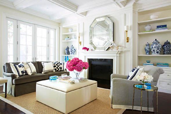
You can't start off better than to create good bones in a space. If a coffered ceiling and built in shelves are out of your budget, how about a simple DIY paneling project to get the effect of the room above?

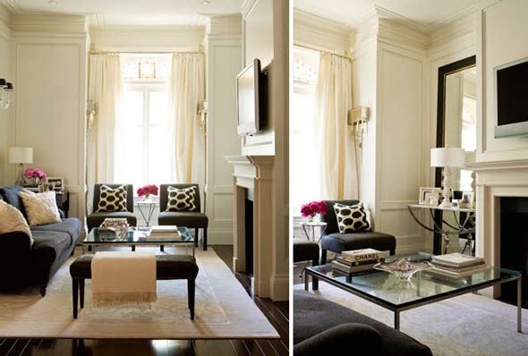

A living room should have at least 3 'tiers' of lighting: ceiling fixtures, wall sconces a level below, and then table lamps even lower. This effect of various levels of light brings interest, depth and warmth to the space.

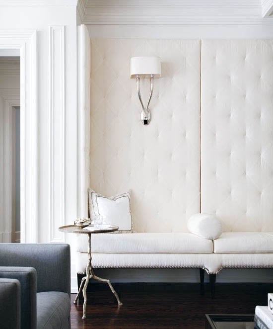
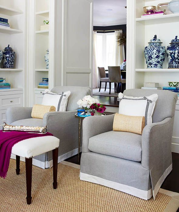

A pair of side chairs, benchs, ottomans that double as extra spots to perch; all of these are chic ways to bring in more seating and create a very inviting space. And seriously, how inviting is that built-in tufted bench? Beauty!

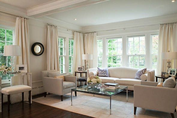


Colleen's signature style is definitely a neutral back-drop with just a dash of color and pattern brought in with accessories, like the Madeline Weinrib pillows and blue and white ginger jars above. How easy would it be to change this up with the seasons? Love it.
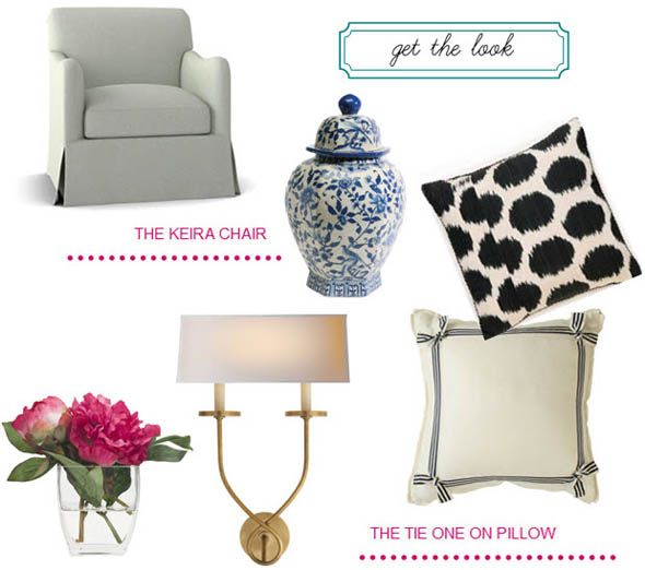

Colleen's new line of furnishings includes this fab keira chair, and the tie one on pillow. A ginger jar collection will never go out of style, and the ikat pillow from Madeline Weinrib adds graphic pattern to keep neutral far from boring. And finally the symmetric twist sconce from Circa Lighting would add glamour to any living room. Now I've got myself dreaming of changing up my entire living room decor!

Wednesday, February 20, 2013

A Chic Houston Home

17

{Guests are greeted by this stylish vignette upon entering the home.}

While flipping through the pages of Luxe the other day, I was happy to see a spread on a beautiful, glamorous home designed by Ashley Goforth, one of the interior designers in Houston whose work I most admire. Ashley’s work is characterized by a balance of masculinity and femininity as well as by a striking use of color. Naturally, she is a designer after my own heart.

Ashley designed this home for an old friend from college and her husband—a stylish couple that had recently moved from New York to Houston. Ashley set out to create a chic, urbane home for them with the style of Manhattan and tailored polish of the Bayou City. I am thrilled that Ashley shared some additional, unpublished images for us to enjoy today.

12 {The formal living room is a study in symmetry. This is definitely one of the more feminine rooms in the home, especially when you compare it to the more laid-back family room below.}

09

{The dining room has a lot of the same elements found in the living room including the lovely taupe drapes and soft color palette.}

11 {The family room takes a more masculine and laid-back approach while still appearing quite polished. The color palette is much warmer here and you’ll notice a variety of textures. The home showcases the couple’s expansive art collection quite beautifully.}

21 {The kitchen is so classic.}

15 {I love the juxtaposition of the more traditional kitchen with the modern, graphic art and the modern furniture in the breakfast area.}

14 {The tulip table, Flat Bar Brno Chairs, and custom chevron banquette are so fun!}

19 {The study exemplifies a balance of masculine and feminine touches. You have the graceful lines of the chairs and sofa paired with a warm gray palette and masculine details like the leather pulls on the cabinets and drawers.}

02 {The guestroom is my favorite! I love the bold, graphic contrast of the charcoal walls, crisp white linens, and touches of gold and cobalt.}

05 {The master bedroom is slightly less dramatic, but no less lovely. It’s such a soothing space.}

08 {The Serene Master Bathroom}


{Images by Nick Johnson courtesy of Ashley Goforth}

Design Under the Influence: Morris Lapidus & The Miami Baroque

”My whole success is I’ve always been designing for people, first because I wanted to sell them merchandise. Then when I got into hotels, I had to rethink, what am I selling now? You’re selling a good time.“ ~ Morris Lapidus
Hello, it's Erika from small shop, with a new edition of "Design Under the Influence!" Last week I had the opportunity to go to Miami for the first time, and I could not wait to see the $1B renovation of the famous Fontainebleau Hotel. Originally designed in the 1950's by architect Morris Lapidus (he also designed the Eden Roc and the old Americana Hotel), it was once called ''the nation's grossest national product.'' Now however, it is the #1 hot spot in Miami Beach! So, I thought it would be fun to celebrate the man credited for creating the Miami Baroque style we all know and (now) love.
In a time when America was experiencing a post-war boom, Lapidus sought to break away from the more modest, unembellished Bauhaus style that was popular in the architecture world to produce works that allowed people to show off their newly-acquired wealth. Even though his work was criticized as being vulgar, obscene and kitschy, Lapidus relished in the pretentious with sexy lounges, curvilinear pools and grand staircases, ultra-plush seating, dramatic canopies and atriums. He designed both interior and exterior, at every turn pampering and indulging guests -- like putting live alligators in the lobby of the Americana, or creating a lavishly grand staircase in the Fontainebleau that led to a coat room so that guests could strut their stuff down the steps in full view. And despite the critics, Rat Pack-ers and Jet Setters alike would happily flock to his flamboyant playgrounds.
If you haven't seen it in person, you may recognize the Fontainebleau from the James Bond flick Goldfinger (1964). Let this short trailer give you the gist:
Appropriately enough, Lapidus titled his autobiography, Too Much is Never Enough. He passed away in 2001, after a prolific career that spanned five decades, and included designs for over 1200 residential, hospitality and retail projects around the world. He even lived long enough to help restore a few of his own works (how cool is that?), and pick up an American Original Award from the Cooper-Hewitt in 2000.
Today, we celebrate his sumptuous style, can't wait to escape to the exuberance; contemporary designers such as Rem Koolhaas and Philippe Starck refer to his work with much respect. Lately he is even being heralded as "a postmodernist long before the term existed."
What a legacy he leaves behind.

Tuesday, February 19, 2013

My Favorite Room: Nathan Turner

Hi, everyone! I usually don’t interject in guest blogger’s posts, but I am so thrilled to have one of my favorite designers, Nathan Turner share his favorite room with us today. Doesn’t it make you want to head straight to the beach? Check out his favorite space in his own words below. XO, Paloma

Bra Kitchen still life 2079

My favorite place to be is at the weekend home I share with my boyfriend Eric in Malibu. When not on the beach, my favorite place to be is our living room. It makes me happy because it’s comfortable, cheerful, and not too fussy…just what beach living should be. One of my favorite things is the giant bulletin board. We have an old Polaroid camera, & since we entertain so much, we like to capture all of our guests and pin them up on the board. I love how the white batten board paneling (painted in Benjamin Moore Super White) keeps the room feeling fresh and clean no matter what season we’re in. We chose durable fabrics and slipcovered everything so there’s no worrying about wet dogs and sandy feet, keeping everything California casual…just the way I like it.

Bra Kitchen still life 2082

Bra Kitchen still life 2084

Bra Kitchen still life 2088


{All Images Courtesy of Nathan Turner}

Monday, February 18, 2013

Glamorous Powder Rooms

ec971d3a37bebb3fbdf3995fd2ca77a6[1]

{This powder bath by Melissa Warner Rothblum of Massucco Warner Miller featuring a marble washstand, Scalamandre’s fabulous zebra wallpaper, and Alexa Hampton’s Ginger Sconces is an all-time favorite of mine.}

The longer Fabian and I have lived in our home, the more we love it. I am currently working on a few design projects around the house and promise to share photos soon. Our house has been really great for us. We have four bedrooms and plenty of space, but I only have two full baths. The thing I constantly find myself wishing for is a little powder room that I can go to town on design-wise. I wish I had a tiny little bath that I could dress up in a fabulous wallpaper combined with a gorgeous mirror, classic sink, and some beautiful lighting, of course. While I gravitate most towards the stunning powder bath above—I just want an excuse to use Scalamandre’s iconic zebra wallpaper, I love all of the powder baths in this round-up.

9ef424e668026eb19e28bf0e10135b33[1]

{I adore the bold, bohemian quality of this powder room. I would choose different light fixtures, but the wallpaper, matching drapes, classic sink, tile, and glamorous mirror are perfection. This feels like a little jewelbox.}

{This powder bath by Gluckstein Designs is glamorous and elegant.}

{By keeping everything mostly monotone, Tiffany Eastman creates drama in this pretty powder bath. The neutral palette allows each of the statement pieces to really stand out.}

click to view full size

{How amazing would it be to do a powder bath in this amazing ikat tile by New Ravenna Mosaics?}

{There are so many fun elements in this powder bath from the red campaign wash sink stand to the Venetian mirror and patterned wallpaper! | Image via Houzz}

{This powder bath via ELLE DÉCOR has stunning bones going for it. I personally love a good chocolate brown paint. When you find the right shade, it can looks so rich. Of course, the lacquered door is fabulous, though there probably isn’t much privacy as a result. I am a little confused by the teeny tiny lantern and the sconce hung at ceiling level right next to it. Other than that, this space is a true classic!}

Which of these powder baths is your favorite? Is there a specific type of room you wish you had in your own house?