{I have also toyed with the idea of replacing our simple wood table with a white marble-topped Eero Saarinen Tulip Table. I was this close to ordering it but it wouldn’t have made it in time for the shoot and it’s been on the back burner ever since.}
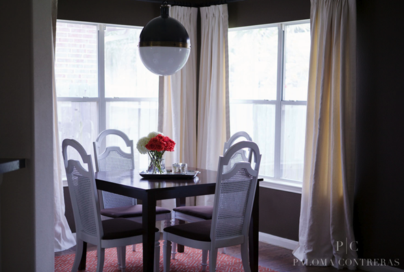
{View from Family Room towards Breakfast Room}
I have narrowed it down to two options:
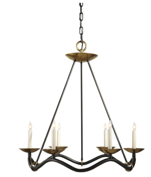
{Option 1: I have loved this Choros Chandelier by Barry Goralnick since it was introduced last year. The contrast of the Aged Iron and Antique Brass is beautiful while the shape is so organic and really makes a statement.}
{Option 2: I also love the elegant simplicity and clean, open lines of the Darlana Lantern in Gilded Iron. It is a chic piece that lends itself beautifully to any style space.}
Please help me choose! Should I go for one of these options or stick with the Hicks?
If you’d like help transforming your house into a home you love, contact me about my design services.


29 comments:
I like the first one! So glamorous!
Both such beautiful choices! The Choros Chandelier definitely makes a statement but we love the darling Darlana!
I absolutely adore the first one. I think it lends a feminine touch to your room.
I love the Choros Chandelier!
I think Option is best for your style chairs and table! It's beautiful.
The lantern is nice but I think the Chandelier would complete the space. W/the curves I think it seems more like your style - plus the 2 finishes are so elegant.
I think that the tulip table would look great with the Choros chandlier. I agree with My Notting Hill, the Choros seems more your style.
I vote for Option 2.
The first one!
~Karen
http://fashionboardconfessional.blogspot.com
love them both!! but think option 2 may stand out more with your dark walls. And boy I can totally relate with being able to help clients make decisions -it takes me FOREVER to do something in my own home and then we I finally pull the trigger I am already tired of it and want to start over! LOL
Looking forward to having coffee with you soon!!
I've been in love with that lantern forever, and I think it would look fabulous in your space!
If these are the two in the running, go with the Choros Chandelier by Barry Goralnick.
out of these two - i'd pick the second one, but they are both great! can't wait to see what you choose :)
-- jackie @ jade and oak
I'd say the Choros, especially if you go for the tulip table (which, incidentally, I think would be a fabulous choice for your space).
I prefer option 2 - I see the hicks pendant everywhere - its soo good, but I always prefer being unique.
I vote option 2
I love # 2! # 1 is stunning, but what you would expect to find in a dining room.
Great choices, but my gut says the Choros. I recently used the Vendome and Ziyi in clients spaces and they're beautiful also (not to confuse you more)! I can totally relate to mental block when it comes to our own homes. Good luck, it's going to be beautiful regardless!
LOVE the lantern!
Option #1!
Neither. You have lovely light in that corner. Don't waste it. Soften your interiors by going with something with crystals. You will love this look!
I vote for Option 2. I think that light would look beautiful in that space.
I would stick with the Hicks and use the $ saved to purchase that new dining table. While the Hicks is popular, lanterns have really been overdone!
First one hands down. It has that wow factor that the other one doesn't.
Anne
All three fixtures are lovely...but I say, ditch the Hicks. It feels too heavy for the space. The lantern is gorgeous, but I see this more over a kitchen island -a pair, maybe. My choice would be the Choros. I like the balanced contrast of the circular shape over the square table, and the wavy curves reflect your dining chairs. Perfecto!
2nd :)
The lantern!
My vote is for the Choros. I agree with the comments that the Hicks is too heavy? Te Choros is elegant and will be beautiful and a great fit in your room?
I say, if you still like it - keep it! It's kind of frivolous to replace things because they become too popular, trendy, or even unpopular. If you no longer like it however, that's reason to change it.
Leslie
Post a Comment