Ever since my buddy and High Gloss Magazine Art Production Manager, Dabney Lee chose this gorgeous Lucite and burl wood Jonathan Adler desk from Pieces for her “Lust List” in our April/May issue, I haven’t been able to get it out of my mind. The clean lines make the desk pretty timeless, but the fabulous combination of the wooden top with the Lucite legs make it quite the statement piece. Since it is neither overly feminine or masculine, I thought it might be fun to style it two ways: for him and for her.
{Clockwise from Top: Lizard Desk Caddy, Thomas O’Brien for Circa Lighting Kenton Desk Lamp with Metal Shade, Ace of Spades Tray, Jayson Home and Garden Rivington Chair, Wisteria Graphic Suzani-Inspired Dhurrie, Furbish Studio Jolly Roger Horn Box, Milan High-Back Espresso Chair}
For him, I chose a look that was fun and youthful, yet polished and sophisticated. This isn’t meant to be your dad’s office, but your husband might love it. I chose strong, masculine lines and a bold color palette used with restraint. I actually wish I could bring this to life for my own husband because I really like the way everything came together.
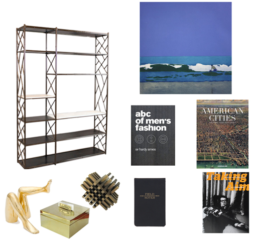
{Clockwise from Top: “Man in the Waves” Painting by Isca Greenfield-Sanders, American Cities, Taking Aim, Field Notes Notebook, Objets d’Art by Kelly Wearstler, Bronze Fretwork Bookshelf from 1960s, ABC’s of Men’s Fashion}
I am crazy about this vintage fretwork bookshelf found via 1st Dibs. It could work just about anywhere, but an office would obviously be a natural fit. The bronze finish makes it feel a bit more masculine and less flashy than if it were chrome. The deep blue hues of the painting by Isca Greenfield-Sanders are so beautiful and set such a great tone for a working space while the books and objets by Kelly Wearstler add a touch of fun.
{Clockwise from Top: Suzanne Kasler for Circa Lighting Thorton Table Lamp, Color Pencil Set with Brass Holder, Pink and Gold Lacquer Bowl, Serena and Lily Louise Chair in Night Leather, Set of 3 Ikat Notebooks, Midcentury European Carpet, Z Gallerie Eddie Chair}
For her, I decided to go with fun, bright colors, naturally! I chose pieces, such as the chairs with curvy shapes and deep colors. I also decided to use gold and brass accents for a touch of glamour. The beautiful vintage rug brings everything together and makes a big, bold statement.
{Clockwise from Top: “Modern Romance” by Yolanda Sanchez, Gold Leather Dictionary, Objets d’Art by Kelly Wearstler for Bergdorf Goodman, HUE by Kelly Wearstler, Chevron Mirrored Credenza, Dolce Vita Style, The Well-Lived Life, In the Spirit of Capri}
I am absolutely crazy about the mirrored chevron credenza from Circa Who in Palm Beach, Florida. It just may steal the show from the beautiful desk we’ve been focusing on. Along with some stylish books, a gold dictionary and some lovely objets d’art, it is the perfect piece for completing the glamorous look for “her office” (I wish it were mine!). So there you have it, my take on two completely different looks inspired by one fantastic piece of furniture. Which one is more your speed: his or hers?









16 comments:
I lust after the desk in-person often at the JA store :)
love this! the desk is great, as is your styling!
Gorgeous collections you've put together with that desk. I actually just ordered the Bond console and dining room table for my dining room, they are being shipped as we speak (to Canada, hoping they arrive intact!). I had been having difficulty selecting a table when I first spied it at the JA store on a trip to New York in November. I'm pairing it with eight Knoll flat bar Brnos in black leather. Hoping they will work together well.
what a lovely post..love both the collections..infact the winged chair in both the round-ups are just amazing..loved them! have lovely day, paloma..do visit my blog when you have a moment..it is all about 'mediterrnean minimalism' today..xx meenal
Love that desk, very chic.
A Girl's Next Best Friend
I love this!! Both looks are great and fit perfectly! Thanks for sharing
http://simplicityisultimatesophistication.wordpress.com/
Just beautiful. Perfect styling too! Thanks for the inspiration!
I adore that console! And your moodboards are lovely...
Hugs & kisses from Rio!
http://acasadava.blogspot.com
THAT CHEVRON MIRRORED CORDENZA!!!!
I'd pick the lady version. I think this is a pretty cool series as well.
oh that CONSOLE... i'm drooling!!!
Both versions are wonderful but I prefer the lady's version. Love the pink artwork and the gray chair!
Have a wonderful day!
Jessie
www.mixandchic.com
Adore both versions especially the ladies!!
Come and enter my new Giveaway from Tracy Porter!
xoxo
Karena
Art by Karena
have been coveting that desk for ages now! i just now become aware it also comes in a credenza :O uh oh!
lovely styling. love your blog!
Rai
http://raianashanesedesigns.blogspot.com
Anything with burlwood and Lucite is genius in my opinion.
LOVE the combos, esp. with the hot pink and gold (obviously!).
I think I need to get that bowl.
so chic! I especially love the "for him" since modern man spaces are so hard to pull off! My hubs loves traditional and modern mix and is going to die when he sees this inspiration!
LOVE THIS POST!!!!!
i love it all, but especially the 'for him'...hard to know what 'they' would want of a work space. haha.
thanks for your inspiration always!!!
xxoo
http://charleneileen.com/
Post a Comment