Jennifer of The Proper Poppy has been a dear friend of mine for a number of years now. I’ve always admired her kind nature and her incredible talent for designing the most beautiful floral arrangements. She puts so much love into everything she does and it always shows in the final product. I had the pleasure of working with her in a professional setting on two shoots for the first issue of High Gloss. She created the florals for the Tia Zoldan shoot and she conceptualized the “Valentine’s in the Valley” story and created all of the floral designs for that as well. Jennifer has beautiful home of her own, but it was fun to see how she would put together her “dream home”. Enjoy!

Through the years I've collected images that have grabbed my attention. Sorting through, I was reminded how some of my tastes have changed while others have stayed in the same vein. Sometimes I'm drawn to the latest and then grounded by the familiar, it's much like life in general I guess. Being a mom of a toddler has definitely impacted my ideas of a dream home. The same goes for my passion for floral and event design. I view spaces a lot differently than I used to. Right now I'm fond of all things clean, quiet and functional. Here is a glimpse as to where my heart and dreams presently lie:
Welcome home! I've been an admirer of this particular architect's work for years. This house is so inviting at twilight, and the front porch would be the perfect place for a nice long chat on a sunny day.
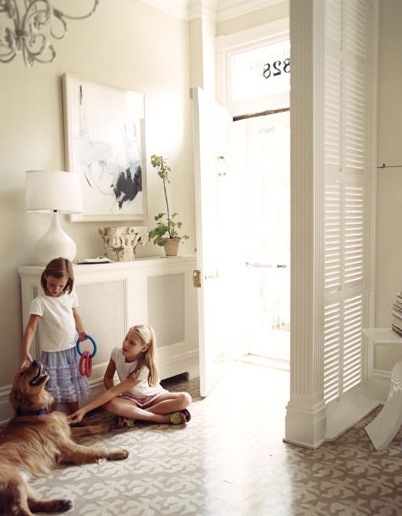
I love a simple entry that has character but isn't imposing.
Simplicity with warmth describes my family room, it's in the subtle details. It would be easy to change things out and get a different look with a few simple touches. You'll see a pattern with me- I like to decorate seasonally with flowers, so a quiet background really appeals.
I love the idea of this pantry as a part of my kitchen. It could double as a work room- storing all my vases, cookbooks and even stationary supplies in one spot. It's easy to close off, but also accessible while being close to the main traffic of the house.
There are so many breakfast nooks it's hard to choose- I can't remember where I saved this one from, but I love the light streaming in. I envision many projects, lots of great meals and conversations in this spot. We tend to eat and work in one space and I like how a nook keeps everyone together and engaged. Bright pillows and floral arrangements would spark up the space.
Here are some flowers from The Proper Poppy I'd put in our nook.
A workspace that is pretty but functional describes my kitchen. There's a nice mix of closed cabinets and drawers to hide the every day items and then a bit of open shelving to show off pretty treasures. Everyone tends to congregate in the kitchen, and I like the couch close by so someone can curl up and visit while cooking is going on.
This office space looks ready for me to set my laptop on the desk for a bit of work on my blog and floral ideas, and then a great area to snuggle up with a good book.
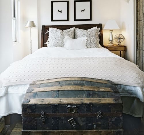
Down the hall would be the guest room. I wonder what voyages that old trunk has taken? And aren't the simple prints above the bed darling?
I'm in love with the subtle basket weave flooring for our guest bath and the cabinet color is divine!
Cheery striped window coverings make this playroom pop, and what child (and child at heart) wouldn't love doodling on that fun drawing table with the mismatched little chairs? The only thing missing- a bunch of original drawings above the couch. Our family would definitely love to snuggle up and read books in this space... it's bright and kid friendly, but without overwhelming clutter.
Sticking with stripes- this children's bedroom has been a favorite of mine. And I had to sneak a little Greek key in here for Paloma! We're working on our son's "little big boy" room, so I've enjoyed peeking at all the ideas for kids out there right now.
As for the master bedroom- I think if it's good enough for Barefoot Contessa- it's good enough for us! Crisp linens and lots of light. A calm spot for a good rest. I'd probably find some sort of art for over the bed...
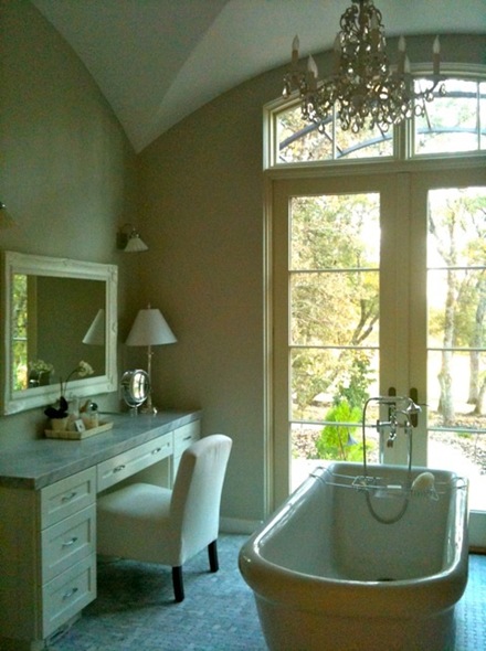
This actually is my friend's master bath- and I am totally taken with the space. I adore the gorgeous french doors and fabulous tub to soak in. It really seems like a lovely place to get ready every day.
Okay- back to a little bit of color! I would lighten up and be more carefree in my closet. I'm drawn to the chevron patterned island and all that Hermès orange.
I've saved this image for a long time. It's such a great pool house/office space... potential is so versatile. It's crisp and clean and just FUN!
Finally- this California girl definitely loves the idea of pocketing all the doors into the walls and being right in the backyard.
And now to throw you TOTALLY off balance... I wanted to share what I think would be a blend of what my husband and I might like in a completely random room. His great love is books and the idea of a clean modern space. My hobby is songwriting and singing, so I love how this room marries the two and is just FULL of light. I can totally see my husband reading some sort of London history, my son bringing in his drumsticks (or some sort of sports equipment) and me at the piano. How's that for a totally different look? I couldn't figure out how to incorporate it with the other photos as they were more cohesive- but still wanted to share!
It just goes to show how many different ways I could take my dreams. On any given day a new image or object inspires me. But I must say- my biggest dream is to have my family under one roof- happy, healthy and laughing together.
La Dolce Vita showcases such a variety of styles and continues to expose me to new sources of inspiration. I always look forward to what Paloma will feature next. It's been a treat for me to participate in the dream home series. Thank you all for welcoming me into your own home and day!
Fondly,
Jennifer
* image sources- 1. Backen Gillam Kroeger Architects 2.-4. House Beautiful 5. unknown 6. High Gloss Magazine 7. Sunset Magazine 8. Elle Decor 9. Lonny 10. Urban Grace 11. Barbara Colvin & Co. 12. Vogue Living 13. House Beautiful 14. iphone candid 15. Vogue Living 16. Domino 17. Backen Gillam Kroeger Architects 18. Apartment Therapy *


25 comments:
I wouldn't change a thing! Wow- where do I start? I love the white kitchen. We have white cabinets, and now I'm definitely going to paint the walls that gray/blue color! It goes so well! And the basketweave pattern on the bathroom floor was also amazing. I love anything chevron, so the closet island caught my eye! Sign me up for this dream home :) Now I'm off to check out her blog- she has great taste!
Wow these images are mind blowing. Just gorgeous. Loving the kids room with the greek key...
Confessions of a Purse-a-holic
Wow!
Can she share this house with me? This is the best one yet! I'm in love with everything!!!!
I hope you're having a great time in LA, Paloma!
xo
Luciane at HomeBunch.com
Jennifer you have me smitten. This house is so comforting and welcoming. The first pic of the front of the house I was taken! I hope you get your dream home some day, and I hope I get to see it!(even if its just in pictures...) Have a great one, thanks!
xo
Thoroughly lovely -- this really looks like a seamless home. Well done, Alcira
nerochronicles.com
wow.. love them ALL!
What lovely choices, Jennifer! I love the consistency of white in the colour palette. Also, the striped walls in the children's room is adorable.
ps I'm hosting a giveaway on Ruffled Rose. Y'all should stop by!
Love that butler's pantry!!!
The exterior of this house is just too gorgeous for words. Loving how cozy and still chic Jennifer's dream home is.
I love the back view most of all, from the front it's too big and sprawling for my taste.
What beautiful rooms - each has something wonderful to offer.
xo Elizabeth
Lover of Poppy now!! Just realized I wasn't a follower of yours and you're part of my daily reads!! Shame on me!!
Follower now!! ;)
Lover of Poppy now!! I just realized I wasn't a follower of yours and you're on my top daily reads!! Shame on me!! Follower now!! So inspiring you are! ;)
Great choices! It is all very open, classic and simple.
Oh that pool house/office space is awesome! Love that.
I love your random room-that would be just like mine too!
G.O.R.G.E.O.U.S.....what a cohesive collection of beautiful rooms to make this dream house...what's not to love!! the last image though a little out of character for the rest of the house...is just perfection...an ideal place to hang-out for the entire family!!thanks for the lovely post, Paloma...its my favourite feature on you blog!!
xx meenal
Love that pantry! The glass doors all the way across and as large a room. My favorite.
Thanks to Paloma for giving me the opportunity to share my dream home ideas. And thanks to her lovely readers for all the comments, it was so fun reading your feedback. I thoroughly enjoyed participating in the series. Looking forward to seeing next week's!
Sincerely,
Jennifer
Thanks for posting. I've been working on a design for a motor court for my 200 year old farm house for months now. I think I just found my inspiration with the first photo in this post. Wish I could see more!
www.ajbarnesonline.blogspot.com
Nice post! I enjoyed reading it and I can see that you have a wonderful home. Wish I can also visit it if there is a time. I like the design. Thanks for sharing.
-pia-
This place is LOVELY. I'm especially liking the kitchen. I saw one with a very similar vibe here http://www.aliceindesignland.com/blog/inside-look-montreal-family-home.html and am in love with both of them.
This place is LOVELY! I especially like the kitchen. I saw a similar one here http://www.aliceindesignland.com/blog/inside-look-montreal-family-home.html and am in love with both of them.
The office... especially the fantastic desk and chair, is my dream come true. Surrounded by books, with a little daybed to relax in, its the perfect space. Fantastic images!
-xx Noe ADELLA AVENUE
I have to admit I have seen my wife do this many times. She’s often collecting images of random bits of houses and piecing together what she eventually wants us to live in. I thought she was the only one but clearly not and similarly the images she collected would amount to a property with a hefty house valuation. I told her that it was called a dream home for a reason. But I really do like the choice of images above, they’re all light and airy creating a really open feel. I just don’t think this interior would survive with young kids though as they’d probably tear it apart.
Post a Comment