I’ve been giving a lot of thought about what I’d like to see more of in 2011 and what I’d like to see go away. For this post, I’ve chosen to focus on the things that I want see more of because as we all know, beauty, whether in a person or in a room, is highly subjective. I also thought it might be kind of mean to post someone’s work and say that I am tired of it. So, without further adieu, here are a few things I hope to see more of this year.
{Layered, Collected, Glamorous Rooms
-Image of Aerin Lauder’s Living Room via ELLE DECOR}
{Chic, Unexpected Combinations in Table Settings}
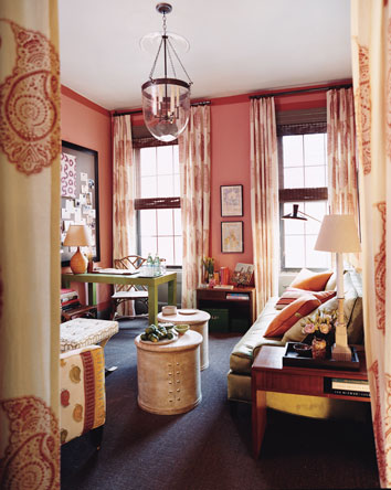
{More of Pantone’s 2011 Color of the Year: Honeysuckle
– Image via Elements of Style}
{Bold Colors Used with Restraint – Image via Mary McGee}
This vignette is filled with several, bold colors, yet the overall effect is more soothing than startling.
{Grey Used in Fresh, New Ways -Image via Another Shade of Grey}
I personally love the color grey, though I know some bloggers feel like it’s been done to death. I happen to think it’s a classic neutral that will never go out of style, but I’d like to see it used in some inventive ways this year.
{Traditional with a Twist -Image via Ashley Whitaker}
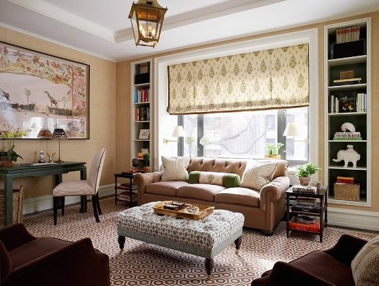
I think of my style as “modern traditional” or “classic with a twist”. Over the past few years, the uber-modern, Design Within Reach look has been very popular. I’d like to see things veer more towards the traditional, with a modern edge, of course!
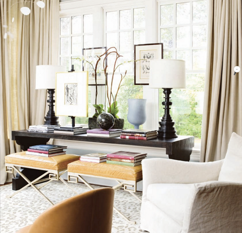
{Successfully Playing with Scale -Image via Atlanta Homes and Lifestyles}
{A Fresh, New Approach to Design in the South – Image via Atlanta Homes and Lifestyles}
I am a Houston girl, born and raised, but I must say, I have a few qualms about design in this city. While we do have a lot of great things going on and many talented designers here, such a huge part of this city (entire neighborhoods, even!) have all fallen for a formulaic French Country look. Even though it isn’t always my taste, I do appreciate it when it’s done well and acknowledge that it can be lovely. Having said that…Houston, we need to move on to something else! It’s okay for your house to look different than your neighbor’s! I am crazy about what is going on design-wise in Atlanta. There is so much great design in that city and it is fresh and inventive, yet maintains it’s Southern sensibility. I believe in you, Houston. Just take a look at the gorgeous room pictured above designed by Southern design doyenne, Suzanne Kasler. I think it appeals to “traditional with a twist” people as well as the French Country folks. Let’s try something new this year!
{A Nod to the Past without doing the Full-Scale Regency Look
– Image via Benjamin Dhong}
{More Fun Rooms with Twin Beds – Image via Mary Rufty}
{Inspiring Outdoor Spaces that are just as Beautiful as Indoor Spaces – Image via Commune Design}
{Lots of High Gloss Paint – Image via ELLE DÉCOR }
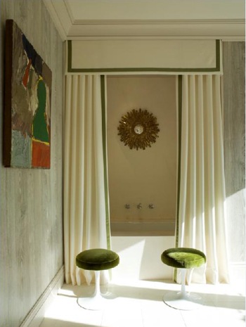
{Rooms that are neither Overtly Feminine nor Masculine, just Beautiful
– Image via Francois Hilard}
So, what would you all like to see more of in 2011? What would you like to see go away?











17 comments:
Glossy paint! I'm with you! And more original ideas!
More color, yes please! And more rustic chic rooms.
Also, I am so inspired by the living rooms that I posted today, especially the 1st one. If you have a minute, go take a look and you'll understand why. Let me know if you agree. :-)
xo
Luciane at HomeBunch.com
Wow- what a fabulous post! I am with you on all of these though I'm nervous about the Panton pick- pink is my absolute favourite colour in the world (painted my living room in it a few months ago) and I'm worried that it will now get overplayed- In any event, love it and think all of these designer wish list items are fabulous. And as an aside, that Manuel Canovas Bengale paper makes my heart sing everytime I see it!
I love what you're showing - so yes, let'd see more this year. I love rooms that are layered with a suble sophistication. I also agree...no two homes should look alike.
I love anything Melissa Rufty touches....so I'm keeping my eye on her new projects.
Wishing you a happy, glamorous New Year!
xo Elizabeth
Paloma, as another Houstonian, I wish to say how proud I am to know you! This is a lovely post. The outdoor living is wonderful! I know what you mean about the 2-story new homes replicated everywhere, but I think there are some splendid works of contemporary architecture & furnishings inside some of these places. xx's
Marsha
I'm TOTALLY with you Paloma! We CAN do something different Houston! pllllllease! great post! cheers to 2011 :)
Paloma, I'm like you and lately, I've really been drawn to rooms that artfully incorporate bohemian or even tribal graphics into the traditional room. Think tasteful ikats in neutral colors, or even a not-too-zany paisley. Sort of like the draperies in the Pantone photograph in the post!
I have to say I'd rather see less full-scale Hollywood Regency, though I do still like little touches of it.
Fantastic post!
Love your take on this. I'm more of a traditional with a twist girl myself, though I love European inspired spaces. That being said, I like authentic European inspired spaces. The cookie cutter designs are getting really boring. Love grey but I love color too. You chose a wonderful image for vivid color with the blue velvet sofa. That is color at it's best. I'm just not a fan at all of really brightly colored rooms paired with white. I would tire of that very quickly.
Hey! I feel like you are talking about my 2011 posts... I dont think gray rooms are ugly- my apt is gray and I dont hate white kitchens- my own kitchen is white!
When I say I am sick of something- its not that its ugly- its that I want to see new variations on the theme to keep being inspired.
I dont mean to come off as mean.
Not at all, Sketch! I'm so sorry if it came across that way. I did read the post where you talked about grey and I've noticed several bloggers discussing grey as well as white kitchens, but I certainly don't hold it against you! You know I love your taste and consider you a blogging friend. XO
I'd love to see more pale and medium tones. And definitely more "young traditional" rooms. I'd like to see the end of ikats, suzanis, furniture upholstered in burlap sacks, subway posters and wooden "Italian" chandeliers.
Hi there! I love your comments on a modern Southern style. I'm an ATL girl and am excited to see the changes continuing to happen in design.
Wow, such beautiful rooms. I am so with you-- I've over super modern. I love neo-traditional and hope to see (and create!) a lot of it this year!
Great rooms....love the outdoor room!
Great roundup of ideas and images! I'm with you on the glossy paint and the layered rooms, as well as the Regency touches without going overboard. And even though I can't/won't really use the inspiration myself, I do love to look at awesome outdoor spaces and honeysuckle pink--so keep those coming too.
I'd love to see more navy, as it's a favorite color of mine and I don't think it gets enough use. I'd also like to see more subtly(!) preppy influences, and as Squeak said above "young traditional" spaces. Black and white always appeals to me, and I'm still digging gray (although I think you're right; it will be nice to see it in fresh, new ways.). Oh, and I'd love to see some variety in window treatments, both in the fabric and the style. Bring it on 2011!
Very well said. I couldn't agree more. Might we see it in your upcoming magazine? Look forward to it.
I'd like to keep seeing brass (the nice, antiqued kind, not the relics from Dynasty) worked into rooms. I definitely think a few things are suffering from overexposure and need to take a breather-zebra print rugs, ikat, greek key (I know...) and white ceramic animals. I'm leaning a little towards brightly painted Regency pieces, too. Put down the paintbrush!
Love all your design wishes and you've including many of my favorites. Although I appreciate all good design, layered collected glamor and traditional with a twist are especially up my alley. I know it fits in with your traditional with a modern edge but I'd like to specifically add the combination of modern with antiques - this is a more common theme in European homes and I love it!!
Post a Comment