{I love the glamorous mix of accessories and textures in Chelsea’s entryway!}
The lovely Chelsea Watlington, who pens the blog, design 59 and works as an interior designer recently shared some gorgeous images of her New York studio apartment with me. I immediately loved the soothing color palette she had employed as well as her eclectic mix of accessories. What I found most impressive, however, was how amazingly stylish she had made this tiny space! So often, people have a tough time seeing past the constrictions that a small space might present. Chelsea, on the other hand, made the best use of the space in her apartment in Manhattan’s Seaport / Financial District, and made it feel super chic at the same time. Chelsea and I recently discussed how she went about designing a space that initially presented some challenges and where she turned for inspiration.

LDV: What were your initial thoughts when you decided upon your studio apartment?
CW: Most would cringe at the idea of living in a studio, but I knew this space had potential the moment I stepped through the door. We quickly realized the space was larger than it appeared once we started placing furniture, and we decided not to put up a wall (although that was a possibility) in hopes of making the space feel more spacious than it actually is.

LDV: How did you go about defining each space within the apartment?
CW: The curtain is just enough to help divide the space while giving a softness to the room. And, the long hallway contributes to the overall spaciousness of the space, plus it makes a great gallery wall.
![IMG_2642[1] IMG_2642[1]](https://blogger.googleusercontent.com/img/b/R29vZ2xl/AVvXsEgj6aftOdoxY0OPKRcU7zo2eVnq7I1KL6bo9nu3GnV0WUXPYAZ2LEoB1bzYX8rBJB_UEWzgzvTwEMFUe1RBYwj7ecDINCJhAaTaFSYKtlqeoyacNMybNPvutOwoOswwAy1iXUjPA8wqE7P_/?imgmax=800)
CW: We chose to keep the bed closest to the kitchen so we could take full advantage of the view and keep the light out during those early morning weekends. The view is the main reason we picked this apartment. Not many people can say they can watch the sun rise over the Brooklyn Bridge every morning, and trust me...it never gets old.

LDV: What type of look were you trying to create in your home? How did you decide on the color palette you used?
CW: As a designer, I have endless products and materials at my fingertips which can lead to an indecisiveness when it comes to my own home. I’ve found the best way around this is by creating a neutral palette. This allows me to change the pillows and accents throughout the space and changing the feel without ordering new furniture. We rent in the city, so this neutral approach is perfect because it allows us to change paint colors and accessories to feel like we have a totally new space. The neutral palette is also very calming, which is a nice break from such a busy city. So, it was important to make this space relaxing but still be appealing from an overall aesthetic point-of-view.
{I love the sleek IKEA bookcase next to the vintage pedestal table and slipper chair.}
LDV: Where did you turn for inspiration?
CW: I LOVE to find old things and make them new again. It helps the environment and is very cost effective. Several of the items in my home were found from flea markets or craigslist and re-upholstered to our taste.
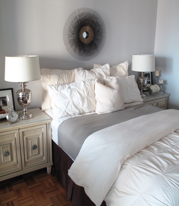
{Doesn’t this look like the most inviting bed?}

Sources:
Sofa: Macy’s
Slipper Chairs: Found at a flea market and reupholstered
Rustic table between slipper chairs: Anthropologie
Bookcase: Ikea
Console: Antique store in Soho
Dining Table: Lillian August, CT
Dining Chairs: Cragislist - had them reupholstered and painted
Night Stands: Craigslist


30 comments:
loven' the Hunters under the table as 'decor' - cowhide rug IN LOVE with - the chest is killer! - and views LOVEN'!!!
*kiss kiss*
Erika
~Tiptoe Butterfly~
I love how this space, which is decorated in mostly neutral colors looks so elegant and chic! Definitely can see the details which are making pretty much of these rooms! p.s. I'd die for the sunburst mirror from the bedroom - stunning!
incredibly chic, and I'm amazed at how spacious it looks! Fantastic views of course, thanks for sharing Paloma, what a delight!
This is exactly my style. Neutral, soft, and chic... Thanks for sharing :) You always post the best spaces!
oh i absolutely love her apartment. those white chairs are to die for.
love this. thanks for sharing!
this is fabulous! i'm actually in the process of trying to pick a gray paint to paint my apartment and this looks perfect - anyway to find out what colour it is???
Love the way she styled her Ikea bookcase. And the rest of her apt looks like one of a well-traveled woman.
YAY for Chelsea! So proud of my super talented friend! Thanks for featuring her amazing work.
this is beautiful! it looks so peaceful and inviting. what a talented designer.
The view is GREAT!!! I love the mix of old and new, sleek and comfortable!
What an awesome place!
Unbelievably gorgeous! I could move RIGHT in and not change a thing!
Great find! Her home is lovely.
I NEED those slipper chairs, darn that they're a flea market score! What a beautiful, calm space!
Amazing use of space and materials! I especially heart the chairs in front of the windows, and the dining table. So lovely.
Chelsea, you are so talented, love your apartment and of course the view. I know you are loving NYC.
This is one of my favorite spaces ever (this and the brooklyn home co.!) I can't wait to see if she has a website. Wonderful!
Love the bedding, anyway to find out where it's from?
What awesome talent!
Great pix on the wall!
Proud of you guys!
Lovely liveable space, I feel comfortable just looking at it.
Amazing and very inviting.
I absolutely love the vintage mixed perfectly with modern elegance! The touch of wimsy (i.e. rain boots under entrance table) finishes the entire space. Well done!
So pretty, I agree about having neutrals, I am not an interior designer, but an everything else designer, and it makes me indecisive b/c I love so many things. People expect my home to be like my paintings, but instead it is all neutral! I love that view, golly, I know just what part of town that is, I miss New York!
Love this! Great placement. Enjoy the personal touch with photos & collections. Great use of space and that amazing view!
Love the bar in the bookshelf. I have a tiny space as well but have been wanting to do a bar somewhere without taking up more floor space, I'm sooo using this idea, thanks!
i love the unlikely combination of a sequined pillow and a ghost chair in her foyer as well as the happily feminine slipper chairs in her living room. thanks so much for sharing her space with us!
thanks everyone for the sweet comments!
the duvet & pillows are from west elm and the starburst mirror over the bed is crate and barrel. the wall color is stonington gray(HC-170) in eggshell by Benjamin Moore Aura. happy designing!
Beautiful! I'm Scott's sister and I remember you as a little, tiny baby! Hard to believe all you kids are grown - and you - all the way to NYC! So glad to see you have found a career you love!
Susan Shaw Hamlin
I love the lamps on the nightstands. Can you share your source? Thanks-beautiful apartment!
Stunning!!! I love it all, but my favorite is the dining room! Those chairs are awesome and it looks like she reupholstered them with leather? Not sure, but it is gorgeous!
Post a Comment