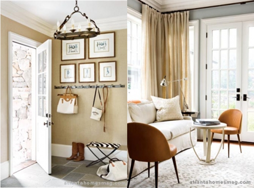
{What’s not to love about this gorgeous space by one of my favorite designers, Suzanne Kasler?}
One look was all it took. I took a single glance at the room pictured above and like Liz Lemon on 30 Rock, I said to myself, “I want to go to there”. All it took were the amazing greek key benches, the perfectly stacked books, beautiful lamps, and artwork to win me over. The sheer beauty of this room made me wonder about the rest of the house. Could it be nearly as good? My dears, it is just as good if not better because this room that sparked a love affair with my design-loving self is part of Atlanta Homes & Lifestyles’ 2009 Christmas House which is nothing short of AMAZING.

The genius folks over at the magazine decided to take an already gorgeous William T. Baker designed manse in Buckhead and have 23 of the finest interior designers in Atlanta turn it into one of the most incredible homes this blogger has ever laid her eyes on. I am massively overdue for a trip to Atlanta. There is such an amazing design scene there with an enormous wealth of talent. If we’re being honest, Atlanta is a more “Southern” city than Houston, so why is the design scene there so much more modern? Why don’t we see more design like this here? Atlanta seems to embrace eclecticism a little better than we do for the most part. Most things in Houston veer towards the French Country or Tuscan looks. I would love nothing more than to see more spaces like this created in my beloved city. In the meantime, I desperately need to book a ticket to the ATL!

{A Beautiful, Tailored Study by Robert Brown Interior Design}

{The large living room features two well-defined areas. The first features a baby grand piano and leather chairs for an “impromptu concert” as described by John Oetgen who designed the space.}

{The room is rich in textures including two Moroccan rugs and Aubusson tapestries to anchor the room.}
{I love the use of color in this room!}
{I love the whimsy of this fabulous guest bedroom by Jim Howard of James Michael Howard Inc. The bed was custom-designed by Howard. Gorgeous, no?}

{The out of this world zig zag fabric was made by Mack Southern Design.}

{The gorgeous master bedroom and bath were designed by Susan Ferrier of McAlpine Booth & Ferrier Interiors. Check out the gorgeous ceiling!}

{Ferrier played upon the scale and volume of the room so beautifully. It is filled with grand pieces, made all the more elegant through the minimal color palette.}

{Of the master bathroom, Ferrier said “the white marble [space] had a strong edge that called to be warmed,” she says. Thus, a little romance was in order. A large-scale crystal chandelier, with contrasting black shades, ties back to the room’s black-and-white photography, creating another grand gesture in the process”.}

{I love the classic and romantic elements used in this bedroom by Amy Morris.}

{“The goal was to not make it overly masculine or feminine—just clean, soft and sophisticated.” – Amy Morris}

{Lovely Details}
{The beautiful, traditional kitchen was designed by Mary Kathryn Timoney of Design Galleria Kitchens}

{Sara Steinfeld used icy shades of blue and silver along with gold accents to create her idea of a “hot and cold” dining room.}

{The dining room features an artistic chandelier by Bourgeois Boheme.}

{The incredible studio was designed by Beth Webb who happens to be a board member at the Florence Academy of Art. Many of the works seen here came from the university’s alumni and staff.}

{The chaise and console table in this room are both from Hermès .}

{I love the laid-back, collected look of the lounge by Jimmy Stanton of Stanton Home Furnishings. How amazing are the convex mirror and chandelier?}

{I love the use of vintage and industrial pieces in Stanton’s design. The bookshelf, zinc table, and industrial light fixture are fantastic!}

{Can you guess who designed this wine-tasting room? It’s Kay Douglass of South of Market! The room is very true to her style.}

{The floor was painted by hand by South of Market artist, Brian Carter. Pretty remarkable, no?}

{The bold upstairs gallery was designed by Mimi Williams who wanted “to convey the magic and imagery of angels”.

{Mark Williams and Niki Papadopoulos drew inspiration from Rhoda’s apartment on the Mary Tyler Moore Show for the guesthouse they designed.}

{Can you believe the bed is from IKEA? I’m pretty sure the fabulous Hermès bicycle cost a lot more than the bed! Isn’t it a fun room?}

{It’s all in the details and styling!}

{I could totally set up shop in the gorgeous office area of the guesthouse. Designed by Randy and Courtney Tilinski owners of Bungalow Classic, it features Benjamin Moore’s beautiful Newburg Green paint. Blue isn’t normally my go-to color, but this shade is absolutely gorgeous! I could honestly spend days on end in this cozy room.}
In all honesty, I haven’t been this excited about a house in a very long time. Thank you to the creative minds at Atlanta Homes & Lifestyle and these brilliant designers for creating such an inspiring space. So dear friends, I know it is nearly impossible to choose, but which space is your favorite?
Image Credit: Erica George Dines for Atlanta Homes & Lifestyle


28 comments:
These rooms are amazing. I love, love, love the mix of styles and periods. I am really trying to do that in my home. It is so difficult when you don't have all the resources available to you like designers do. Also, budget plays a huge factor! Really enjoyed looking at these.
~jamilyn
It is like Christmas morning, I mean each room is just STUNNING and its like one amazing present to open after another. I need to go back now and save them all :)
Is that all one house??? I'm confused. I honestly wouldn't be able to pick which one is the master and which is the guest bedroom...
I think the art studio and the master bath are my favorite rooms in the house! And the Wegner wishbone chairs are in the house I featured today, as well! Great taste all around!
Alaina
zig zag bedroom!!! but every room really is amazing!
Alaina, yes it is all ONE house! Can you believe it? It must be a huge home. Just the scale of the rooms alone tells me it must be enormous.
Speechless. Beautiful. And I love the 2 green chairs in that one room, such a great contrast. So inspiring.
I had the good fortune of visiting this year and fell in love with each and every detail. I posted the Christmas House Color Palette handout on my blog. I can also email it to anyone who's interested.
http://www.blulabelbungalow.com/2009/11/smitten-bybarrel-shade-chandeliers.html
Great post! I love Suzanne Kasler, I have used the first picture in an upcoming post called Something different. I loved the use of framed art in the window, that is something different !! She does amazing work. Kathysue
Wow. I absolutely love this house -- it's going into my files immediately!
I really love the bedroom. That room made me hover over it a while. And I really like the floor to ceiling artwork a couple of the designers tried. How inspiring!
They are all amazing - but the bed with the panels is the best one!
I die for that bathroom with the series of pictures hanging on two sides! The ceiling is AMAZING and I love the soft color palette.
These are so great. I grew up in Atlanta, and I agree, that city is FULL of talent!
Really great write up. Terrific images - I can't seem to get over the studio. So light filled! And excuse me while I run out to Ikea to buy a bed?!?! Again, really terriifc. Marija
Love the Newburg Green paint in the bottom pic, stunning, and elegant. Quite might possibly be, I agree.
I think the upstairs gallery...I could gaze at that painting all day.
wow! so much eye candy for me! i love it!
All the rooms are gorgeous, and I'm especially loving the master bathroom. Inspiration for when we gut our master wing. I can hardly wait (although I have to.) Great post, P!
truthfully, i had looked at this feature online before, saved a few photos to my inspiration folder, and moved on. the suzanne kasler space is design perfection and the bedroom with the bicycle caught my eye, but other than that it was out of sight, out of mind. so THANK YOU for redirecting my wandering eyes. your contagious enthusiasm and insightful commentary have forced me to take a closer look and i am so happy i did. thank you for a wonderful post and for being so good at what you do. bravo!
I love your blog and have read it faithfully for over a year!
Today i couldn't resist posting a comment because I am an Atlanta native. I lived in the city for over 6 years and fell in love with it more everyday. It has so much to offer, and you are right, the design scene is amazing!
I moved to Texas (Dallas) just over a year ago and married my best friend, so now my last name is Contreras, also!
This post, like all of your others, is amazing! I am in love with this house! The neighborhood of Buckhead is full of amazing homes like this one.
When you do make a visit, I'd love to make some insider recommendations... there are many amazing stores off the beaten path not often mentioned in magazines... and restaurants, so many wonderful places to dine!
Keep up the great work, Paloma!
Bests,
Rebecca Contreras
All of these rooms are stunning! I love that you quoted Liz Lemon. I always say "I want to go to there" and most people just look at me as if I failed grammar class. haha. I love the bold use of neutrals in all the rooms. Thanks for sharing the goodness. :)
2 words...jaw dropping!
OOHH I want to go there too! Such a livable house...great design and attention to detail but never stiff and "designed". I would love to have seen it in person. Thanks for sharing.
No kidding! Each and every one of those rooms is a feast for the eyes!
stunning. very inspired.
The Studio is my favorite room...its so sexy!
WOW
each room is a
treasure
what great
collections
love the palettes
thanks for sharing
ray
I want to go at there, really how can you find such these things & places.
Post a Comment