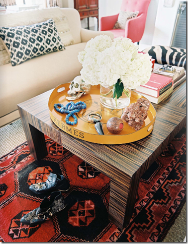
This bohemian beauty was featured in the third issue of Lonny, which just came out on Wednesday. The living room was designed by Betsey Burnham and her team and belongs to her clients, The Andersons. I love the architectural details of the home and find that the eclectic accessories complement it perfectly.
A fabulous Hermes tray (remember Olivia Palermo’s?) sits atop a zebrawood table. I love the colors in the room and who doesn’t love a huge bouquet of white hydrangeas?

Ethnic fabrics in Ikat and Suzani patterns and the Turkish rug lend color and a bohemian feel to the room.
Image Credit: Patrick Cline for Lonny Magazine
Hope everyone has a wonderful Valentine’s Weekend! Be a sweetie and be sure to join us on the new new La Dolce Vita Fan Page on Facebook. :)


17 comments:
I'm totally in love with this room! I love, love, love the little workspace... so polished!
I absolutely adore the tribal, geometric and vibrant colored rug - especially in its place under a gorgeous textured wood coffee table.
This room is a pleasure to flip through, but there is one jarring thing that makes it a bit too personal for me. The large photo of a putto (their child?) in a loose contrapposto is too Baroque for the space. Despite the fact that the photographic medium is modern, it just seems to confuse the overall design.
Granted this may be a personal touch for the owners, which is fine. My comment should only be reviewed in the design context.
What do you think? Did I see this wrong?
Love the Hermes tray! Unique color, so fun :)
I'm so glad to see elements like suzani, zebra, and ikat are still be used in fresh ways. I for one am not ready to relegate them to the "out" file. Great pic for Fab room Friday!
I love this room...I want that house. Lovely. So me.
This may be my favorite Friday room thus far. I am loving black and white graphic pillows and accessories lately- but this is more subtle and livable!
This may be my favorite Friday room thus far. I am loving black and white graphic pillows and accessories lately- but this is more subtle and livable!
That really is a fabulous room- I love everything about it!
Have a good weekend!
This room is fabulous! I could only dream to pull together something as remarkable as this.
-Cara @ Live the Home Life
Love this room, the color palette is gorgeous and something I haven't seen that often recently.
Janell
Hi Paloma-
I love these rooms and Lonny Magazine! Thanks for posting :)
Cara
I love the photo of the cute baby above the fireplace.
Wow! That is what I love about designers! I never would of thought to contrast those wall colors! Love it!
Love this! I've got to get a chance to check out the new Lonny!
One of these days I will own a Hermes tray! I've seen them a few times and get pea green jealous everytime I see it! I love Lonny but I wish it was an actual magazine, I understand the digital aspect of it but I still like the real magazine concept!
I loved this room, too, but didn't notice the adorable portrait above the fireplace until I saw it again on your blog. That and the tray make the space for me! (i love a tray)
Beautiful room, and I want to squeeze that wee baby in the adorable photo above the fireplace. Such a cutie!
Post a Comment